Icons are small, less detailed pictorial representations of anything. They are mainly used for communication. Sometimes icons help where language could not help. In digital designs icons, vectors are pictograms or ideograms used to help users understand things better and navigate through the app or website easily.
Icon vectors have a vital role in designing anything related to digital media these days. They are maybe tiny in appearance but in importance, they are not tiny. Any design depends on icons to be successful.
Icons play a crucial to help, clarifying, navigate, and simplify things for users. If not used properly, icons have the power to ruin the user experience of a specific app or a website. The importance of icons in today’s digital world cannot be denied. This is why we decided to discuss how to use icons in digital designs efficiently and what mistakes are mandatory to avoid for a good result.
What are Icon Vectors?
Icons are small symbol on a computer or smartphone screen that represents a program or a file. Icons help designers to create a custom design that specifically represents their unique brand. Icons took less space and provide meaning to long paragraphs worth of space in the digital world and enhance the understandability of any design. In this blog, we will discuss where and how to use icon vectors in digital designs to make the designs stand out. We will also see an even more important topic, that when not to use or avoid icon vectors to make the design more effective and visually pleasing.

Properties of an Effective Icon:
An icon needs to be effective to leave its mark in the digital world. The few features an icon should have are clarity, meaning, simplicity, originality, communication, scalable, noticeability, and recognizable.
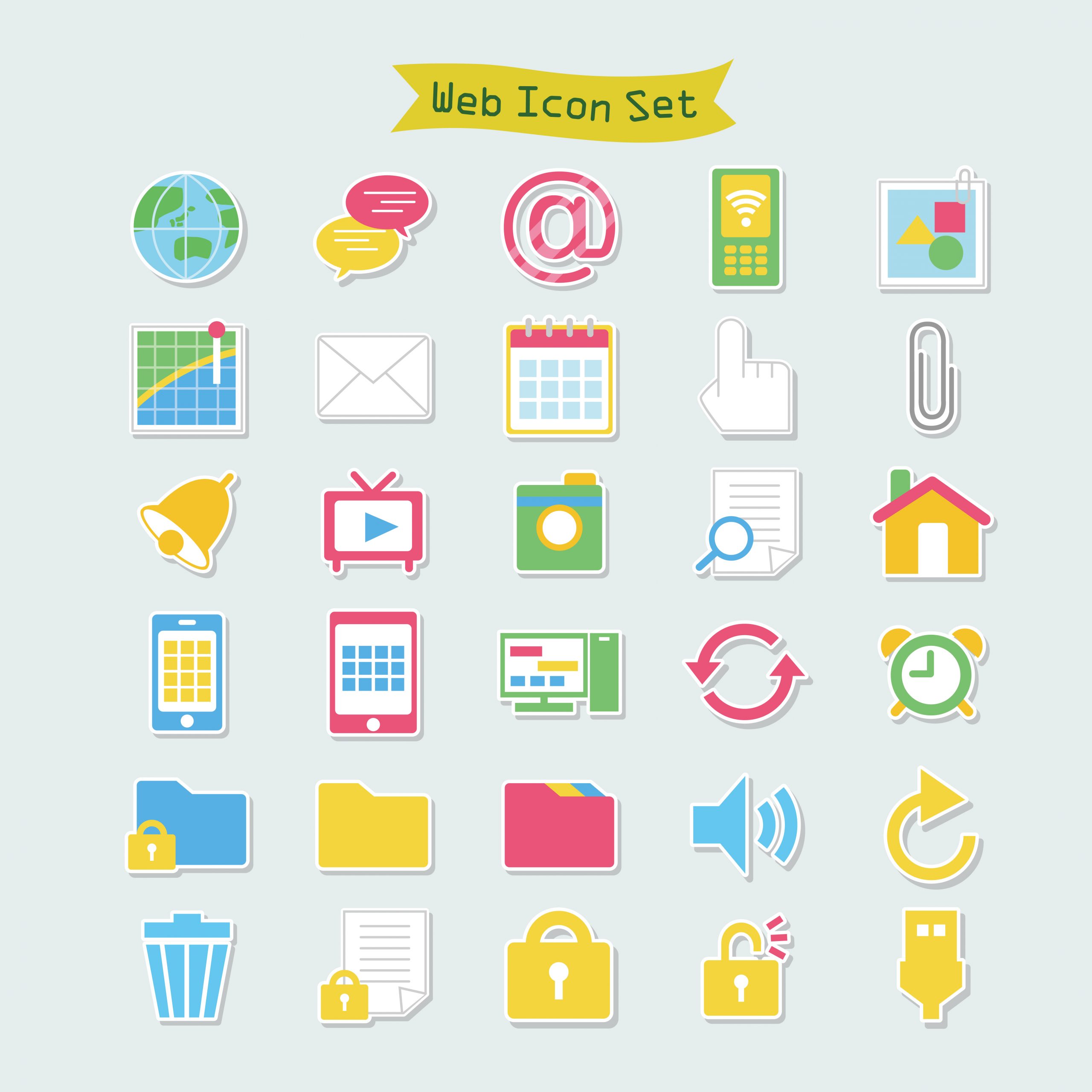
Some Basic Types of Icons:
These are some basic types of icon vectors used by designers worldwide.
Interactive Icons:
These icons are mainly tappable icons with links attached to them. They help users to bring them to their desired page. An example of these icons is the “go back to top” icon on long website pages. When the user tap on that icon, the link attached to it will bring to the top of the page.
Decorative Icons:
As their name explains, they help a design to look more visually appealing and aesthetic. These kinds of icons are usually used in seasonal branding and special offers.

Clarifying Icons:
These icons are used to explain the functions and usability of a design but these icons do not directly interact.
App Icons:
These kinds of icons are used for the representation of any brand or its app. One glimpse of such icons tells the user to which brand this icon belongs. For example, McDonald’s icon, or apple icon tells anyone in seconds what is this.

URL Icons:
These icons are used in bookmark tabs where users save some pages for later use with the help of these icons.
Benefits of Using Icon Vectors
If used correctly, Icons bring a lot of benefits to any UX design. Now we will some main benefits you can get by using icons appropriately in your design.
Attention-grabbing:
In our everyday life, we come through icons very often in the form of street signs, traffic icons, icons about shopping centers and restaurants, etc. A similar thing happens in the digital world as well. Icons are mainly used as universal symbols for some specific actions that could not be ignored, i.e., you may miss a stopping sign if it is written just in some language but you can’t ignore it when it is in the form of a prominent stop icon.
This happens because our brain functions for pictures more efficiently than anything in writing. This is why icon vectors in digital designs are widely used as well.

Easy to Understand:
The level of complexity in a design is very important. It will tell if your design is capable to make your potential customer stay on your app or not. If an app design is difficult to understand, people won’t stay on that page for long. This is why designers use icons while designing an app or website. Icon vectors are easy to understand just like we say images are worth a thousand words. If you are designing an app and instead of using icons, you write everything, your design will look messy and roomy. Icons help designers to create attention-grabbing and attractive designs.
Utilize Space Efficiently:
Some brands have a lot of information to share about their brand. These details often come in long paragraphs. If the designer writes long paragraphs as it is, it will not grab the attention of users as no one has a longer attention span these days. So, in such cases, designers add catchy icon vectors and pictorial information to enhance the design capability. The importance of icons vectors increases more when you are working on a design compatible with mobile screens. On mobile screens, you got limited space and cannot write a lot of things. So, you can use icon vectors to save space.
Visual Attraction:
The combination of text and icons enhances the beauty of a design and makes it look visually appealing for users and clients.

User Friendly:
It is important to use user-friendly icons. Icons should be easily recognizable and make the user experience good. When people use such apps that are familiar to them and they can easily understand and use, they feel at ease and relaxed. This positive experience makes them stay longer on such apps.
Representation:
Icon vector designing is difficult sometimes as it is hard to convey a broader message in a small pictorial form. You can also use widely used icons in your designs as well with little variations to less the complexity of the design i.e., using a general home icon or a message icon. You need to make sure that the icon represents its true meaning and does not complex the situation.
Highlight Important Points:
Icon vectors distinguish between different parts of a screen. You can add icons to the part of screens where you want to get the attention of users, i.e., an icon of home to go to the home page or the icon of a shopping cart in one corner. If a page contains these icons, users feel free to easily go to these links in one tap.
Language Barrier:
Icons could be used to convey the messages, language could not. An example of this is, icon vectors of call, message, music, mail, calendar, settings, and clock could be understood worldwide though in each language they all have a different vocabulary which is hardly understandable for people of different cultures. So, by using icons on your app or website, you do not have to translate basic things for your international users. You can see further examples.

How to Use Icon Vectors More Efficiently?
Simplicity:
The simplicity of the icons is mandatory. Your icons vector should be as simple as possible but it should also represent its true meaning. The key is, to use an icon that is less complex in appearance and communicate wider messages.
Consistency is the Key:
Consistency in design is crucial as it will represent your brand identity ultimately. This is why it is important to be consistent while using icons for some rand. You have to use the same colors in your icon vectors throughout the design. If you are using one color, stay with it. You can’t go with 5 black icons and one in grey color. If you are using a color palette of 6 colors, use the same colors throughout the whole designing process to create a branding kit. Also, make sure, the colors you are using represent the brand overall.
Size of Icon Vectors:
The size of an element in a design reflects its significance in the design. The same formula goes for the icon vectors. You have to assign space to each icon according to its importance. Another way to select the size of icons depends on the screen size and whether the icon vector is clickable or not. Icons in 1×1 cm are recommended usually for mobile app design so that they could be easily clickable.

Scalability of Icon:
Nowadays, you could not know if users approach your website from a mobile phone browser or a website browser, you have to make sure the icon vectors you are using are scalable. Otherwise, the icons could appear too big for the mobile screen ratio or could also get pixelated if they are too small. In both cases, users get a bad experience with your website.
Labels on icons:
Though it is considered good that icons speak for themselves and you do not have to name them. But if you are doing something different, and using unique or customized icons, it is better to name each icon. Just label your icon on right or below the icon. This naming will save your customers from confusion and also save their time.
Icon Background:
Sometimes, the design looks simple and lonelier. In that case, you can add colorful or even mono-color backgrounds to each icon vector. These simple and small backgrounds give vibrant look to your designs and make them prominent.
Infographics:
Icon vectors are highly used in infographics because they say a lot without any words. Imagine long text paragraphs of information on one hand and on the other hand, one chart or infographic table, with basic icons and a small line of text in front of each icon. Infographics are a lot more understandable, visually appealing, and attention-grabbing.
Branding Via Icons:
Each website and app have their own unique set of icons. This will make their brand stands out in a crowd of similar websites. You as a designer has to create icons set that are consistent in design and details. If you are using color-filled icons, keep it that way. If you are using minimal outlined icon vectors, you have to keep that pattern while designing the whole rand guideline. You just can’t use 2 icon vectors color-filled and 4 icon vectors with only an outline.

What to Avoid in Icons:
Icons are very useful in most cases. They enhance the beauty of the design and make the design meaningful and understandable. Icons are mainly used to ease out the user experience. But sometimes, designers failed to convey the actual message by some simple mistakes.
Now we will discuss how to avoid common mistakes while using icon vectors in your designs.
Vague Icons:
Icons should be easy to recognizable. If you go into too much detail or work on a unique idea for an existing icon, it will create barriers to the user experience. Icons should not be unclear as well. They should communicate their meaning.
Not Properly Sized:
Size matters. So one key point to remember is whether the icon vectors you are using are properly sized or not. The icon you are using should not be too big that it is no longer looks like an icon anymore nor it should be too small that you click on one icon and it will open another one. The minimum size of an icon should be 1×1 cm or 48×48 pixels for mobile phone screens.
5-Second Rule:
The designers have to keep this rule in mind while designing an icon. If the icon you are using or creating, is not understandable in 5 seconds, it means it is not fulfilling its purpose and needs to be replaced.

Avoid Conflicting Icons:
If an icon has various meanings, then avoid using it in your designs. Sometimes these icons will convey the wrong message or maybe do not convey any message at all. If you are using an icon and then you have to explain the icon’s actual meaning, that means the basic purpose of using an icon dies. The purpose of an icon is to summarize details with a picture not that you have to explain the picture as well.
Avoid Cliché Icons:
Icons containing heart or star shapes should be avoided to add in any design. This is because, on various sites, these icons have different meanings and functions. Such icons confuse inexperienced or new users about their true meaning. Also, people find it difficult to remember on which website, heart or star means what, and on the other website what is their true meaning.
Alignment:
It is important how your interface looks to users. If some of your icons are smaller than the others or placed incorrectly, your brand’s image got bad. Make sure your icons are properly aligned as per your screen size and concerning the other elements on the same page.
Avoid Confusing Icons:
Icons should be clear. A good icon is that the user could tell its meaning and purpose without its label. To achieve this level, avoid using the same icon for two different actions or two different icons for similar purposes.

Overuse of icons:
Be mindful while using icons on your website. As the proper usage of icons can glorify your UX design, over usage can ruin the design as well. Don’t use icons for the sake of just adding elements to your screen. Nowadays minimal designs are in demand. So, without true need, don’t add an element.
Too Detailed:
This is the main mistake, many new designers made while designing icon vectors. They create a very detailed image of an item and consider it a good icon. The rule of thumb is, the better the icon, the less detailed it is.
File Type:
This is important to make sure while mentioning general website icons, to use their original/correct icons. For example, you can’t use the YouTube icon in blue color rather than red.

Final Thoughts on the Mistakes to Avoid While Using Icons
It is good to think outside the box but this approach is not always helpful. The purpose of icons is to increase the understanding of design in less time. So, you have to avoid being over creative and introduce everything unique while there is an easy solution for something. If there is a very well-known icon for something as simple as home, save, play, print, etc. use them as it is. Anything else for such common options could create ambiguity in design. Icons that people have seen before and are familiar with our best to use. Using common icon vectors help your customers in easy navigation and to perform various tasks easily.
Conclusion:
The creation of icon vectors is quite difficult. It is not that they need a lot of work to create an icon. But the process of thinking about what to create is difficult. An icon has to represent the whole idea of its meaning which is difficult to express. We hope this blog covers all your confusion in the process of designing and selecting an icons vector set. If you are facing any difficulty in designing or selecting one perfect set of icons for your next digital design project, you can visit this huge collection of icon sets. You can download and use hundreds of icons in your work that are specifically designed while keeping all requirements in mind.