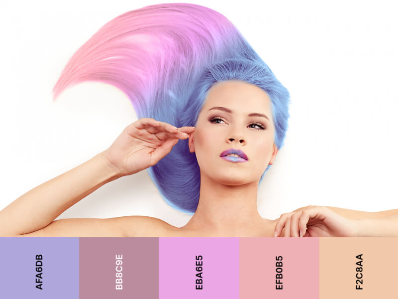
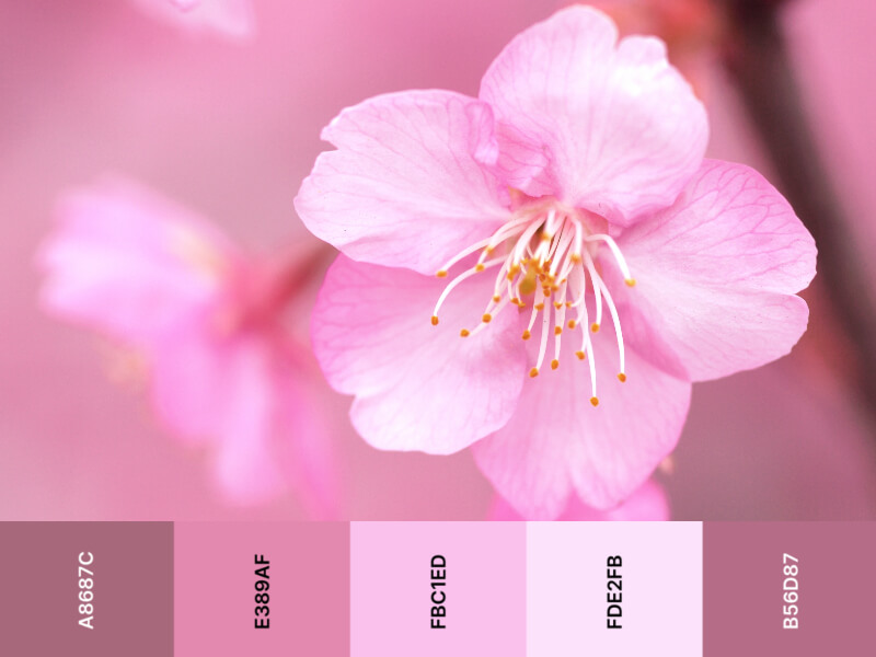
In color science, pastel color palettes are colors that have high luminance values but low saturation. They also tend to contain less gray than other colors.
Pastel colors work well for brands that want to convey a feeling of comfort and sweetness. They are particularly popular in the fashion, cosmetics, baby clothing and food industries.
1. What are pastel colors?
Pastel color palettes are light or muted versions of primary and secondary color hues that give any color a soft, delicate, and dreamy quality. They’re commonly used in design for their ability to create an airy, soothing atmosphere.
There are a variety of pastel colors that are available, and they can be mixed to create your own unique palette. For example, if you have a bright red paint, you can add white to it to create a pastel pink.
You can also mix your own pastel hues by experimenting with the amount of color you want to add. If you add too much of the color, it will be darker and more saturated than if you add less.
The best way to decide what colors are right for your design is to use a color wheel as a reference point. Using complementary colors on the color wheel will make it easier to choose the perfect shades for your project.
Another important factor is the tone of the colors you’re using. Keeping the mood of your design in mind is the key to creating a pleasing and harmonious result.
Some colors, such as green, are considered to be calming and soothing. They can be associated with the feeling of safety, nature, development, evolution, birth, and tranquility.
For this reason, they’re often used in child-friendly spaces and homes. These shades are also believed to be a good Feng Shui choice for a home or office because they symbolize neutrality and sanity.
Using pastel color palettes are also a great way to introduce a youthful and fresh feel to a space. They also look very elegant and refined, and they can complement any type of design.
The key to creating a successful pastel palette is to mix them with other colors that are in sync with them. For example, using soft yellows and blues with pastel violets can create a stunning and feminine effect.
If you’re looking for a more contemporary take on pastels, consider using light blues and soft greens as the base of your design. Pairing these colors with dark or black details will help you bring your designs to life in a way that’s truly unique.
2. 10 lovely pastel color palettes for illustrations and vector graphics

The most popular colors in a pastel color palettes include pink, lavender, blue, and green. However, there are many other hues that fit into this category as well.


If you’re using a pastel color as the backdrop for your design, try incorporating darker tones into your palette to add depth and interest. Darker tones include eggplant, magenta, navy blue, and dark green.


Pastel color palettes can be a great addition to your design, especially if you want your visuals to look more sophisticated. In addition to their softness, they also work well in contemporary style designs and are easy to combine with other hues.
When we think of pastel color palettes, we probably envision baby blue, pink, or peach, but they can also be found in light greens, lavender, and other shades that have a gentle, calming effect. They’re particularly popular in interiors, as they create a serene feeling of tranquility and comfort.
Many interior designers use solid pastels in their spaces, combining them with neutral colors and contrasting them with bolder accent colors like red, purple, and orange for a unified look that feels modern and clean. They can also be used for the background color of a website or a piece of graphic art.
Pastel color palettes are a form of tint, which means they are diluted versions of primary and secondary colors. For example, if you mix a pale pink, it will have a tint of a red because you add white to it.
They’re usually associated with spring and holidays, but they can be used in any type of design. They evoke a peaceful and optimistic emotional response that can be used to send a positive message.
Although they’re a great choice for design, pastel color palettes can sometimes be difficult to implement in a website. They can make the sphere feel washed out, or too feminine, so it’s important to know how to incorporate them effectively in your visual content.
In addition to their softer appearance, pastels are a good choice for website backgrounds and graphics that feature light-filled screens. These hues come to life on a screen with a lot of light, unlike dark colors that can appear dull on RGB color spaces.
Another great reason to include pastel colors in your design is that they’re a universally accepted color for children’s rooms and nursery decor. They’re soothing, calming, and can help a child focus on their learning. They’re also a good option for logos and fonts, as they’re more neutral and less distracting than brighter hues.
If you’re creating a new website for your business or brand, incorporating pale colors into your design is an easy way to make it stand out from the crowd. While these colors aren’t as bold as the others, they can still create a warm and comforting effect on your audience.
To build a pastel color palette, you need to consider what kind of mood you want to set for your design. Some pastel colors feel soft and sweet, while others are more subtle and elegant. Whether you’re building a website for baby products or a luxury cosmetics brand, you’ll want to keep in mind the type of customer you’re trying to reach and incorporate a pastel palette that reflects this.
Depending on your subject, it’s important to consider how the light hits your design. This can make a big difference in how pastel shades appear, so it’s important to test them out before incorporating them into your design.
To get you started, we’ve put together some unique designs you can use to create illustrations in illustAC. These illustrations will help you come up with the perfect designs for a variety of projects, from business to life. illustAC will give you lots of ideas of how your project will look with the pale color palette and they are sure to inspire you!


