We all make color in design choices, even when we don’t realize it. It generally happens by instinct, but there’s a science behind it called Color Theory. The color theory states how different colors are related to each other, and how they look when they are combined into numerous colored schemes.
Color theory (psychology) is a branch of color theory that studies the relationship between colors and feelings. For anyone working with colors, whether they are a small business owner designing a flyer for an upcoming event, a designer choosing a color in design scheme for their next project, or an entrepreneur designing a logo for their newest startup, these two areas of color in design knowledge are essential information to have.
We’ll go over the fundamentals of the color wheel, color theory, and color in design meaning in this detailed tutorial and how these connect to visual marketing, branding, and design. We’ll also discuss how to effectively use color in design inspiration, design software to organize color in design palettes, and common color theory profiles and systems.
Color Theory
Let’s review some keywords before getting into the fine details of color theory.
The pure, vivid colors shown on the color theory wheel above are hues.
White components are added to create tints to brighten and desaturate a single hue. A color’s tints are frequently considerably more serene than its saturated form.
Gray should be added to a hue to create a tone, bringing down the overall chroma.
Single color in design can be made into a shade by mixing with little amounts of black, which results in a darker hue.
Saturation is a word used to describe a color’s total intensity, chroma. More saturated than its tint or tone is a pure color.
Value describes a color’s overall lightness or darkness. Darker colors are less valuable than lighter ones.
The Color Wheel
You might have seen a color theory wheel in your art classes or remember the well-known ‘Roy G. Biv’ to remember each color in design of the rainbow. The color diagram is an illustration that demonstrates twelve different colors around a circle, determined to represent each color’s relationship to one another. Complementary colors are those that are positioned across from one another. Colors close to one another have similar qualities and often go well together.
Let’s dive in and investigate the various hues that are displayed on the color theory wheel.
Primary Colors
Primary colors are the original colors that include red, yellow, and blue. We can’t mix any of the color in the design together to get these colors.
The basis of color theory as we know this powerful combination forms it. These three pigments are the foundation for a wide color in design spectrum. They mix to produce all intermediate hues, secondary and tertiary colors, and more.
Secondary Colors
Secondary colors are made(formed) with an equal mixture of two different main colors. Yellow and blue colors are mixed to create green, yellow and red combine to make orange, and red and blue are blended to create violet.
On the color theory wheel, these secondary colors are in the middle and equal distance from the two main colors used to create it. The secondaries are combined in a triad that develops an inverted equilateral triangle.
Tertiary Colors
When nearby primary and secondary colors are blended, tertiary colors are produced. For instance, yellow-green is created when the primary color yellow is combined with the secondary color in the design green.
Each tertiary color’s name starts with the combination of the nearby primary and secondary hues. The name yellow-green should always be used instead of green-yellow.
Color Schemes
Using the color theory wheel, you can make any color scheme or combination, but some look better than others. Like mixing colors to create new colors, colors can be paired to develop visually appealing combinations.
Fortunately, finding color in a design combination that looks excellent doesn’t require spending hours sitting down and trying them all. To find a variety that works, use tried-and-true colors in design schemes. The most significant color schemes are covered below, along with advice on using these guidelines when creating color theory palettes with various shades.
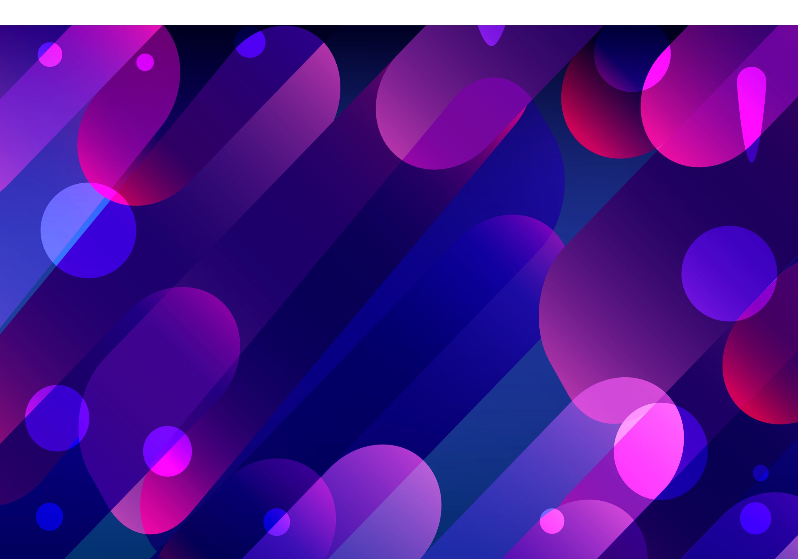
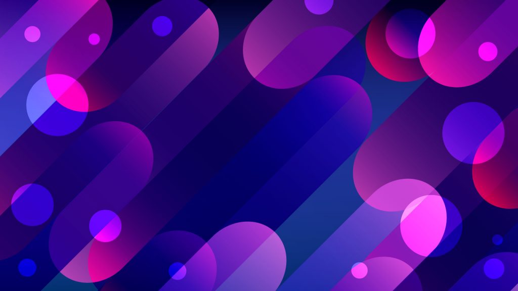
The color palette images mentioned below can be found within our 101 color combinations, inspired by images in illustAC’s collection.
Complementary Colors
Complementary colors placed on opposite sides of the colors wheel; usually, one color is primary, and the second one is secondary color theory. The complementary colors are orange and blue, yellow and purple, and red and green.
These combined colors complement a composition for added contrast and visual intensity. The vividness of the orange citrus fruits stands out against a light blue backdrop.
Monochromatic Color
A single color is the focal point of monochromatic color theory schemes, which frequently use variations of one hue by combining tints, tones, and shades. Although it may look to have a dull color theory scheme, these variances in value give your composition richness and depth.
This color in design combination is very adaptable and aesthetically appealing. Subtle color in design changes on one hue serves to simplify a design without making it too flat. Using several colors in a design can frequently overwhelm the eye and disrupt the design’s tone.
Analogous Colors
Analogous colors are a combined of three or four colors that go well together and border each other within the color theory wheel. The term analogous refers to closely related, so combining these hues has a harmonious appeal similar to monochromatic color theory schemes.
Keep your palette grounded when choosing similar groupings for your composition by pairing only cool or warm hues. Keep to an intense color in design and emphasize it with related shades. Green and blue, which are close to one another on the color theory wheel, are transitioned smoothly in this aurora borealis color theory scheme.
Achromatic Colors
Achromatic colors, including whites, grays, and blacks, don’t have a hue or saturation. Many artists use achromatic settings to give clear signals of value through dramatic shadows and highlights.
Split-Complementary Colors
Split-complementary colors in design schemes may match complementary color schemes. Still, they also include the complementary color’s two adjacent tones, for example, yellow mixed with blue-violet and red violet.
This color in the design Scheme has a similar visual appeal to complementary schemes, but not with the intensity. The harsh contrast of complements can be softened by adding similar hues.
Triadic Colors
A triad includes three colors placed equidistant from each other on the color wheel, making an equilateral triangle. These triads consist of three main colors, i.e., primary, secondary, and tertiary. A bold trio of yellow, blue, and red can be challenging to balance. Let one color in design stand out, like the yellow on the car below, and highlight it with other triadic colors, like the red and blue on the beach equipment on top of the car.
Create hierarchy when designing as a general rule. Choose a dominant hue, then add accent colors carefully to prevent colors from competing for attention.
Double Complementary (Tetradic) Colors
Double complementary color in design schemes, or tetradic color in design schemes, increase the ante by using two pairs of complementary hues. Complementary colors are already vibrant in nature.
Color in Design Meaning and How It is affecting branding
Color theory concentrates on color symbolism and meaning and how colors and combinations impact people’s emotions. The importance of color theory can be used in various fields and professions, assisting marketers in developing identifiable brands or new homeowners choose the perfect color in design for their dining room. Each color generates a certain emotional response in viewers, which shapes how that viewer perceives the overall display design. This favourable brand perception can affect consumers’ purchase decisions and eventually enhance product development, marketing, and branding sales.
You will be able to know how to color in design is perceived by the audience reading this article and know what particular colors should be used in your design.
Red Color in Design
Popular for its appealing and vivid personality, red brings out intense emotional responses in its (audience) viewers. It can enhance enthusiasm, anxiety, and appetite. To capitalize on that increased appetite, restaurants frequently use red in their branding materials. Additionally, brands choose red hues to convey an energetic and risk-taking vibe.
While the red color in design represents a bold and strong hue, remember to use it sparingly, especially when paired with different bright hues. Too much intensity can also weaken a design and stir the wrong emotions, even inciting aggressiveness. A completely saturated red in color in design is the best used in accents or subtle company product or service elements. When the red color in design is used as a dominant hue, ensure to soften it with tints or shades.
Warm Colors
Warmer colors in design like oranges, reds, yellows, and orange stimulate the six senses and elicit a sense of happiness with their vibrancy. These warm colors have a ton of emotional meaning, but they can sometimes be overwhelming when used as the dominant shades in a composition.
Warm tints, tones, and shades are your best friends since they help desaturate a color in design without removing its positive effects. Warm color in design should be used sparingly, either as an accent color in design scattered across branding pieces or combined with colder colors for a harmonious balance.
Orange Color in Design
Orange mixes the intensity of red with the joy of yellow. Its vibrance typically denotes comfort, laxness, and a new beginning.
Be careful when pairing orange with other colors in design. Pure orange and black are closely related to Halloween. Try using blue tones as a complementary contrast or stick with warm analogous color in design by including yellows or reds, as shown in this flat lay pattern of grapefruits.
Although orange hues frequently convey a pleasant vibe, brands may want to utilize this color theory carefully. Use orange-colored tints, tones, and shades to lessen their intensity, or go with subdued hues like peach, terracotta, or apricot to lend a touch of elegance.
Cool Colors
Cooler colors, on the other hand, easily tend to reflect peace and dependability. Blues, greens, purples, and pinks are frequently more adaptable; they can be used as the main hue or an accent color in branding elements.
You need to add emphasis to your composition by experimenting with a cool hue’s complement or by applying warmer tones as an accent to its cooler counterpart.
Yellow Color in Design
This color design hue reflects warmth, positivity and serenity in its purest form. Do you know that yellow color in design is the eye-catching hue that people tend to get attracted to quickly, typically used about caution, security vests, and road signs.
Yellow is a well-liked color for retail shops since brands use it to draw customers to their establishments. Instead of choosing the attention-grabbing hue as a dominating color, consider using yellow’s tints or tones as branding accents. When used overly, yellow can overwhelm onlookers and be perceived as a cheap way to boost sales.
Yellow color in design is a challenge to pair it with, so just stick to analogous, monochromatic, split-complementary, or triadic hues for an appealing color palette. The agate texture effortlessly cooperates with yellow tints and tones for a look that is easier on the eyes of the viewers.
Blue Color in Design
From the shiny blue skies to the dazzling oceans, the blue color in design is renowned for its positive associations. With its calming nature, this well-liked hue symbolizes trustworthiness, loyalty, and peacefulness. But there are also a few negative connotations connected with the blue color in design, which is known for its melancholiness, the symbol of depression.
The blue color in designs are loved universally, which means that many companies and organizations use some shade of blue in your banner campaign or logo. So, how can you stand out in the vast sea of blue? Pairing using unique and memorable color in designs is undoubtedly the best way to appeal to viewers.
Combining blur color in design with a warmer hue like an orange or yellow is a great starting point. Create your color palette utilizing the proper and tried complementary, analogous, or triadic color theory schemes. Or, if you want a muted composition, pair blue tones and shades with a warm accent color for an eye-catching, appealing branding image.
Green Color in Design
The green color is often connected with fruitful harvests, prosperity, and lush forests, instilling a sense of growth, recurrence and safety. Green is a standard color used in the various logo and branding elements. This hue is combined or associated full of meaning, making it perfect for eco-friendly brands and sustainable grocery chains.
The green color is a unique and special color accessible to the eyes, making it perfect as a dominant color or an accent. If you want an effortless color palette, combine green with analogous, monochromatic or complementary color theory schemes.
Monochromatic and similar arrangements produce a calming and harmonious palette. Complementary color schemes, like soft reds and greens, contrast nicely in a composition.
Purple Color in Design
Purple was a common color choice among emperors and kings, lending an air of exclusivity and power. It also has a rich historical significance. Color meanings change with the times. Nowadays, peace and elegance are often represented with the color purple. The 2018 Pantone Color of the Year, ultraviolet, is a positive and ethereal interpretation of the traditional violet hue that looks relatively modern. Purple’s calming and opulent appeal pairs nicely with businesses that provide high-end goods or promote tranquillity, like yoga studios.
Using purple color in its purest form can easily overwhelm a design, so instead, try to cooperate with its tones and shades. You can mix purple with its complement, yellow for a bold contrast, or combine split-complementary schemes for a more subtle difference.
Pink Color in Design
When thinking of pink as the color, we automatically think of romance, femininity, intimacy, and lightheartedness. But like other colors, pink also have different cultural meanings overseas; in Korea, the pink color symbolizes trust, and in Japan, it is considered more masculine. You should understand that translating colours across cultures is essential in the creative realm.
Pink is often a tricker color to integrate within a composition, but when it has a simple tint of red, you can easily use the color wheel for your benefit. Pink colors go well with muted green hues and monochromatic or analogous color schemes.
Learning about Color Profiles and Schemes
While color combinations are essential to your design, it is also important to differentiate between the different types of color profiles and systems. The primary color profiles, CMYK and RGB, exhibit colors in distinct processes that affect the overall color range you can use in design. RGB color profiles display brighter hues, while CMYK profiles cannot reproduce those same values.
Process and spot colors also affect the color in design utilized; the color gamut between the color system is drastically different. When printed, spot colors look more intense and uniform, while process colors are developed with CMYK dots, that results in a more limited color range.
RGB
The Red, Green, and Blue color components of the RGB color profile work together to provide a wide range of color variants that go beyond a CMYK color profile range. Only screen displays, including those on computers, mobile phones, and televisions, support this color mode.
Your design will create hues that are different from the screen preview if you try to print it using only an RGB color profile. When published, the color in your design will try to find a CMYK equivalent because CMYK color profiles have a lower gamut than RGB profiles. These alternatives might be foggy or significantly less vibrant, changing the design’s overall tone. Always establish your online-only designs in the RGB color profile as a general rule to prevent color alterations.
CMYK
The CMYK color profile consists of Cyan, Magenta, yellow, and key that pair to create a range of hues. This four-color process works well for any printer. When you zoom in on the printed image, you can also see the four color dots that layer to develop different hues and gradations. Dots per inch from printing and engaging the CMYK color profiles. Though all printers produce prints in CMYK, the result might not be the same and varies in styles and models of printers.
All primaries in RGB color spaces are combined to create white in additive colour processing. When subtractive color techniques are combined with CMYK modes, all primaries mask to produce a dark shade. The paper’s white is diminished when inks and dyes are applied on top of one another. Use CMYK color profiles only when designing for print because they produce a limited gamut than RGB color profiles.
Process Color
The most common method of offset printing engages process colors. These colors are produced by combining magenta, yellow, cyan, and black or CMYK inks. Process colors offer a limited color range if compared with spot colors.
Process, or four-color, printing is perfect for jobs requiring multi-colored inks to produce an appealing design. Each screen is printed at a unique angle to create a cohesive picture.
Spot Color
In offset printing, spot colors are produced when inks are laid down in a single run instead of multiple dots. Solid or spot colors include pure and combined inks that are produced without the use of screens or multi-color dots.
Finding Inspiration to Use Color in Designs
Look around for inspiration when choosing colors for your designs and other creative endeavors. Look outside and take in the colors of nature, or study well-known pieces of art from various disciplines to discover color combinations you may not have previously considered. Venture outside of your comfort zone to create some genuinely striking color combinations.
Another excellent place to start is by taking color samples from images or learning about unusual color combinations used by other designers. By doing so, you may immerse yourself in the most recent color and design fads and learn which colors work best for your project’s mood and overall tone.
You can also look at the websites like Behance, Dribble and illustAC to see the modern color schemes and illustrations, clipart images and how they’re thoughtfully applied across different projects.
In illustAC, you download numerous high-quality cost-free illustrations and clipart images.
How to Upload Free Swatch Files in Adobe Illustrator
First, click on the hamburger dropdown in the Swatches panel and then choose Open Swatch Library> other library and select the swatch files.
How to Use Free Swatches in Adobe Photoshop and InDesign?
Select the hamburger dropdown menu in the Swatches panel, click Load Swatches, and then choose a specific swatch file to see it display in the panel.
Conclusion
This article is all about understanding color picking, whether you’re selecting the colors for your logo or choosing artwork for a room in your home. Now that you have basic information about color theory and color in design, you’ll begin saying that color is everywhere. As trends are always evolving, stay curious about the color and remember there are always new ways to get started with the color wheel.