
Infographics can be found everywhere. They’re extremely popular on the internet, particularly on social media, and their attraction is obvious: infographics make it extremely simple to summarize a large amount of information into a fun, easy-to-read visual. A professionally produced, personalized infographic design, like any other design, will yield the best outcomes. The term infographics (information through graphics) itself refers to its basic nature and usage.
When it comes to communicating complex information or chronological data analysis understandably, infographic design looks to be the natural solution. A good infographic design may condense potentially complex information into a simpler form. However, creating an infographic that flows smoothly on information dimensions and comprehension levels is not easy. You need to know some basic design principles before you create an infographic design for yourself. To make it easier for readers to extract important messages from an infographic, a lot of information and effort must be gathered in one place.

What is an infographic?
By definition, an infographic is a visual representation of any type of information or data. An infographic design can help you communicate information in the form of an appealing visual image, whether it’s a study on market trends or a step-by-step guide on how to do your laundry. In most infographics, the mix of vivid colors, drawn characters, and bold language immediately draws your attention and provides an overview of the issue.
Keep in mind that the purpose of an infographic design is to make the viewing experience enjoyable and interesting for your viewers. And it all comes down to how you combine various graphic elements—such as colors, icons, photos, illustrations, and fonts—to communicate a topic in an engaging, appealing, and understandable manner. A well-designed infographic is:
- on-point
- visually appealing
- provides useful information
- presents information rationally
- shareable

Why should we use infographics?
There is a reason infographic designs are so popular: they’re entertaining, engaging, and simple to share. Furthermore, they provide numerous advantages to all types of content creators, including corporations, academics, and organizations. Marketers may use infographics to increase website traffic, visibility, and brand awareness, as well as boost engagement. Infographics can help educators and trainers convey difficult topics or break down complex material to make it easier to understand. Nonprofit organizations might use infographic designs to raise awareness about a cause or social concern.
Using infographics is also a speedy method for getting your point through to your customer and capturing their attention. Good infographics also help make it easier for the image to become viral. People view your infographic, click on the link, and presto! You have a new potential customer on your website. If done effectively, that image will always be connected with your business or website and can draw visitors to your site long after it was first posted.
If your company must display data effectively. Then infographic designs may be the tool for you. Studies have discovered that 90% of the information that we remember is based on visual impact. We live in a world where 1.5 billion pieces of content, 140 million tweets, and 2 million videos are published every day, so it’s easy to see how a simple visual aid may help your business stand out.
It’s not every day that you can use something that is both visually appealing and capable of presenting an engaging story. An infographic design can help you clarify a hard subject or make an otherwise boring subject more interesting. At the end of the day, our major goal is to produce something appealing that will be noticed, discovered, and shared. There are no restrictions on where your infographic design may be shared. Packing a lot of information into a visual package is a great way to get your point across, drive attention and traffic, gain visibility, and establish yourself as an authority.
Principles to create great infographics
You don’t have to be a professional graphic designer to create interesting infographic designs. There are numerous free graphic design tools and free designed infographic designs available to those with little to no graphic design experience. You only need to consider a few essential principles to make your infographic design more appealing to users. So, let’s look at how to create a great infographic.
1. Use the Accurate Visual Elements
Data can be presented in a variety of ways. Some data visualization methods will be more suited than others depending on what you want to illustrate. So, which strategies can be most beneficial? When developing your first infographic design, start with the elements listed below.
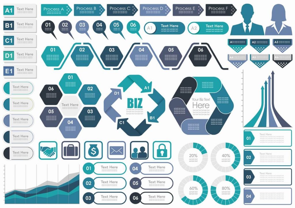
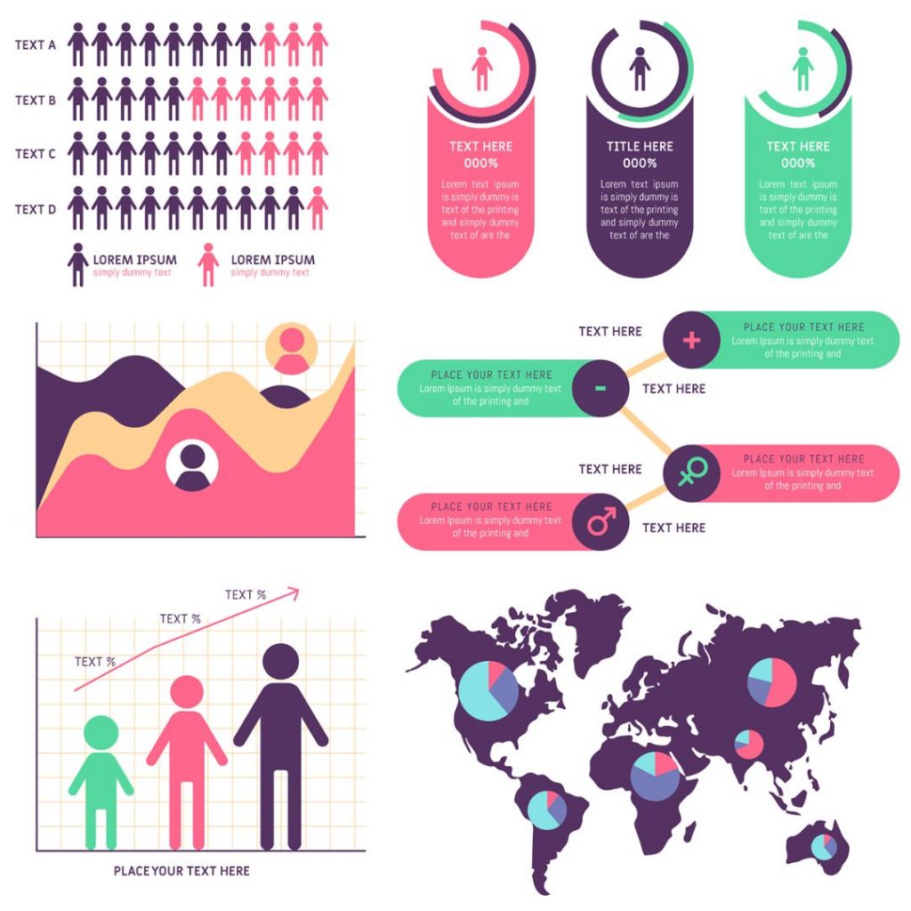
- Bar charts – this style of data visualization is superior to pie charts and bubble charts. Anyone can immediately understand the proportions between data points using a bar chart.
- Maps – use them to indicate distribution throughout a certain geographical area.
- Timelines — are the most effective tool for visualizing time.
- Photos — You may use photos in your infographics to show how a concept has evolved.
- Venn diagrams – helpful in highlighting topic overlap.
- Scatter Plots – demonstrate relationships between two data sets.
When creating an infographic keep in mind why you are creating it. Start by determining what you want people to understand from your infographic design. This will help you create your best infographic design.
2. Choose the Appropriate Template
If you decide to make your infographic, be prepared to spend hours selecting pictures and organizing information inside the proper layout. But isn’t there a more efficient way? Sure, with infographics templates on illustAC, expert designers have already done a large portion of the work for you. All you have to do is modify the information, change the photos, or change the colors. If you already know what you want to say in the writing, it shouldn’t take long.
When selecting an infographic design, you may easily filter depending on your infographic’s topic and visual kind, making the selection process much easier. Aside from the aspect of time-saving, checking various infographic designs might help you better understand how to organize your data. You may discover a few good ideas that will inspire you in your infographic design creation. When creating an infographic, you must first settle on a layout based on your required structure. Use a layout with numerous columns if you need to include a lot of information. Then simply put your data in it.
3. Consider Your Target Audience
Suppose you need to create two infographics. One will be given to first-year elementary school children and the other to university students. Both infographics would contain different terminology and graphics, and they would differ in terms of the complexity of concepts. That is why it is critical to first identify the learning goals of both audiences, as well as how advanced their knowledge of the given concepts is and what images will appeal to them.
Before continuing to choose a layout for your infographic material, jot down a few key points to remember about your target persona. You can start by answering the following questions:
- Who is my ideal customer? Who is my target audience?
- Which channels do my target audience use and browse the most?
- What statistics do I have about my target audience, and what specifically can it tell me about who my target reader is?
4. Write a Catchy Headline
One of the components that a reader will notice before reading the details is your infographic headline. It’s comparable to newspaper headlines in that if it’s engaging, catches the reader’s attention, or asks an open question, the reader will read the article. So, how can you write a title that will keep a user reading your infographic from start to finish? Here are some things to consider while creating headline versions.
- Keep it short – your headline’s word count should not exceed 70 characters. A user should instantly understand what the infographic is about when scanning text.
- Consider your target audience — build titles that will connect with them. Start by understanding their perceived interests, goals, and objectives regarding the discussed topic.
- Include keywords — use the keywords that people might use to find an infographic. You may learn about search volume for popular terms by using various keyword research tools.
- Look at your competition — see how they name their content to get some ideas. It does not necessarily be an infographic; instead, research article titles relating to your infographic theme.
5. Keep in Mind Basic Design Principles
You don’t have to be an Adobe Photoshop or Adobe illustrator expert to produce a good infographic, but you do need to understand some basic design concepts to generate aesthetically appealing graphics.
Here are some basic design guidelines to keep in mind while creating a more engaging infographic design.
- Establish a clear hierarchy – choose what information should be displayed at the top of your infographic.
- Maintain a logical structure – you’re telling a story with a beginning and a finish.
- Use consistent fonts and colors – don’t go overboard with fonts. Choose one or two fonts and make sure you use them consistently throughout the infographic. The same applies to colors as well: use colors from your branding to keep your brand relevant.
- Make use of white space – Using white space can make your infographics easier to read and navigate. White space is the space that exists around information and graphical elements. It allows your design to “breathe.”
- Use matching graphics – use graphics that enhance your infographic’s message and avoid using images just to break up text with images.
- Don’t overwhelm the reader – maintain the reader’s attention on the important information and message, not on the flashy items like 3D animations, multiple graphs, charts, or bright icons.
6. Optimize your Infographics SEO
An interesting infographic is widely shared on social media and utilized in blog posts. That’s why infographics are frequently viewed as a standard growth hacking approach for organically improving your domain rating score. You must remember a few critical optimization techniques to make it easier for people to find and share your infographic. The following are the most critical factors that must be optimized:
- Title – write a catchy headline that includes your keyword.
- Meta description – make your headline actionable and describe how the article will benefit the reader. Make sure your major keyword appears in the meta description content as well.
- Filename — Don’t name your image files aimlessly; always include your major keyword. This is true for every image used in a blog post.
- ALT tag — with this element, you can tell search engines what your image includes so that they may correctly index your infographic. Make sure to include the keyword here as well.
- Headings – Your h1, h2, and h3 headings should include both primary and secondary keywords.
- URL — The URL of the article where your infographic is located should be concise and include your core keyword.
- Blog copy — include your infographic in the appropriate location — it should serve as a summary of previously mentioned components described in the post.
- Include social sharing buttons and a call to action, reminding your readers to share your material on Facebook, Twitter, and LinkedIn.
- Keep blog word count in mind — search engines prefer content that is optimized and contains the appropriate number of words. Check the length of the articles in the top search results for a specific keyword to determine your word count.
- Ensure proper resolution – use full graphics resolution and ensure that the image can be viewed on all screens.
- Add embed code — include the code that readers may copy from your website and paste into their website to embed your infographic. You can put it directly beneath your infographic.
Conclusion
You don’t have to be a professional designer to make interesting infographics that your viewers are likely to share on social media or include in their designs. Your infographic design layout only helps you to underline the idea and make the infographic more engaging and appealing. The information you need to convey, as well as the infographic design format you choose for this purpose, are frequently more important than the design itself. Knowing a few fundamental design principles will suffice to achieve this goal. With all templates available on illustAC for free, making an infographic design is not very difficult these days for anyone.