There are many things that come to mind whenever colors are mentioned, and among these include HEX codes. However, they are more than just HEX codes, especially for marketing strategies. Colors are important communication tools with effects that are almost equivalent to your copy itself. But this is only if you know what you are doing.
For example, a strawberry-flavored candy wrapper without a red color on it will not pass the right message. Colors play many roles in many marketing strategies, and they are more than just HEX codes. In this article, we’ll take you through the different color trends that you should know and also provide tips to help you use these color trends rightly in your marketing strategies, so continue reading to find out more about these color trends in 2023.
The year 2022 came with different marketing trends, but there’s more to expect in the coming year, and color palettes are not left out of this. They are, in fact, a key marketing material to pay attention to. Continue reading to find out more.
The Importance of Color Palettes in Marketing
The two main things that colors affect your marketing strategies are tone and emotions. However, measuring this can be rather tricky because the color is super subjective. It’s possible to guess the emotion that color will evoke. Despite that, there is emerging research evidence suggesting that a person’s reaction to color completely depends on their preferences and experiences with colors.
This doesn’t imply that color is not significant for marketing, but it implies that you’ll need to know and understand your customers, products, and brand so that you can use the right colors and also send the right message. You also need to perform enough research and also learn more about the type of colors that will resonate with your customers. All these are the important things that you should do when choosing a color, and it’s vital to ensure that the colors perfectly match your brand, as well as the message you hope to deliver.
The bottom line is that colors are tools that will help you create marketing strategies that will resonate with your customers uniquely. This is especially when you use color trends that are already catching the attention of everyone. When you use colors wisely, you increase the chance of getting the attention of your audience.
Color Trends in 2023 That Will Help Your Marketing Strategy
Now that you understand the importance of colors in marketing, here are some color trends to look out for in the coming year.
1. Adventurous Pastels
Pastels are soft, sweet, and pretty. If you’re looking for the perfect color trend for springtime, you can be sure that pastels will be the perfect palette that you should use. Before now, pastels weren’t considered to be any close to being adventurous.
However, in the coming year, you’ll see a lot of designs with a pastel twist in them. This could be alongside different pairings, including line illustrations, geometric shapes, or funky patterns that are mostly maximalism design styles. This will basically include colors, patterns, and objects that show artistic whims.
Source: https://es.venngage.com/
2. Earthy, Rustic Muted Tones
Another color trend to look out for in 2023 and for your marketing strategies is the earthy, rustic, muted tones. Pastels are not the only options you have for soft colors, and this color trend is one that designers from across the world are already embracing, and this wouldn’t stop anytime soon.
A key thing to note about muted colors is that they tend to tone down a brand. Therefore, for someone in an industry where everyone uses bright colors, muted colors will make it easier for you to stand out. Also, for a brand looking to communicate more naturally, organic, and thoughtful than others, muted colors will help them communicate even better.
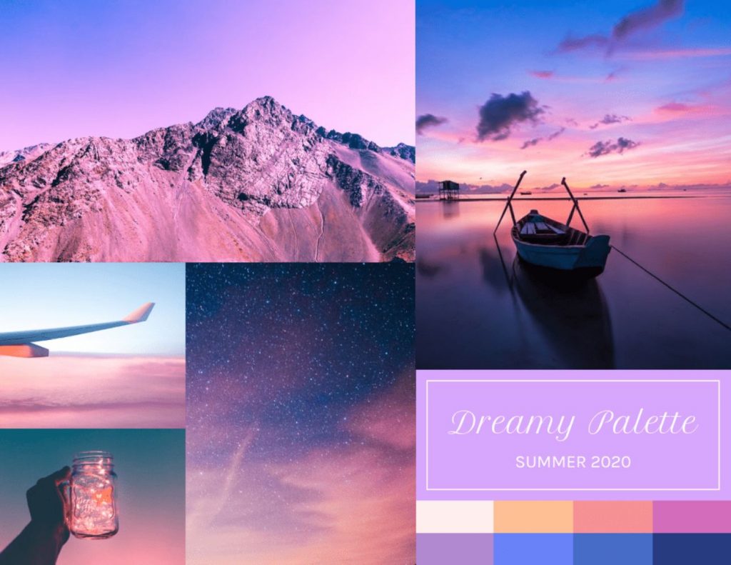
3. Light and Airy
Calm colors are rapidly becoming the coming thing in recent times, and this is more than just using muted hues or pastels. In the coming year, there will be a lot of eggshell finishes, watercolor designs, and minty shades. The common thing with all of these is that they all evoke a light, airy, gentle, and calm feeling. Everything will feel like you are resting on a cloud or floating.
There are many ways that you can create an airy feeling in your design, and the key thing is to utilize soft colors in your design. You might also want to consider pairing them with calm and simple typography.
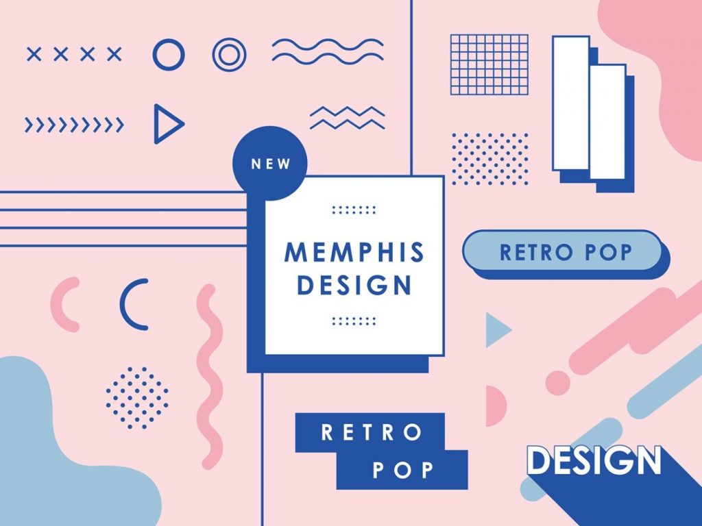
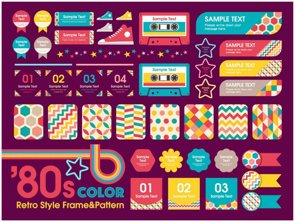
4. Colorful Memphis Design
This color trend is one that is from the 1980s. Memphis design is mostly characterized by geometric, abstract squiggles and shapes. The design didn’t support the idea of minimalism, which was previously the dominating force.
Memphis designs are increasingly becoming popular, especially now that they have been polished with minimal color palettes. They now comprise vibrant quirkiness, which is something to look out for in the coming year.
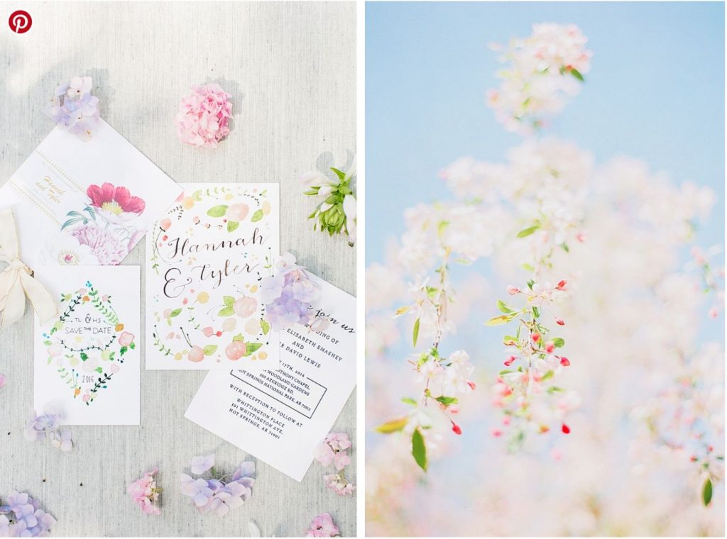
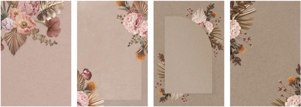
5. Vintage Flower Power
Another color trend that you can use for your marketing strategies in 2023 is the vintage flower power, and this is a color trend that delivers floral hues in desaturated and toned-down color palettes. It’s a trend that is mostly used a lot in floral patterns.
With a color palette like this, you can create floral patterns with an earthy, comfortable, and old-school feeling. Also, toning down and desaturating the colors allow designers to deliver the retro-vibe in their design. With this option, you can easily deliver your brand message effectively.
Source: rawpixel
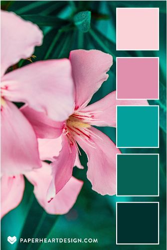
6. Jewel Tones with Neutrals
These are also bold colors, and they are mostly derived from gemstones. An example is the striking blue of sapphire or the deep red of garnet. Even though this color trend is generally saturated, it’s important to note that they bring a completely different feel which is not like other bold colors you’ll find.
If you want your brand to have a more sophisticated look in 2023, then you should consider working with jewel tones. As mentioned earlier, the colors are not so aggressive, even though they are generally bold colors.
7. Retro 70s and 80s Colors
Most of the trends for the coming year seek calmness, and you can find this from the other color trends that we have highlighted above. Another way to evoke calmness in your brand or your design is by using soothing and muted colors. You can also utilize the advantages of evoking a nostalgic effect on your viewers.
Whenever people think of the past, it’s mostly less complex and less stressful than the world we leave in today. You might be wondering how this has any impact on the color trends for 2023. The key thing to note is that designers are rapidly embracing color palettes that were mostly used in the 70s and 80s.
8. Hyper-saturated Color Contrast
Even though most of the other design trends that we have mentioned above all seem to be embracing calm color palettes. This is a loud and overstimulating color trend to look out for in the coming year. However, it brings much fun when it is done rightly.
It shares a lot of similarities with anti-design and brutalism, but of which don’t consider the traditional design guidelines. Basically, hyper-saturated color contrasts go beyond boundaries when it comes to color combinations. The color combinations are basically in competition with each other for attention. This trend brings a visual experience that is captivating and fun.
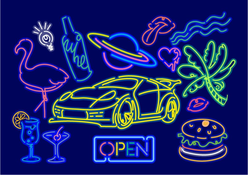
9. Neon/Pop Art Colors
Another way to go bold in your design is by opting for neon colors or even primary colors. This is a great option to make your marketing strategies appear bold. Depending on the context, design elements, and color combination that you use, you can either use this color trend to make things appear modern or retro.
10. Pantone Color
This is the last color trend for 2023 on our list, and it’s one of the most intriguing and inquisitive options you have. Pantone color basically captures creativity and curiosity. It’s a color trend that places emphasis on how we move and where we are. Pantone also makes it so much easier to express new ideas and emotions.
With this color trend, you can bring a renewed sense of curiosity and optimism to embrace and explore the digital space. This will also make it easier for us to expand our ideas of the world.
We have provided different color trends to look out for in the coming year, and you can be sure that these trends will fit into your marketing campaign. In addition to that, you also need to know the best ways to use each of the trends that we have provided above.
Here are a few tips that will help you effectively use the color palettes that you choose for your design:
Choose Accent Colors and Primary Colors
If you go through any website that was professionally designed, you’ll realize that the colors are not used to the same extent. You can apply this strategy to your own website, and you basically need to select primary colors for text and background, and accent colors for calls to action, and other elements that you would like to include in the design.
Use Contrasting and Complementary Colors Strategically
After choosing the color palette that you would like to use, the next thing you should consider is to get a color calculator and explore the contrasting and complementary colors for the main color you choose. It’s worth noting that contrasting and complementary colors are perfect for accent colors.
Use Three to Four Colors
You might be tempted to want to make things extremely colorful by using multiple colors. However, this will only reduce the visual appeal of your design. To keep things very simple and still maintain the visual appeal of your design, it’s best to pick three to four colors. This will also help in ensuring that the visitors of your website don’t get overwhelmed by your design.
Preserve your Elements
In many cases, color palettes tend to appear as if they are similar because they usually have similar shades. With that said, it’s important to use these colors carefully, especially when combining them in your design. The main thing is to maintain sufficient contrast with them so that people can easily visualize other elements in your design. For example, it wouldn’t make sense if you placed blue text on a dark blue background. That will only make it difficult for your viewers to read the text.
Make your CTA Pop
We already mentioned earlier that it’s great to use a contrasting accent color on your CTA button. This is because it will make the CTA button stand out, and appear unique, compared to other elements on the page. The aim is for your visitors to be able to easily identify the CTA button without hassle.
Conclusion
If you’re planning a design for the year 2023, we recommend the inspirations and color trends that we have provided above. This includes adventurous pastels, hyper-saturated color combinations, jewel tones, retro color schemes, light, and airy colors, and colorful abstracts. You can rest assured that all of these options will come in handy for your design in 2023.
Another way to draw inspiration is with the aid of illustrations, and we have included some illustrations in this content. For more illustrations, we recommend checking illustAC. Here you’ll find different ideas and how each of the color trends above are applied to these designs. Whether you want to refresh your brand or you want a design that will last for as long as you want, you can be sure that you will achieve it with these color trends and illustrations from illustAC.