
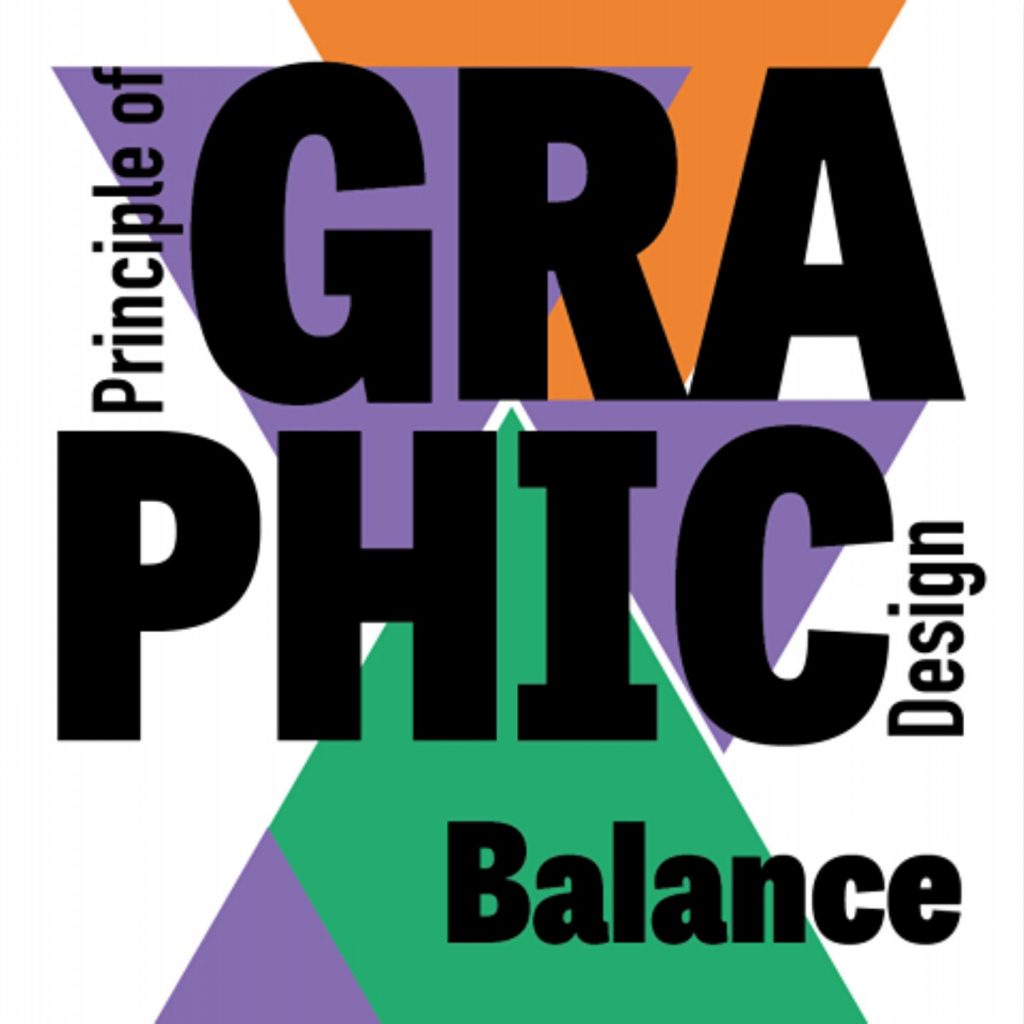
Design principle balance in design refers to how the visual weight of features on both sides of a design are balanced with each other to achieve coherence, completion, and satisfaction. Your composition should be balanced vertically, horizontally, diagonally, or backdrop vs foreground to achieve optimal balance. If your designs lack balance, the viewer’s eye won’t know where to focus, and what you’re trying to say may be lost because sections of less interest can easily go ignored.
The following aspects of the design principle balance must be harmonized to get the desired result:
- Objects
- Colors (value, hue, saturation, and transparency)
- Textures (smooth versus rough)
- Location
- Still versus moving
Design principle balance in graphic design is achieved by placing the above elements, each of which has a different visual weight. Imagine seeing a skyscraper leaning to one side to better understand what is meant by “visual weight.” You would undoubtedly experience some apprehension and refrain from entering. Though less extreme, the same idea applies to your designs because it’s in people’s inclination to want a certain degree of balance due to the stability and framework it offers.
A dark element in the design will naturally feel heavier if it is placed adjacent to a light element. Given that contrast and a focal point appear to be the antithesis of balance in graphic design, you might be perplexed as to how you can achieve design principle balance in design. It’s not impossible to have contrast or a focal point while maintaining balance. To maintain good visual balance, you should think about how to distribute and manage the other design elements.
What is Design Principle Balance?
The visual weight of a composition’s elements is known as design principle balance. To add stability, structure, emphasis, and dynamics, balance is used. When designing, one should make an effort to arrange visual elements in a way that is both functional and aesthetically pleasant, or in a specific way to achieve the desired style and feel. You should consider the various graphic design concepts while creating any design, including contrast, unity, emphasis, and balance in the case of this article.
The five balances that are discussed here are:
- Symmetrical
- Asymmetrical
- Radial
- Mosaic
- Discordant
How is Balance Applied in Design?
Design principle balance could be applied in any design in the following ways.
1. Symmetrical balance
The perceived weight is uniformly distributed when there is a symmetrical balance. Any orientation along a straight line through the center of the design would result in an evenly distributed visual balance in design principle balance. This gives the composition a more steady appearance and organized appearance. An excellent illustration of the design principle balance can be found in the picture below. The composition’s visual rate is the same on both sides. The weight is equal on both sides. This structure is properly balanced.
Look at the picture below, though. Watch what happens when you paint one side of the triangle a light color while leaving the other a dark hue. Doesn’t the lighter side feel lighter than the dark value side?
It’s crucial to remember that while the symmetrical balance is excellent and helps the viewer’s eye grasp what is being presented more clearly, it doesn’t always convey an engaging design. Your design won’t become monotonous if you locate the center and use different approaches to mirror the weight on each side as per the design principle balance.
The secret to great design is balanced, but one of the tools you may use to get there is symmetry. Here is a brief overview of the four varieties of symmetry.
Types of Symmetry
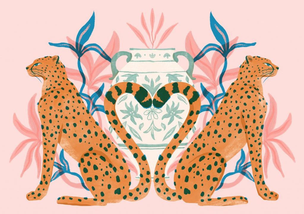
Reflectional Symmetry
Just picture slicing an apple in half. Reflectional symmetry in design principle balance occurs when both sides cross a central line and are mirror images of one another. This method, also known as bilateral symmetry, can be used vertically, horizontally, or diagonally. Reflectional symmetry can have perfect symmetry, in which case the image is identical on all sides. On many occasions, like a face, the two sides will have slight variations.
Translational Symmetry
Imagine the same shape occurring repeatedly. When visual components appear repeatedly throughout a place, this is known as translational symmetry. This cycle can be repeated in any direction and for any amount of time to achieve design principle balance.
Rotational Symmetry
Rotational symmetry can be visualized as spinning windmills and moving automobile wheels. This approach, also known as radial symmetry in design principle balance, involves all visual elements rotating at any angle around a central point. For capturing a sensation of velocity, dynamic action, or speed, this kind of symmetry works best.
Glide Reflectional Symmetry
Everybody has noticed footprints in the sand or snow. Consider how every stride creates a mirror of the foot to the opposite, but due to mobility, each footprint doesn’t match the other. A variation on reflectional symmetry called glide reflectional symmetry includes moving each mirror image from its original place. Similar to rotational symmetry, it suggests forward motion in design principle balance.

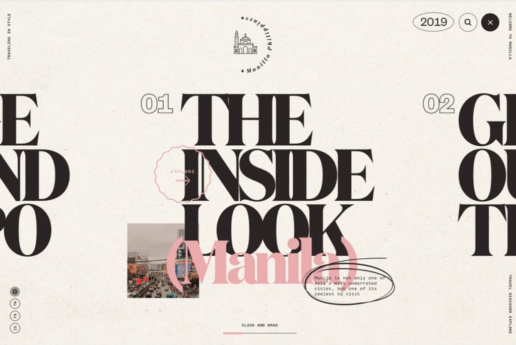
2. Asymmetrical Balance
Every element does not need to be distributed with exact symmetry for there to be visual balance. Asymmetry can also help to create design principle balance. It can be compared to a seesaw or a beam balance scale that you might have used when you were a child. The placement and stacking of the heavier and lighter parts will determine how balanced you are even with differing weights on either side. The purpose of an asymmetrical composition is to purposefully unbalance the design’s constituent parts. Asymmetry can add tension and a sense of movement to your design. As long as it is still balanced, one side can appear to be heavier than the other to achieve this effect.
For instance, one huge ingredient can be balanced out by multiple little elements. Alternately, you might place smaller components farther from the composition’s center. In either situation, the pieces are not uniformly spaced and of the same size as they would be in a symmetrical balance. Your composition yet maintains a sense of design principle balance while generating appeal visually. The image below is a superb illustration of asymmetrical equilibrium.
The composition’s tension is increased and the viewer’s attention is drawn to the “Character Design” text, which is the composition’s main focus, by the feeling that the upper pieces are slightly heavier than the bottom ones. Designing asymmetrically can be more difficult because you can’t just completely match each side’s visual weight. To give it the correct vibe, you will need to experiment with different approaches to balance the pieces.
A composition is presumably asymmetrical if it doesn’t fall into one of the aforementioned categories.
Asymmetry as a design principle balance is a difficulty and a benefit to you as a designer. Because our eyes naturally find balanced, symmetrical designs to be more interesting and beautiful, these designs tend to be more engaging. Asymmetrical visual elements require a little more effort to balance, but you’ll also have more freedom to play with unusual patterns and forms than you would with symmetry.
3. Radial Balance
You can also opt to apply radial balance around a single point as opposed to balancing both sides of a central line (like a snowflake). Usually, but not always, this is carried out from the middle. You can achieve design principle balance by positioning items, colors, or textures at equal intervals from the center or by balancing a seesaw, for example
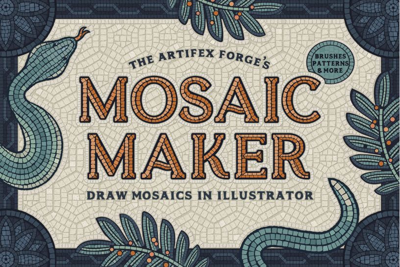
4. Mosaic Balance
Mosaic balance, also known as crystallographic balance, is a form of controlled chaos in design principle balance. Due to the obvious lack of a focal point, it may initially appear to be “noise,” but upon closer investigation, you will discover that everything meshes when the elements have a common emphasis.
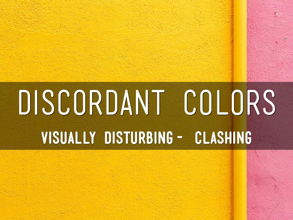
5. Discordant or Off-balance
Knowing the rules will help you determine when and how to breach them. There are instances when you want your design to make your audience uncomfortable. You may want them to take a moment to reflect or to get up and do something. Typography is a case in point of this design principle balance. The discordant design may be used to your advantage if the designer wants you to concentrate on a certain element, such as a brand name.
Examples of Balance in Graphic Design
The greatest method to understand balance is to observe a few symmetrical and asymmetrical situations in the actual world.
Logos
Airbnb
A prime example of pure reflectional symmetry is the Airbnb logo. Both parts are identical if you draw a vertical line in the center. Use simple shapes and aim for a minimalist logo with few intricate components to achieve reflectional symmetry like this.
A prime example of asymmetrical balance is the word mark for Google. The first three letters of the word mark are substantially wider than the last three, giving the initial half of the word mark a stronger visual presence.
Web Designs
Apple
A beautiful illustration of excellent reflectional symmetry may be seen on Apple’s Mac website. The headline and subheading above both have equal spacing between the lines of typography on both sides of the vertical, central axis, in addition to being the same length on both sides of the MacBook screens.
The Atlantic
This news magazine website has columns of varying lengths and a left side with more visual emphasis on photographs, giving it an unbalanced appearance. Making the columns of similar length and evenly spreading the photos on either side of the vertical, or center axis would improve the visual harmony.
Business Cards
InClean
The InClean business card achieves ideal harmony and balances with its straightforward design. Ample white space and perfectly placed language maintain this minimalist composition balanced and fashionable.
Hallo
The only thing printed on this business card’s one side is the word “Hallo,” making it extremely basic and asymmetrical, and unbalanced. The huge typeface can be too much for others. Others would interpret that as the design’s goal. This kind of arrangement straddles the border between balance and imbalance.
Why is the balance needed for an effective design?
A design without balance simply feels wrong. Simply put, a balanced composition is more aesthetically pleasing and, depending on the type of balance you select, might evoke a sense of order. Balance makes a design easy to understand at a glance when combined with a distinct visual hierarchy. Additionally, balance can be used to direct the viewer’s focus to particular design aspects. When used properly, focal points can be used to direct the reader to the pertinent information in a writing.
Tips for Applying Balance in Your Designs
You can apply the balance in designs in the following four ways:
- Color: Use vivid colors in minor sections of your design to counterbalance more substantial regions of bland hues.
- Shapes: You may balance out a design or the placement of parts inside a composition by using a variety of shapes.
- Pattern: The repetition of an item or symbol produces a sense of order and fulfillment.
- Movement: If one side of the composition is visually heavier than the other, using lines and edges to fill in the space on the lighter side will still emphasize and draw attention to it.
You will have several approaches to make your design look “correct” if you have these four options in your toolbox.
Conclusion
Now that you are more aware of the crucial role that balance in graphic design plays in the success of your compositions, be sure to take this idea into account for your upcoming work. Using symmetry and asymmetry effectively is essential for effectively telling your message through graphic design. The notion of good balance can be used to transform unremarkable designs into something outstanding and unforgettable. Consider which type of balance will work best for your design, whether it be radial, mosaic, discordant, symmetrical, or another.