In the UI/UX space today, flat design has grown to be a trend in many parts of the world. Over the past few years, flat designs have successfully gained entry into the mainstream of design. Even the biggest and most popular companies now utilize flat designs.
Are you wondering why everyone is turning the start using flat designs? It’s because of how they help in improving the user experience of apps and websites. This is the key thing that’s required for gaining high conversions.
This article will take you through everything you should know about flat designs, from what they are to their pros and cons and alternatives to flat designs. Continue reading to find out more about the 2023 UI design trends.
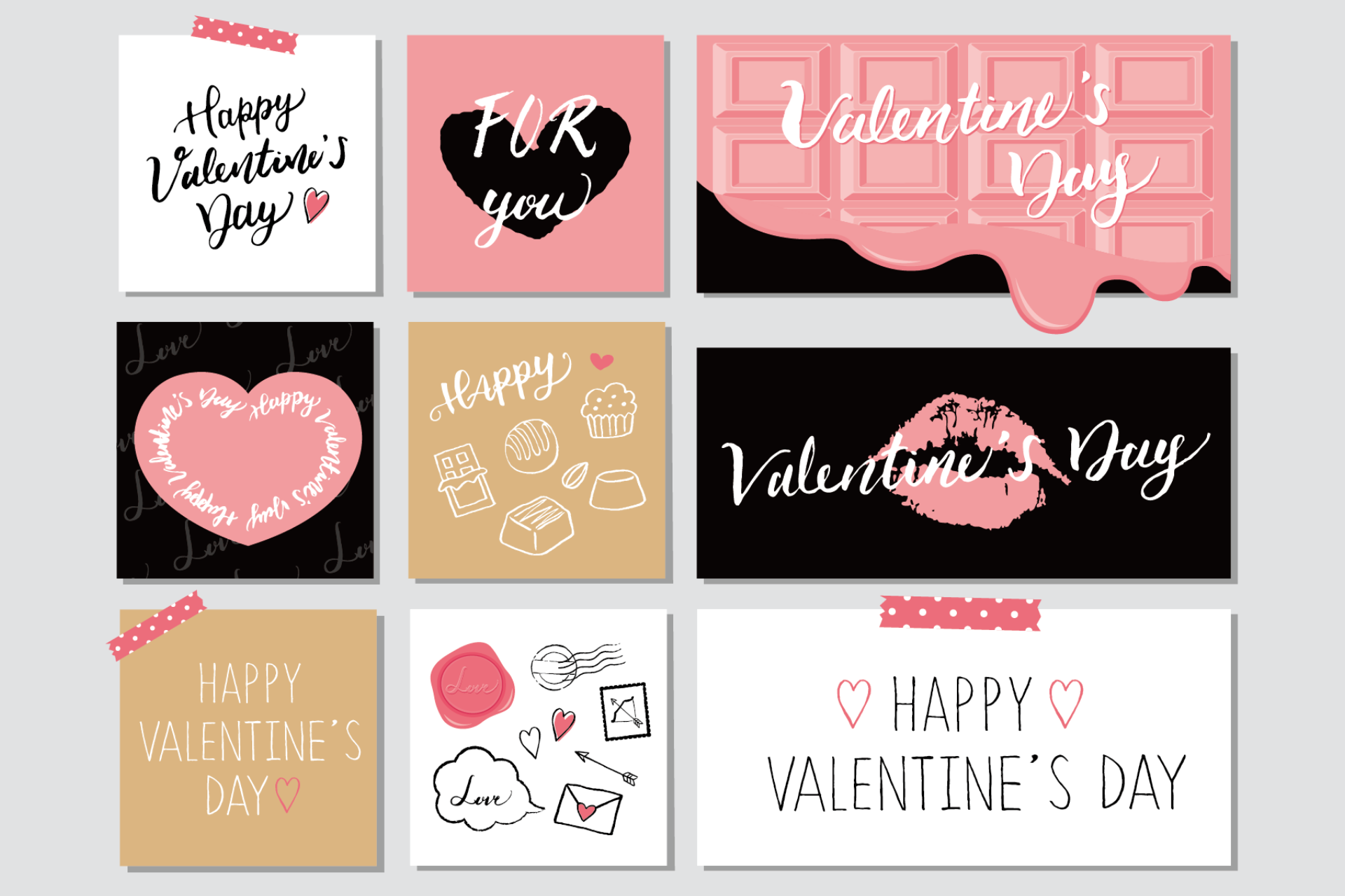
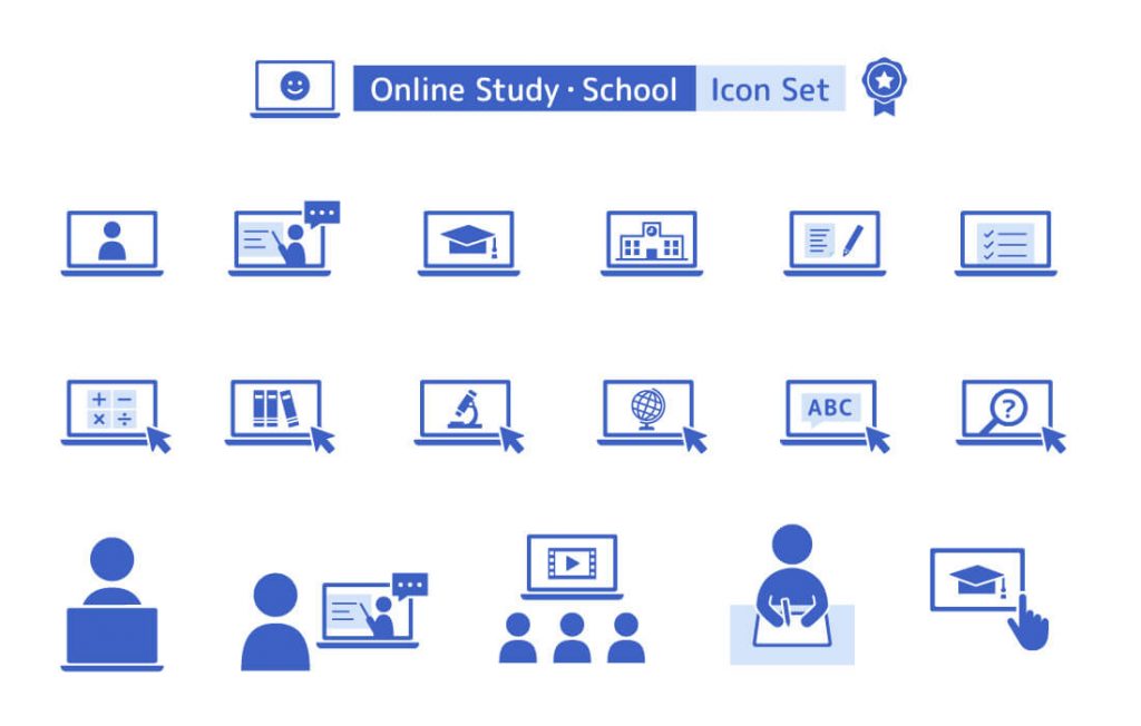
To get started, here’s the meaning of flat design: Flat design is basically an approach that is applied in creating a two-dimensional and minimalistic design for mobile or web interfaces. The amazing thing about flat design is that it helps eliminate unnecessary elements and styling in design. This is not like other trends and practices like skeuomorphism.
Benefits of Flat Design
Flat design is one of the design trends that is popular for many reasons, among which include the following:
Improves readability
Readability remains one of the cornerstones of flat design. It makes it easier for users to understand website content without hassle, regardless of the device that they use. Flat designs basically replace complex images with flat illustrations and vectors. This strategy both makes it easier for users to grasp the details of any concept.
Also, it helps to emphasize sans-serif fonts and other clear typography, including the text background, which is mostly made of a contrasting color.
Free of distractions
The most dominant feature of flat design is that it’s mostly about minimalization. This is without decorative elements or embellishments, and the aim is to easily win the attention of users and get their focus on your content.
Decreases page-load time
One of the main features that enhance every marketing strategy and increase page ranking is the optimization of the website. If you’re looking to decrease the load time of a webpage, you should consider using a flat design.
Nobody likes to visit a website that takes ages to load, and the best way to avoid this is to reduce the load time with the aid of a minimalist design.
SEO advantage
In addition to optimizing the page, the SEO advantage is also a benefit of using a flat design. One of the main factors that websites pay attention to is the loading speed, and as mentioned earlier, you can enhance the loading speed of your site when you use a minimalist design.
Updated look
It only takes 50 milliseconds for your users to have an impression of your website. This implies that you need to be able to win your user’s attention within the shortest possible time after they visit your website. With flat designs, you can easily make your website have an updated appearance, and this will in turn make it easier for you to create a solid first impression when visitors visit your website for the first time.
Pros and Cons of Flat Design
Pros of Flat Design
Flat design is trendy
Flat design is UI design trendy, but the big questions always lie in whether it will last long or not. If you’re looking for an on-trend option to go for, you should consider flat designs without hesitation. More and more projects today are actively using the design, and it’s also gaining much recognition across the world.
Simple mobile interface
A common way that flat designs are applied is in mobile design. Most of the impressive flat designs and interfaces are mostly used on mobile apps and with easy functions. Also, it’s easier to tap big, bold buttons on devices, and there’s no need for zoom functions.
Bright color sets a mood
Flat designs are easy to use in setting a happy mood. Bold and bright colors are more engaging, and it’s easier to use them in setting a tone of positivity and engagement. If you’re looking to increase positive association in your design, you should consider using flat colors in your design.
Focus on great typography
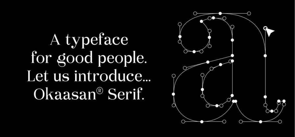
One amazing thing about flat designs is the focus it offers on beautiful typography. This makes it easier for typography to blossom in different flat design projects. Examples include simple sans serifs and beautiful decorative lettering. Basically, the key thing to note is that great type remains a key component of flat designs.
Sharp and clean visuals
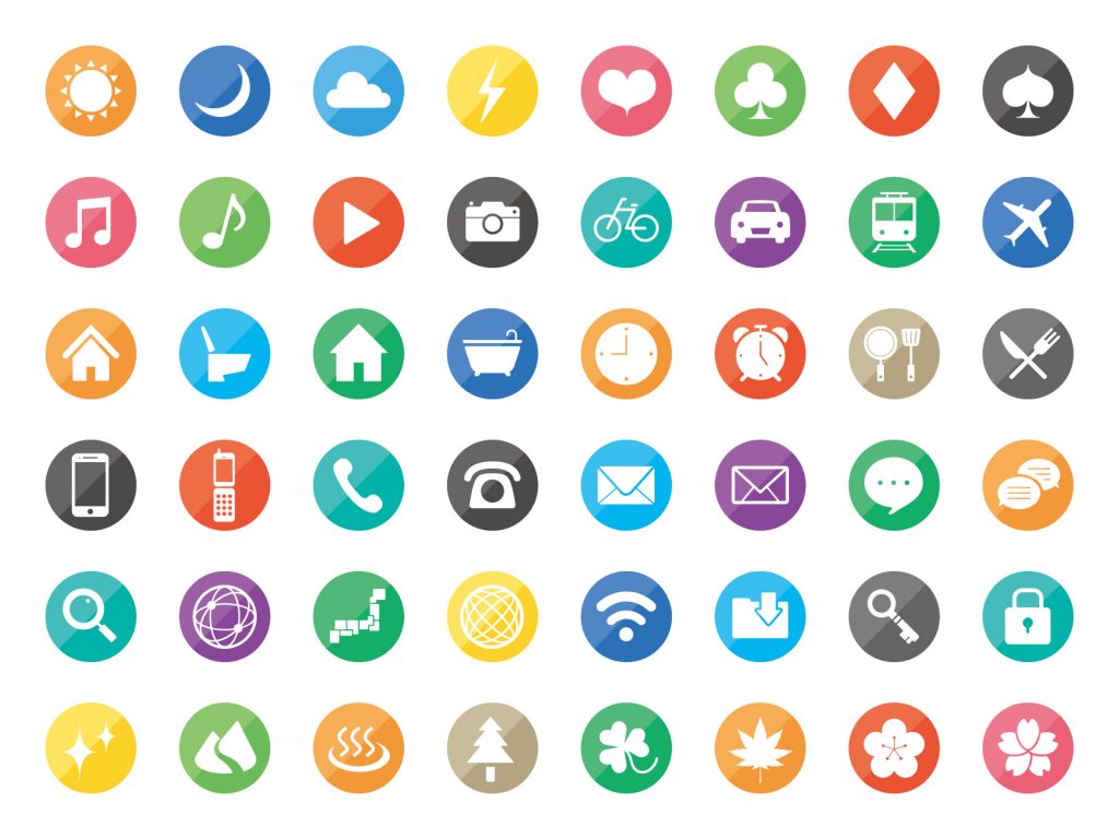
Flat design has a clean and sharp nature, which is a key feature that adds to its beauty. The style utilizes high contrast, which includes type, boldness, and color, all of which are easy to follow. Geometric shapes are mostly applied in creating buttons and other elements of the user interface.
Flat design discourages boredom decoration
Sometimes, you’ll easily identify that a designer was bored after looking at their design. Some of the easily identifiable features are odd animations, shadows, and other random effects that are not relevant. The constraints that come with using flat design, as well as its simplicity, also make it easier for designers to maintain honesty in their design.
Cons of Flat Design
Flat design is trendy (yes, right!)
Even though this is an advantage, it’s equally a con, especially considering that no one can tell how long this trend will last. Today, newer trends continue to enter the scene, and designers continue to move to these new trends quickly. Even though flat designs are trendy now, there’s no certainty that they will be trending in the coming year.
Usability concerns
In cases where more complex user experiences are required, flat design may not live up to the expectation. This is because not everyone is comfortable with this type of interface, and in some cases, they won’t know what to click or type.
According to the Norman Nielsen Group, flat designs can alter usability in terms of understanding what clickable is. Another thing to note is that flat designs are not always informative.
Color palettes can be tough to match
Using multiple colors in a project makes it difficult to match them properly and create harmony. This is one of the challenges that come with using flat colors in designs. In cases where designers are able to create successful color palettes, you’ll find that they mostly stick to a uniform look, especially when it comes to brightness and saturation.

Weak typography becomes more obvious
As mentioned earlier, flat designs help to create a focus on good typography. However, it’s important to note that this is a two-way thing, and flat designs can also create focus on bad typography, making them stand out significantly. When it comes to boldness, the flat design stays unforgiving. For anyone who doesn’t find it easy to select fonts or combine pairings, flat designs may not be a perfect option.
Some decorations can be good
The decoration is not always bad, and in some cases, It’s the only thing you need to make your design stand out. However, you can’t conveniently achieve this with a flat design because it brings different limitations, especially when it comes to the tricks applied to make your design appear attractive.

What Will Replace Flat Design
For many years now, there have been different predictions forecasting the end of flat designs. This also includes different debates suggesting that flat design will be the revolution that is here to stay or just another trend that is sure to pass. However, what you should have in mind is that flat designs are ubiquitous, and it’s not easy to foretell what will surpass this type of design.
However, a couple of indications suggest that it will eventually pass out. Examples include Google’s material design which offers skeuomorphism and Apple’s new design language. The big question is if these trends actually mean that we are moving away from flat design or not. Also, if we are actually moving away from flat design, what are the implications for the app and web universe?
Are you wondering what will replace the flat design? Continue reading to find out the key things that follow after flat design.
Material Design
One of the major things that can replace flat design is material design. Material design is actually an approach that is provided by Google, and it’s not so far from the basic principles of flat design. However, the main thing to know about material design is that it delivers a completely unique and diverse feeling to design.
Basically, the material design offers some of the elements that you would get from skeuomorphism, and it’s mostly introducing this to flat design. It maintains the minimalism of flat design and offers more texture and depth that makes it easier for designers to represent real-world objects and interactions. This makes it so much easier for buttons to stay clickable while maintaining the hierarchy in the design.
With this strategy, designers can now easily apply different enhancements like shadows and lights to their design, all of which are not achievable with flat designs alone.
The introduction of Android Lollipop in 2014 by Google was the first-time material design entered the scene. Basically, Lollipop maintained the clean and modern aesthetic appeal of flat design. Another amazing thing about the Lollipop design is that it presented more shadow and light, both of which help to bring more depth to designs.
Different designers and developers appreciate material design, and this is because it’s device-friendly and also intuitive. Also, material design helps in improving user experience, and this is with respect to delight and accessibility.
iOS 10 Design Language
The release of iOS 7 was alongside leather and wood backgrounds and skeuomorphic icons, all of which were in favor of minimalist fonts and icons and flat backgrounds. However, the release of iOS 10 brought a different dimension to flat design.
The tagline of the release was ‘Big, Bold, Beautiful.’ Also, this was together with different changes accompanying the overall design language. Apple used this medium to include bigger fonts, bolder headers, stronger use of images, and sleek white backgrounds.
You can identify the new style from the different apps, including Map, Home, Health, and Music. All of this ditched the conventional hyper-thin fonts and backgrounds and now utilizes completely white backgrounds. This is in addition to the smaller sub-headings, bold and big headings.
The big question is if this new design approach from Apple means that they are moving away from the conventional flat design and embracing material design from Google. Well, that’s not completely the case.
Apple’s redesign helps to create more room to add texture and depth to enhance the user experience. This is in addition to more comfort and better cues that it offers. Another thing to note is that it easily achieves all of this without the old skeuomorphism.
Basically, the design from Apple indicates that they are taking a softer approach to flat design. This approach also takes into account readability and size with the aim of enhancing user experience.
Conclusion
We have covered a lot about flat design, and the most important thing to always have in mind is that there’s no perfect outline out there. Therefore, the most important thing is for you to be able to tailor your design such that it perfectly matches your goals and also effectively delivers the message you want to pass. The flat design remains a design trend that is gaining ground in different mobile and web spaces today. It is mostly used for better readability, enhanced user interface, SEO advantage, and the ability to reduce page load.

