
Gestalt principles provide a psychological framework for understanding how the human mind perceives and organizes visual information. German psychologists Max Wertheimer, Wolfgang Köhler, and Kurt Koffka developed the theory underlying them in the 1910s and 1920s. It has now gained popularity in fields ranging from therapy to various design fields.
The term “Gestalt” literally translates to “unified whole” in German, which is relevant given that the theory discusses how the mind converts visible randomness into predictable forms. Consider music: our brains are wired to organize what we hear into melodies rather than individual sounds. Applying Gestalt principles in the design process is a key tool for graphic designers. Understanding how viewers interpret visual information allows designers to emphasize visual relationships and communicate more effectively. This post will look at the law of similarity and some other Gestalt principles and how to apply them to design.
In this post, we’ll introduce you to the law of similarity to help you understand why these Gestalt Principles are so crucial for graphic designers. With the knowledge provided below, we hope you will be able to produce intriguing and memorable designs by using the Gestalt principle.
Law of similarity
According to the law of similarity, our human mind is designed to interpret similar-looking elements as a single entity. We try to classify them into logically and aesthetically comparable groupings and categories. In short, we differentiate between totalities based on the shapes, colors, outlines, brightness, and sizes of objects. What is the main thing that graphic designers, are worried about? The style? The attraction? Rather designers focus on how viewers receive and interpret information. It is necessary to create visually encoded messages appropriately; this is a purely scientific approach that incorporates usability and psychology. That’s what Gestalt principles and the law of similarity are all about.
According to the law of similarity, if given a choice, the brain will focus on the easiest and more reliable form. This law emphasizes the value of fundamental geometric forms including squares, circles, and triangles. We bring together shapes that resemble one another and give them a specific meaning. When there is a row of diamonds, we don’t see the individual figures; instead, we see the row of diamonds as a whole because of the law of similarity. If you want users to notice the necessary parts first when seeing your graphics, it’s crucial to emphasize them. All forms and shapes, colors, and lines that appear to match are immediately noticed by human minds.
The Law of similarity in any design helps to perceive the entire pattern more quickly than some individual pattern elements. Additionally, we enjoy the way the design elements interact visually. It is the reason we like website designs with repeated textures, forms, brightness, and colors because of this law of similarity which makes the layout familiar to our brains. Applying the law of similarity as a graphic designer helps viewers to quickly and easily scan data. You can control their eyes and brains by drawing their attention to small details you want them to value highly.
For instance, if you’re designing a web store, you might arrange similar things together using the law of similarity or draw attention to the way they look on a page.
How to use law of similarity in graphic design
When it comes to the law of similarity, items do not have to be identical to be grouped. Rather, as long as they share at least one visible attribute or quality, such as shape, size, or color, they will be perceived as comparable and placed in the same group. Let’s take a look at how this works:
Color
When two objects share the same color, it typically signifies that they are linked and perform comparable functions. In general, same-colored things stand out more prominently than other characteristics, such as size or shape. As a result, similar colors can help link different types of objects or elements and highlight their association due to the law of similarity.

Shape
According to the law of similarity, shapes can also be used to represent a group. For example, when elements share a shape, it is natural to think that they are the same, causing viewers to skip the accompanying text within the figure since they already believe that the element is the same as the others.

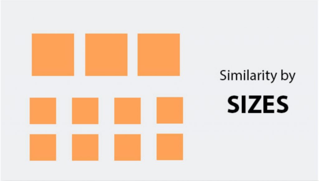
Size
Size is commonly used to suggest a relationship in the law of similarity. That is, if an object is scaled similarly to other items, the object will be seen as related and of equal importance. Size is typically used to connect objects with comparable properties and to establish a visual hierarchy. This enables viewers to swiftly scan the page and see and understand the many categories.
Apply Gestalt principles in design
To begin with, how do apply the Gestalt principles in graphic design? These are some principles associated with Gestalt theory:
- Proximity
- Similarity
- Symmetry
- Continuity
- Common Fate
- Closure
These seven principles explain the Gestalt theory’s basic goal, which is focused on the concept that the human brain is built to simplify and organize complicated images or designs with multiple aspects. Instead of processing them as a collection of separate bits. The mind does this by subconsciously, organizing the parts into an orderly system that generates a whole.
Now that we’ve answered the question, what are the gestalt principles? We can now get into the meat of the matter, which is how to apply Gestalt principles to design. The seven principles work together to form a framework for organizing the many components of a design. Proper implementation yields simple, clean, and memorable designs.

How does Gestalt Principles relevant to graphic design?
Learn how to apply the Gestalt principle in design so that you can master the art of design. Graphic design, like any other field, is structured on guidelines that help you develop a successful composition that conveys a clear message to your audience. If your design or process lacks that balance, the result will be a poor and ineffective design. Without the fundamental design elements and concepts that help customers intuitively grasp or connect with your message, you are at a significant disadvantage in comparison to your competition.
Let us reveal a little secret to you: the best designs are basic, consistent, and clean. In this article, we are defining design principles as well as the six most important design aspects and principles so that you can master the art of design. Gestalt principles are reasonably easy to apply to practically any design. A quick look at Gestalt principle examples shows how quickly the 7 principles can enhance a design that would otherwise appear disorganized or unclear. Transform a design with competing aspects for a user’s attention into one that offers the viewer a design that organically takes them towards an activity or through a hierarchy of key items effectively.
How do Gestalt principles relevant to web design?
The Gestalt principles are essential when you design anything for a website. This approach tackles visual perception by presenting a set of principles that define how humans visually organize information. Let’s briefly discuss these elements and how to use them in web design.
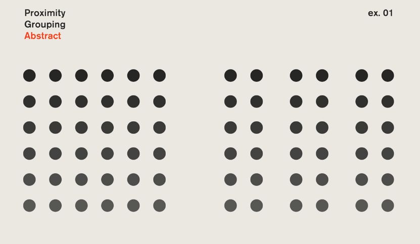
Proximity and its relation to web design
Objects that are close together appear similar to us.
This technique can group related information, such as sections on the same page/web application or navigation buttons. Given the proximity, white space is critical for allowing the eyes to rest.
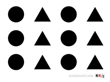
Similarity and its relation to web design
Objects with similar qualities (color, shape, size, texture, and orientation) are perceived as part of a group, even if they are not in adjacent or closed positions. Elements with similar features indicate that they are part of a group. These can be page/application interface elements such as web links in the navigation menu or price cards.

Symmetry and its relation to web design
Symmetry Knowing how to effectively combine symmetry allows us to organize graphic elements in a fluid, harmonic, and simple manner, providing stability and structure to what we want to express. A grid of photographs, a list, or some product displays is some examples of this.
Continuity and its relation to web design
We sense movement and direction based on some elements, even if this is not explicitly stated. Continuity is used when certain factors suggest that we should pay attention to a given location or direction. Thumbnails in a gallery, a slide of photographs, or a drop-down menu are examples of this.
Proximity and its relation to web design
We group items that are moving or heading in the same direction, regardless of how distinct or how far apart they are. Proximity is a principle that adds dynamism to a web design by linking movement and rhythm change. The breadcrumbs in the navigation or a progress bar help us to illustrate this principle.
Closure and its relation to web design
Even if a shape or object is missing something, our brain will tend to complete it. The iconography that millions of people view on the internet is a vivid example of this design approach. In any website or app, we can see icons that depict many types of actions, situations, or elements in a clear, brief, and minimalist style that avoids skeuomorphism.
Designing a website can be a difficult balance of pictures, context, tone, and usability. By following the rules, ideas, and suggestions in this article, you should be able to navigate the design process with ease, regardless of your ability level. Finally, it is feasible to have a website that is both visually appealing and functional; just remember to maintain the correct balance.
Conclusion
There are numerous Gestalt Laws, significantly more than we discussed in this article. Some Gestalt Laws are unique, while others overlap; some are more effective for website design than others; some are simple to apply, while others are more difficult. However, we can conclude that Gestalt Laws do provide some useful suggestions, such as how to group elements that belong together, how to draw attention to key aspects, or how to create an image of balance and stability.
Keep the Gestalt Laws in mind when designing or optimizing a website. Begin with a solid and consistent design to lay the groundwork for a successful website. After a while of working with Gestalt Laws, you will notice that they get internalized and that you will begin to use them intuitively.
You can also precisely test whether or not you successfully used certain Gestalt Laws. Do you want to know if your users see a piece of material as a whole? Or if they believe your website’s general design is harmonious or chaotic? Or if they genuinely pay attention to the elements you want them to pay attention to? Even at the conceptual stage, you may simply test your design and obtain answers to these issues.
Do you like the article? Subscribe to illustAC to hear more from us.