If you want to enhance the visual appeal of your website, you should add illustrations. Illustrations are a great way to create a unique and exciting brand story.
In this article, we’ll talk about some of the most popular types of website illustrations and 5 best web design examples. These illustrations can help you to boost your site’s performance and create a better user experience.
1. Why Should You Use Illustrations in Web Design?
The reason why you should use illustrations in web design is because they can help you evoke a variety of emotions. They can make users feel uplifted, inspired to deep thought, or trigger nostalgia or comfort.
Illustrations can also help you create a sense of asymmetry, which is a big part of branding. This asymmetry can help people feel like you are unique and stand out from the crowd.
In addition to influencing feelings, images can also help you build brand recognition and trust. They can even increase your social media presence and engagement.
Moreover, illustrations can add a creative flair to your website that makes it stand out from the competition. They can also serve as a visual divider between different sections of your site.
Another reason why you should use illustrations in web design includes the fact that they can help improve user interfaces. This is especially true in user onboarding.
This process can be a very stressful one for many users, so it’s important to give them a positive experience from the moment they land on your website. By using illustrations, you can create a connection between your website and their emotions that will last long after they leave.
This is a great way to differentiate your website from your competitors and develop strong brand recognition. It will also help you get higher conversion rates, more sales, and more traffic.
2. Types of website illustrations
There are many different types of website illustrations, each with their own unique appeal. When you choose an illustration style for your site, it’s important to think about how it will enhance the overall design.
Aside from being aesthetically pleasing, they can also tell your brand’s story or help create a world-building environment for your website. For example, if you’re designing a website for an eco-friendly company, you could use a variety of green and nature-themed illustrations.
Another way to make an illustration feel more like a real thing is to incorporate texture and gradients. This approach can give your website a feeling of depth and can really elevate it to the next level.
This technique is especially popular with flat web designs and is called “Neumorphism.” It uses real-life images but with simplified, flat-designed icons. It’s a great way to convey the minimalist realism trend in current digital design.
Finally, a lot of the best illustrations for websites come in the form of collages. These are images that come together to form a new whole, similar to the original way that different forms and materials were gathered together for art.
This technique is great for sites that have a strong visual identity and want to create a consistent, cohesive look. It’s especially effective when paired with a color palette that complements the images. For instance, the Guarantee Quote website blends semi-flat illustrations with a neutral color palette to create a sophisticated and balanced design.
Flat Illustrations
Flat illustrations are a great way to add a touch of realism to your website. They can also help you communicate your message in a clear, effective manner.
One of the key factors to successful flat illustrations is their interesting perspective and composition. Make sure the illustration is balanced if you want to express calmness or intentionally tilted if you need to demonstrate dynamics or tension.
Another consideration for creating interesting flat illustrations is original stylization. This will ensure that your vector style is unique and stands out from the crowd.
Finally, you can use textures to give your illustrations an additional layer of meaning and flair. This is especially important if you’re working with a conservative style like Memphis or Art Nouveau.
Using flat designs for websites can be a great way to add a touch realism without going overboard with 3D graphics. For example, the Caps viens-la game has a lot of 2D elements, but the designers managed to create a sense of depth by adding some shadowing and 3D styling.
There are a number of other ways to create a stunning flat design, but the best way to ensure your site looks good is by keeping it simple. You should also consider how you can use illustrations to convey a specific message and how they will fit into your overall design strategy.
3D Illustrations
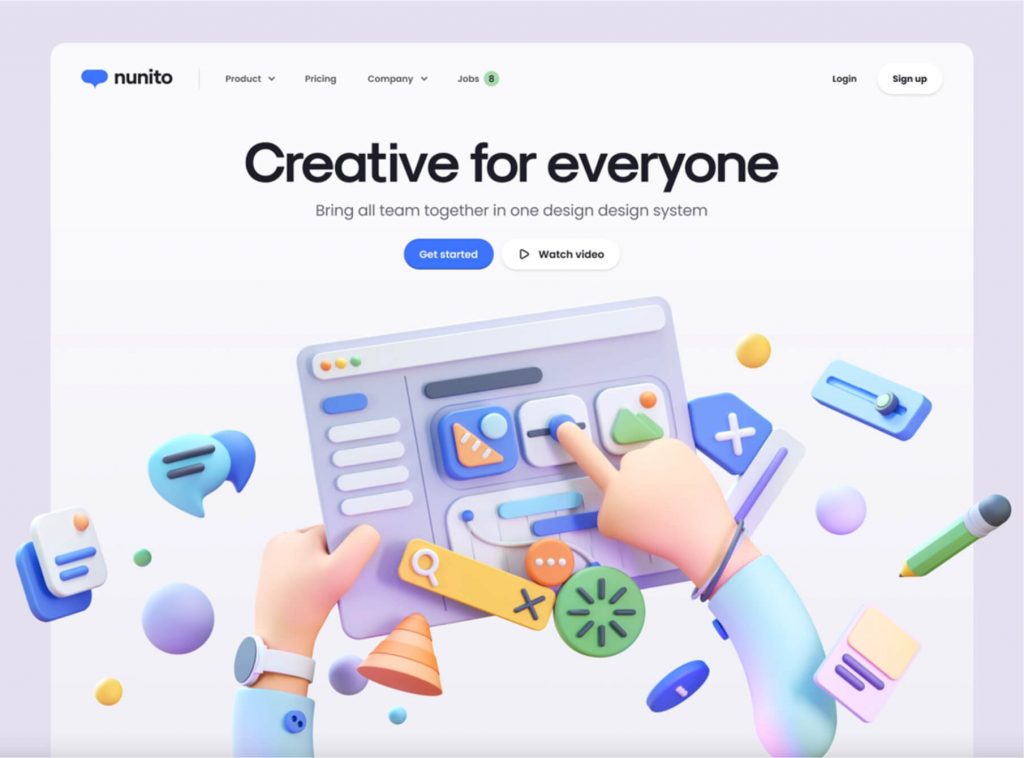
3D illustrations are a great way to add a creative element to your website design. They can create an amazing look and feel for your site, as well as attract more visitors.
This type of illustration has become super popular in the past few years. It is often used for UI designs and other types of graphics, but it can also be used in other areas of web design as well.
When it comes to 3D illustrations, the best thing about them is their versatility. They are used in so many different ways, including websites, posters, flyers and even billboards!
Another great use for these illustrations is in product design. When you are trying to sell a particular product, having an engaging illustration that makes your customers feel involved can help you sell it more quickly and easily.
For example, if you are selling a new computer, having a 3D image of it will make your customers more likely to buy it.
Similarly, if you are selling an app or game, having a 3D version of it can really help your users get an idea of what they can expect from the product.
A great example of this is Dasher & Crank, an online store that uses 3D illustrations to communicate their brand identity. It is a very clever idea to create an entire website around this concept, and it works beautifully!
Interactive Illustrations
If you’re looking for a creative way to bring your website’s design to life, look no further than the use of illustrations. They’re eye-catching and provide a unique touch to any site, and they can be used as stand-alone elements or combined with photographs.
Illustrations can help you tell a story, build worlds, and visualize data in exciting ways. They also give your site a more immersive feel and help users interact with your content.
These types of illustrations can be used on their own or paired with photos and videos. However, it’s important to remember that they should complement your content rather than be the primary visual element of your site.
Another popular way to use illustrations is to combine them with terrific animations. These kinds of designs draw the user’s attention and make them want to stick around for a while.
The designers behind NiftyNafty used this approach to create an artistic website that’s filled with cool illustrations. The site achieves a nice balance between photos, illustrations, and content, and the design is sleek, modern, and focused on information.
The company’s website features a series of illustrated dog mascots that follow customers from the site to their monthly boxes. The mascots are flat, but they’re scratched out to resemble three-dimensional models. The website also uses a textured background for the mascots to feel more alive. These flat illustrations are a great way to add interest and color to your website without making it too busy or overwhelming.
Hand-drawn Illustrations
Hand-drawn elements are a great way to add personality and charm to your website. They also help to highlight important points and create a more personal experience for visitors.
A hand-drawn illustration is often more personal than digital designs, and it can be a great way to demonstrate your dedication to the project. It can also be a good way to show your audience that you take your branding seriously.
Using hand-drawn elements can make your website stand out from the competition and encourage customers to stay on your site. However, it’s important to use them with care and ensure that they don’t overwhelm the site.
One way to ensure that you don’t overload your website with sketches is to find a balance between them and other visual design elements. This includes using hand-drawn components in conjunction with video and photography to help bring your brand to life.
In a world where everyone is focused on futuristic creations, hand-drawn elements can be a great way to draw attention back to the importance of human experience in digital content. They can also help to convey the importance of individuality in a cluttered world.
In addition, hand-drawn elements can be incorporated into your website’s navigation menu to help people navigate your pages quickly and easily. This can be especially useful if you have a lot of text on your pages, as it can give your visitors more context and help them to find their way around your website.
3. 5 Best examples of effective website design
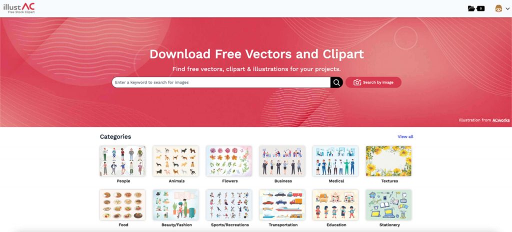
illustAC
You can use the free vectors and illustrations available on illustAC to create your own web design. The good use of illustrations with various illustrative effects will make it easier for users to read and understand and does not take much time. The illustrations give the reader an immediate visualization of the setting, the mood of the story, and the characters. People immediately react to the characters from their visual appeal.
Lottiefiles
Access a library of 1000s of free Lottie animations. Easily bring the power of motion to apps, web, social & design. With LottieFiles, you can create, design, download, edit, share, and organize animations for all your motion design needs.

Dribbble
Over a million free illustrations are available as the best illustration resources used for website design. From simple to complex styles collected and curated on dribbble it makes it easy to find the website illustrations that best suit your purpose.
Typewolf
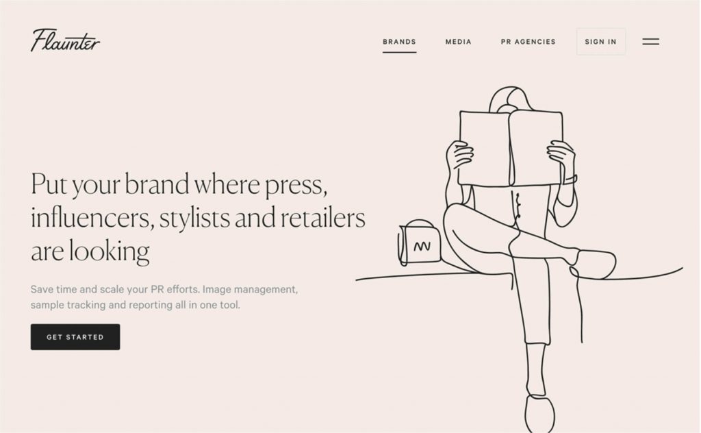
The illustrations with simple lines seem meaningless, but deep inside it is a great meaning.
With minimalist images, and clean lines, this illustration will bring a new feeling to your website and attract users at first sight.
Vector4Free
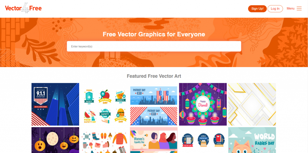
Even if Vector4Free’s library of free vectors may not be as extensive as some of the other sites on this list, it will still have website illustrations for you to design. You can use keywords to search for free vector collections sorted into them. You can choose from a variety of formats, including AI, EPS, SVG, CDR, and PDF, depending on what suits your needs.
