
What is Visual Hierarchy?
Visual hierarchy is a principle in a design that refers to how design elements are arranged to show their order of importance. For example, designers structure visual characteristics like menu icons so that the users can understand information quickly. By laying out elements logically and strategically, designers influence viewers’ perceptions and command them to desired actions.
Visual hierarchy holds real importance in design as it defines the importance and sequence of elements within a composition. The order impacts comprehensiveness, impact, and value. Naturally, there are objects with a composition that are more crucial than others or contextualize other elements. Therefore, you can first utilize numerous visual hierarchies to draw attention to those crucial elements.
The main reason visual hierarchy is an essential principle to know is that it’s on the designer to create the hierarchy so that the viewers or customers don’t have to think about where they should look first. The viewer’s eyes are automatically drawn to each element in the exact order they’re meant to view it.
12 Principles of Visual Hierarchy Designers Should Know
We have collected most important principles of visual hierarchy in graphic design that every designers shuold must know. In this article, we’ve mentioned 12 principles of visual hierarchy that every beginner designer need to understand well, So let’s dig into it:
Size Impacts Visibility
Bigger is indeed better, am I right? On the other hand, the classic adage is still something to argue for, but the size is the most effective way to emphasize visual elements(visual hierarchy). Bigger features get attention more easily and quickly than small elements.
It is the reason you can see the newspaper headlines in larger or bigger fonts, and even significant stories have even bold headlines than the rest of the article on the page. In any design, you can see whether it’s words or images; not only will most stand out and carry the strongest message in them.
No matter how big or small, a single object has no scale until and unless compared with another object. It allows the designer to create balance in a design and focus on dominant elements. Hence, the greater the scale, the greater the emphasis.
Color and Contrast Draw Attention
Just like bigger elements are taken as more important than smaller elements, bright color generally draws more attention than duller colors. For example, if one sentence in block typography is highlighted with a bright color, it easily grabs the viewer’s attention.
Consider the design, like natural color tones being highlighted to neon colors. This type of color tone is known as duotone, an increasingly popular web design trend. The effect, which layers a couple of contrasting colors over a photo, leads to appealing designs(visual hierarchy) that figuratively pop off the screen or page.
A spectrum on a more gentle scale might not be able to highlight certain features and colors that contrast dramatically. A red object will stand out more when placed against a green or black background than when set against an orange or purple background.
The color scheme means the color combinations used in a design and how they are related to one another. A designer’s choice of color scheme creates unity, rhythm, harmony, and balance within creation, but it also creates contrast and emphasis.
Too many contrasting colors can make a design look chaotic and disconnected. The same occasionally applies to the artwork that uses a color scheme that differs from color theory. But selecting the ideal color scheme includes much more than just picking a haphazard monochromatic, complimentary, or tetradic mix.
Similar colors can be used to place (group) related objects in a design, and color choice can advise distance and weight. Warmer colors like yellow and red advance into the foreground of a design with a dark background; on the other hand, cool colors like green or blue usually recede into the background. The opposite thing happens with a design over a light background, i.e. Cool colors such as green and blue appear closer than warm colors. It is how our(human beings) eyes perceive it.
Hence, the selection of colors in the visual hierarchy affects the viewer’s ability to identify a figure from the background within a design. Mixing cool and warm colors can develop depth, just like perspective.
The placement of each hue on the color wheel is essential, but so is its warmth and contrast with the colors around it.
Perspective Creates an Illusion of Depth
By using perspective, designers can create the illusion of depth ranging from a few inches to many miles. We typically see larger objects as being closer than similar tiny objects because we see similar illusions in the actual world. As a result, they usually command attention before any other elements on a page.
For example, an illustration of a road is usually wide at its lowest point and gradually becomes narrower the higher it stretches across the canvas. Similarly, the object near us(viewers) will always seem greater for us than the same thing farther away. The proper perspective will utilize proportion and scale to communicate the appropriate distance properly. A half-mile stretch of road sketched on the same size canvas will recede much more gradually than a five-mile stretch.
Fonts Organize Design
Consider a table of contents, an outline, or a standard resume. Each typically has types in various sizes, with main headers being larger than subsections and tiny details. The most important information is highlighted using different types, which also organize the document’s overall appearance.
Typeface(visual) hierarchies can be created with text of various sizes, spacing and weights, or a combination of each element. Even when a single font is utilized throughout your design(visual hierarchy), differing size and weights draw attention to more important design elements. It creates an overall composition that is easy to read and understand.
Just imagine a resume with larger and bolder fonts for references than for the applicant’s name. It might not only look haphazard but more likely to create confusion for the ones quickly scanning a mountain of applications.
Similarly, a design(visual hierarchy) featuring a series of the type with the same font size and weights won’t effectively draw attention; it’s a challenge that has to be met quickly, with so many audiences spending split seconds gauging the quality of your design.
For this reason, in addition to introductory copy text and a manual selection of font properties, most web design systems also provide a pre-set visual hierarchy of fonts for titles, subtitles, and graded headings.

Space Provides Emphasis and Movement
Rule of space
One of the most basic principles of visual composition deals with what you leave out of your design. According to the Space rule, an aesthetically-pleasing design needs its fair share of clutter-free negative space, often offered as white space, regardless of the design’s actual background color.
Designers might transmit a completely different visual message by hiding an “arrow” within a composition’s elements or by highlighting certain aspects in relation to the surrounding content, as in the case of a single element on a white page. Proper planning and strategic spacing can draw viewers’ eyes across the page in a targeted sequence by contributing to age-scanning patterns.
Page-scanning patterns
Viewers tend to scan pages based on particular patterns observable through their eye movements. When designers want audiences to notice elements in a particular order(visual hierarchy), they often rely on the most common patterns.
For example, native English speakers read from left to right. Hence, they present a similar scanning pattern when faced with a page of text. On the other hand, Arabic is written in the opposite direction, i.e. right to the left. The chance that someone may scan pages in this “opposite” manner is higher if they are used to reading that language. When producing content for audiences worldwide, designers should consider these differences in their design(visual hierarchy).
F-Patterns
Do you know that the most common- eye-movement pattern in English is the F pattern? Do you wonder why it is? If yes, it’s precise because of how we read a book, a newspaper, a letter or a web page. We tend to scan the page from the left to right along the top and again for each line of text until we reach the end of the page.
Due to this natural tendency, designers most frequently use the F pattern while creating web pages(visual hierarchy) and other graphics that mainly rely on text. Because reading in a different direction than what we’re used to is uncomfortable.

Z-Patterns
Designs that rely more on images are often composed in a Z pattern. Because our brain processes the images faster than text, viewers can scan the page easily and quickly by looking across the top from left to right, then down the page diagonal before completing the scan by crossing left to the right.
Designers must emphasize some aspects of a composition by placing them along these common ‘z’ eye-movement patterns. Just think about a heading, an image and a subheading.

Proximity Suggests Relationships
Proximity, or where the elements appear in relation to one another, is an essential element of the composition. Simply put, putting related elements together in a visual hierarchy suggests to readers and viewers that they are also related.
Take an example of a white screen with a group of five dots on one side and only a dot on the other side. Our first assumption will always be that the five are a group.
By placing elements within a specific proximity of each other, added images and messages can be created. Think of how often you guys see three circles and a line positioned in a way to advise the happy or sad face character. The advised image then often gained quite a lot of attention from its elements.
Negative Space Emphasizes
Just like grouping elements near each other suggests their relation, white space around elements singles them out as separate groups of detailed information. Not only do viewers or readers find it easy to digest by grouping it into compartments looking at the negative space, but it also creates concentration as it helps viewers’ eyes zero in on individual elements.
Compositions lacking ample negative space result in a confusing, messy, and chaotic design. In other words, less is more. Savvy designers can also use the black space to suggest an additional visual message. Think of the ‘arro’, implied within the center of the renowned Coca-Cola design(visual hierarchy), FedEx logo, etc.
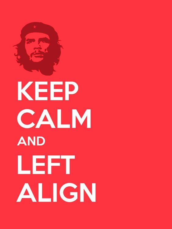
Alignment Directs Eyes
Alignment is an element of the structure by which items are placed in a design or visual hierarchy. It says the visual components, whether text or images, are not positioned accordingly throughout a composition. For example, a typical page of typography is aligned to the left for the object sharing the left margin.
A lot of graphic designs are justified or centered, which means they are dispersed over the page to share the left and right margins. If words were thrown across a page in every direction, it would make for a highly confusing scene. While Z-pattern designs frequently blend left, center, and right alignments, such as in the ad above, F-pattern designs align things to the left.
The middle of the frame is where simple visual designs are most typically aligned; this format promotes harmony and balance while visually appealing. Most West readers are used to reading pages from left to right. As a result, text-based designs frequently have the same left margin alignment.
Right alignments frequently balance out an overall design that may lean more to the left visually. In the opposite situation, left alignments can have the same result.
Odd-Numbered Groups Create Focus
The rule of Odd-numbers allows designers to emphasize specific images by keeping them in the center of a group. By keeping an equal number of neighboring objects on either side of the main focal point. Hence creating an odd-numbered group, the result clearly shows the most important visual elements situated in the centre.
Repetition Unifies a Composition
Similar to how contrast draws attention to and highlights certain design features, repetition fosters unity, which improves comprehension and recognition.
Consider the majority of written works. The layout of the pages is set up so that chapter headings are one font, body text is another, and footnotes are a third font, all of which are used consistently throughout the book. When a style is repeated, a work becomes cohesive and recognizable as a whole.
Lines Suggest Movement
Movement is the best way to gain attention from the viewers, especially when it’s implied within a still design. Lines are efficient in pointing to items of emphasis; think of an arrow but do not have a physical appearance on the page to do the trick.
Grids Organize a Design
The most effective designers are composed of some grid. The most typical grid is the classic modular composition of crossing horizontal and vertical lines.
Every professional, i.e., photographers, graphic designers, and artists, has long used the rule of grids to enhance the overall balance of their compositions. The rule involves mentally dividing a composition into a grid of two horizontal and vertical lines or nine different sections.
Instead of the classic vertical-horizontal grid, designers can choose a diagonally-directed composition to ensure their creation stands apart on a page and draws viewers’ attention.
Some designers even choose to break the grid completely, randomly placing visual elements across a page to stand apart from surrounding gridlocked text. That surrounding text can be either in the same design or visual hierarchy or in the surrounding page. Do not get followed by randomness. Breaking the grid, every choice must be calculated and with purpose.
Visual-hierarchy principles are some of the most effective strategies for emphasizing elements of a design(visual hierarchy) and conveying a design(visual hierarchy) message.
Designers must decide wisely what principles to use or risk diluting any emphasis and breaking down the visual hierarchy. If everything stands out, then nothing stands out.
Ten best visual hierarchy examples of your inspiration
Now you know what visual hierarchy is, it’s time to look at some of the best visual hierarchy examples ad get inspired:
Scale
One of the simplest and straightforward ways to quickly create visual hierarchy in the design is by making the elements larger than the rest. You have to have a nice variation in scale across all elements, but one should be the focal point.
Color
Another to create a visual hierarchy in design is by using color strategically. Maybe you want to use a limited color palette, or the brand you’re designing with has its own predetermined color hues. This is an advantage to help draw attention to one part of the design over another.
Depending on the color you want to use in design, one usually adds more contrast and, therefore, attention. For example, the black color tends to stand out the most in any design, so use it sparingly.

Scanning Patterns
Designers use F patterns while creating web pages and other graphics that mainly rely on text due to the visual tendency. Moreover, designers who rely more on images often use the Z pattern.
Proximity
The arrangement of components in close proximity might convey additional messages. For instance, positioning objects in specific positions on a map can help viewers understand how close or far something is. Of course, the size and scale of the map also play a role in this. Not always an inch a mile.
Negative Space
Grouping elements near each other suggests their relationship, including white space around elements singles them out as separate groups of detailed information. Viewers find it easy to digest grouping into compartments looking at negative space, but it also creates concentration as it helps viewers’ eyes zero in on individual elements. Compositions do not have ample negative space, resulting in confusion and chaotic design.
Typeface weight and pairing
The choice of typeface is essential for creating a visual hierarchy. Weight refers to the breadth of the lines that make up a typeface’s letters, and style, such as serif and sans serif, are among its most crucial characteristics. Italicization and other changes can also have an impact.
The phrase “the right teas to keep you warm” is the focus point of the website design for The Tea Factory. Still, variations in type weight and italicization and word arrangement offer a more dynamic, less linear reading experience. Due to size and space, the call to action, “See our selection,” is more clearly highlighted than the text above.
In some cases, the primary goal is to present a variety of information equally urgent. Setting it all to the same weight and size typefaces would accomplish the equivalency but also make it monotonous.

Direction
Because it is the most readable format, page layouts are often created using a grid of vertical and horizontal lines as a guide. A new method of establishing hierarchy in such a system emerges: breaking the grid.
Compared to adjoining grid-locked text, text that is arranged on a curve or diagonal will naturally stand out and take the lead. This has long been a successful marketing tactic, as seen in the bus stop poster by Frost Design.
Size
This is a straightforward one: People read larger things first. In the Young Vic theater advertisement, if your eye lands on “performance” before “cracking,” you should immediately contact a perceptual psychologist. You might be able to get paid well to undergo testing for a unique abnormality.
Repetition Unifies a composition
Repetition promotes unity, which enhances comprehension and recognition, like how contrast attracts focus to and accentuates particular design elements.
Grids
Professional artists and graphic designers have been using the rule of thirds to enhance the balance of the composition. This rule of thirds means dividing a composition into a grid composed of two horizontal and vertical lines or nine separate sections.

Conclusion
The design needs to consider visual hierarchy since it establishes the significance and order of the elements in a composition. It affects how your viewers will view your content in a sequential sequence. The order can dramatically impact understanding, effect, and value.
We hope reading the article was helpful for you to know and understand some principles of visual hierarchy as a designer. Furthermore, if you are looking for amazing illustrations and cost-free graphic images, then illustAC is the place you should look for. illustAC has offered thousands of cost-free illustrations that can be used in your projects. Also, over seven million people have already trusted illustAC, its premium users, so what are you waiting for? Hurry and subscribe to illsutAC and enjoy thousands of cost-free high-quality royalty illustrations.