Getting your design idea printed involves a few essential criteria, whether it’s a brochure, business card, or package printing design. These standards are referred to as the specifications in the printing business. A successful printing project requires the proper manufacturing parameters as its fundamental building pieces. This article will teach you all you need to know about printing your design projects so that your clients will be wowed by the stunning print results.
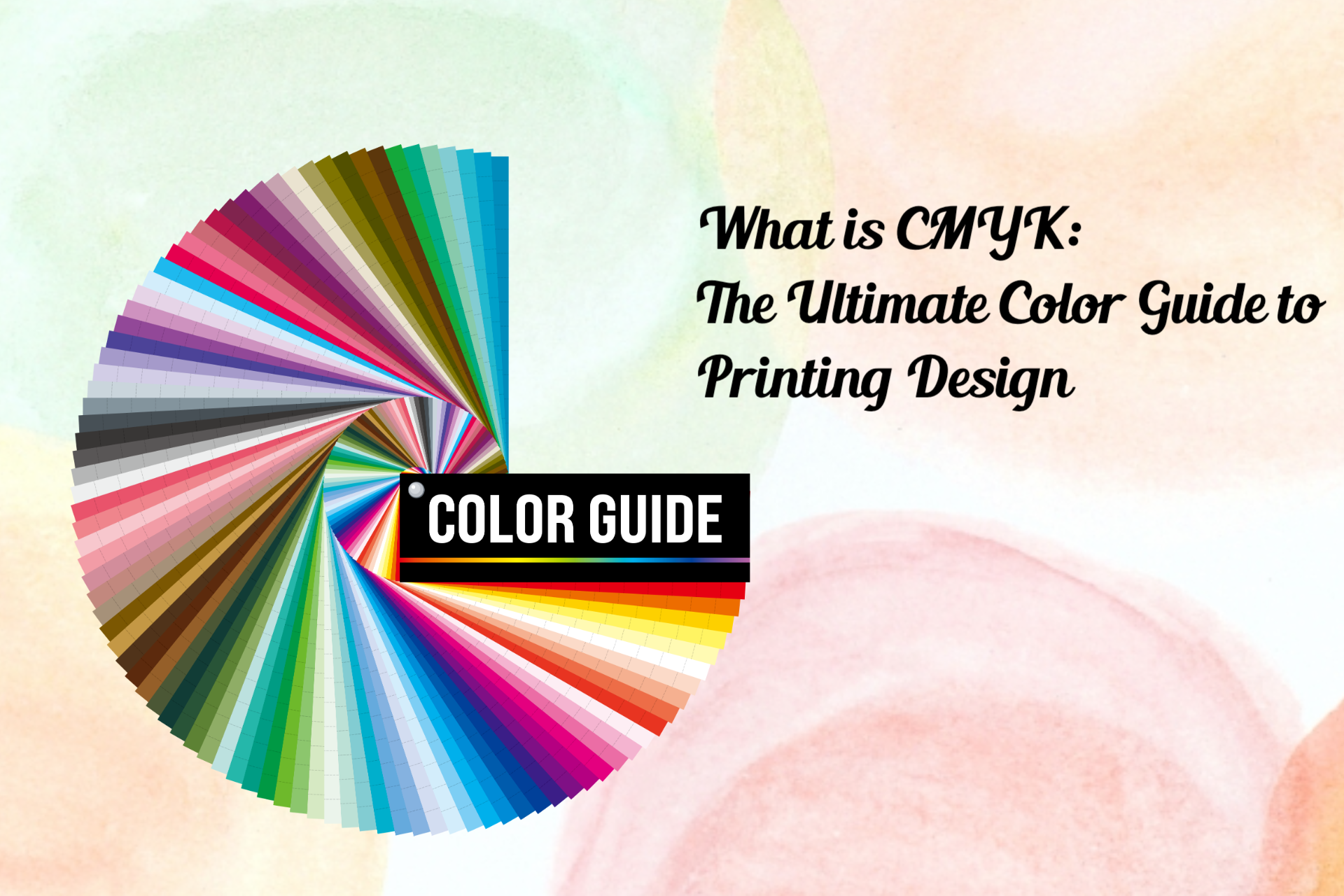
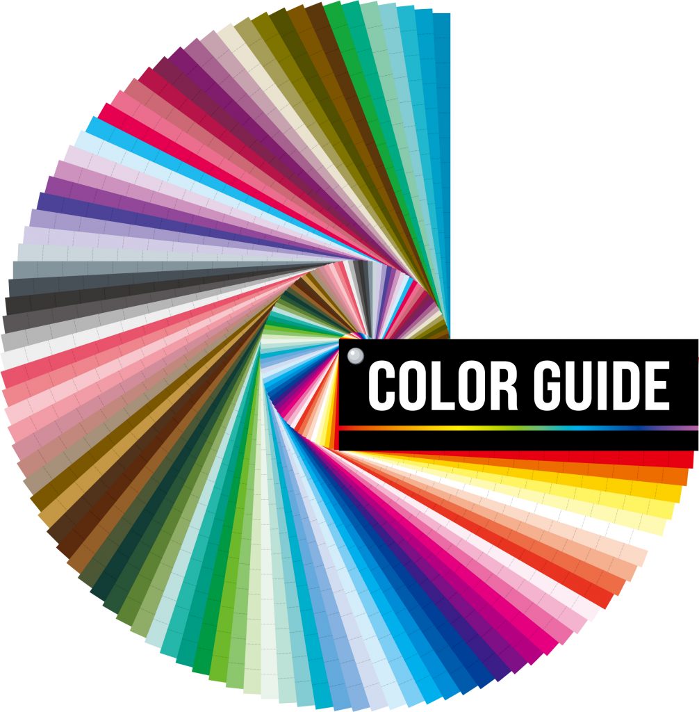
Knowing about CMYK color modes is crucial if you’re a designer or ordering a design so that you can organize and maximize each step of the printing design process. Because it’s more important to know which one is perfect for your project than just knowing what the letters stand for—spoiler alert: they’re generally colors!—that goes beyond simply understanding what they mean. One color space is always preferable to the other depending on the location and how the final product is exhibited. Acronyms no longer cause you anxiety. The CMYK color mode will be defined, along with its functions and ideal applications, in this section.
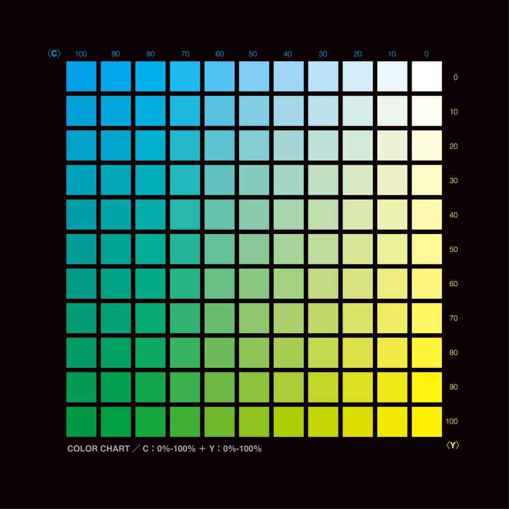
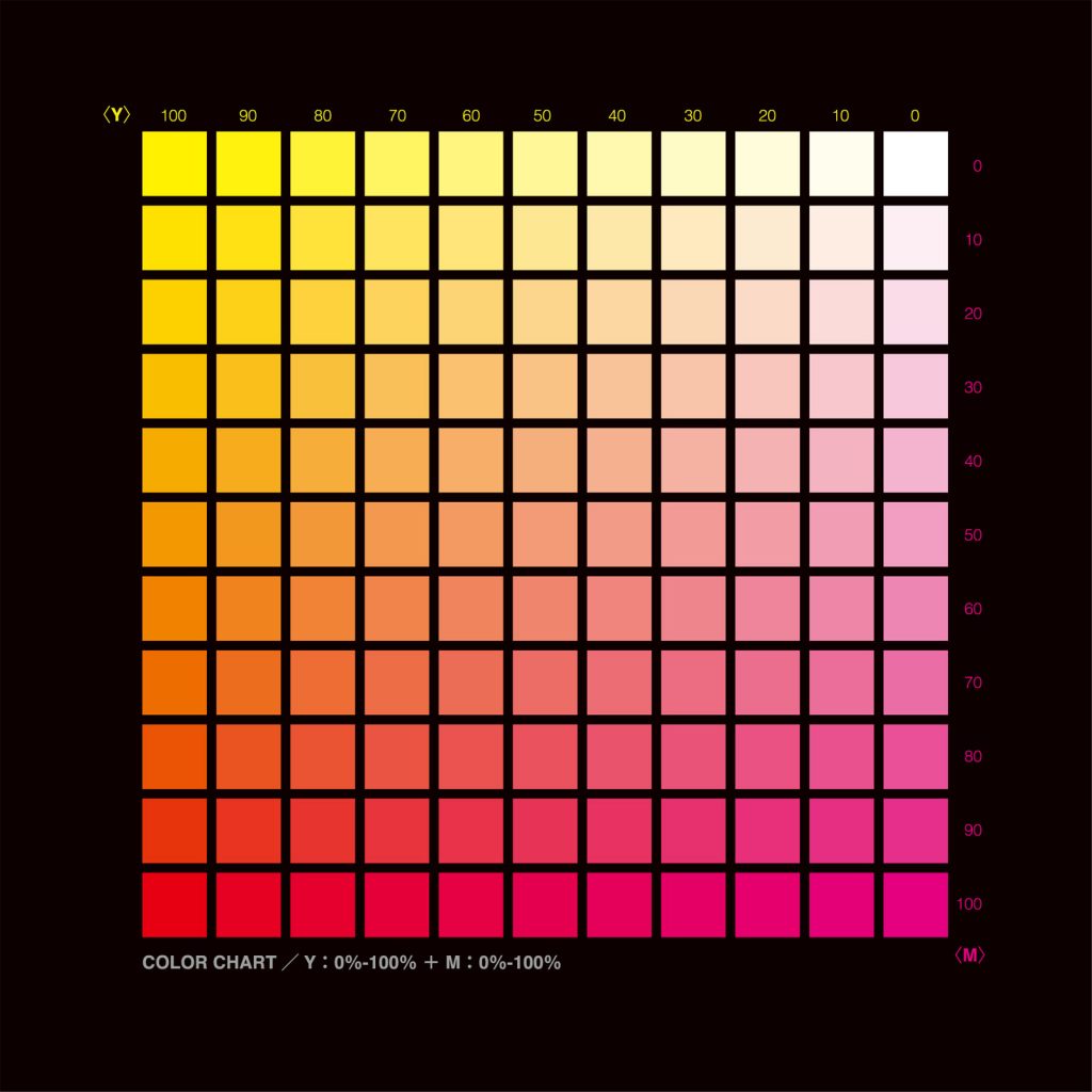
The color space used for printed products by printing design is CMYK (Cyan, Magenta, Yellow, Key/Black). By adjusting the amounts of physical ink and CMYK colors, a printing machine produces graphics for printing design. Subtractive mixing is the term for this. Each layer of ink gradually dims the initial brightness of each color, which is initially white, to produce the desired color. Pure black is produced when all hues are combined.
When to use CMYK? For any project printing design that will be printed out rather than only viewed on a screen, use CMYK. The CMYK color mode will produce more realistic results if you need to reproduce your design using ink or paint. Choose CMYK for any of the following printing design projects:
Branding Business Cards Stationery Stickers Signs & Storefronts
Publicity materials pamphlets billboards posters flyers car wraps
Merchandise branded clothing t-shirts hats promotional items i.e. pens, mugs, etc.
For packaging printing design that needs multiple colors of ink to create a realistic image or design, CMYK printing is the best option. CMYK is the preferred method if your packaging needs three or more colors. Even while CMYK printing yields high-quality output, there is a possibility of color variance between printers or jobs. By conducting press checks and offering advice on your artwork, your packaging partner may collaborate with you to ensure a consistent result.
The CMYK color model is used in digital printing design for folding cartons, corrugated boxes, and display items. To expand the color spectrum and provide a larger variety of colors, some digital presses combine extra base inks with the conventional CMYK. Pricing is determined by the amount of ink used rather than the number of colors utilized, and no print plates are needed to transfer the picture to the package surface. The full-color treatment is thus possible for even small orders and prototypes.
Which file types work best with CMYK?
PDFs Due to their compatibility with the majority of systems, PDFs are perfect for CMYK files.
AI Assuming that everyone on the team is using Adobe Illustrator, AI is the usual source file for CMYK.
EPS Since EPS is interoperable with various vector software, it can be a perfect source file substitute for AI. The best course of action, in our opinion, is to ask your printer which file type they prefer before printing design.
What is a Spot Color in Printing?
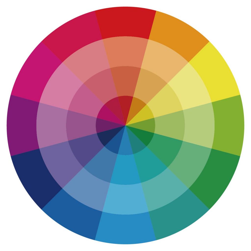
Spot or solid colors are terms used in the industry to describe colors produced without screens or dots, such as those found in the PANTONE MATCHING SYSTEM®. Each spot color in the PANTONE MATCHING SYSTEM is created using an exclusive ink mixing process that Pantone developed from a palette of 18 basic colors. In your younger years, you undoubtedly blended yellow and blue paint to create green. Similar in idea, but with an increased demand for accuracy, is producing a PANTONE Spot Color.
Precision starts with printing design ink producers that have been granted a license by Pantone to create inks for blending PANTONE MATCHING SYSTEM Colors. They must submit samples of the 18 fundamental colors to Pantone every year for approval to keep their license. Printers can then use a PANTONE® FORMULA GUIDE to order the colors by number or mix the colors themselves using that formula. The customer’s selected color is produced by the printer thanks to a PANTONE Chip that is included with the ink and/or job.
Whether you’re printing a business logo or a piece of digital art, it’s crucial to pick a printing design technique that makes your product seem as wonderful in real life as it does on your computer screen. Depending on what you want to print and how it will be printed, it might be difficult to determine whether spot color or process color is the best option. However, both techniques have advantages and disadvantages that should be considered.
Spot colors are solid colors created using a specific premixed ink and are typically based on Pantone Matching System (PMS) colors. Pantone colors are standardized, and each one is assigned a unique number and name that allows designers and printers in different locations to quickly identify the same color. Spot colors are strong and vivid, but the printer will almost probably charge you more if you’re offset printing design.
Printing offset Despite improvements in digital printing design, offset printing has been the industry standard for more than a century in commercial printing design. Offset printing uses inked metal plates to transfer images on paper. To print in black and white, only one plate is needed; however, to print in other colors, two plates are needed. Your task will cost more to print the more plates it requires.
Is Spot Color the Same as Pantone?
The business responsible for defining colors is called Pantone. Any manufacturer, no matter where they are, can be confident that the color they use will match the one that was ordered for printing design thanks to the Pantone matching system they developed. To do this, they simply utilize a Pantone color manager to find the Pantone color code for the requested color. All of it may be attributed to the uniform structure that they have put in place. A reference Pantone code is available to aid in identifying each color.
Anyone with access to the actual database can check the Pantone colors palette, which has more than 1,000 hues, to make sure they are using the right shade. Using the Pantone color management system in printing design, it is very simple to identify the closest Pantone color. Pantone Matching System (PMS) colors, often called Spot colors or Pantone Matching System colors, are particular color formulas that reproduce colors accurately in print.
Like the CMYK 4-Color Process, PMS ink colors are pre-mixed from existing color formulas and given a standard number rather than mimicking colors by layering various ink hues. Regardless of when or where the printed product is produced, using a PMS color ensures that the color will be constant for printing design. There is typically a surcharge, though, because PMS ink colors are made with unique compositions. On envelopes, stationery, and some business cards, PMS colors are frequently used for a logo or text that needs to have a consistent appearance.
How to Prevent Surprised Results? If you plan to print your piece utilizing the CMYK 4-color process, you must avoid using PMS Spot colors in your artwork printing design. It is always a good idea to consult the Pantone Process Book when designing for the CMYK 4-color process and then use the Process color that is most similar to the desired PMS Spot color. Alternatively, it can produce an outcome you weren’t expecting when your PMS Spot color is transformed to a CMYK Process color to create printed output. Before diving too far into your printing design project, always check with your printer if you have any questions.
Do Manufacturers Have to Follow Spot Color?
Yes. Since Pantone is so particular about its accuracy, ink producers with Pantone licenses are required to submit samples of its 18 fundamental colors every year for approval. Only once they have been approved successfully are they permitted to order colors.
What Is the Purpose of Spot Color?
The Pantone Colors color system, which is used for spot color printing and is only applied to the designated color area, is made up of solid or premixed colors. Single runs of the process and a separate plate are used for printing in a single (spot) color. There will be two runs and two plates if there are two colors for printing design, and so on.
Advantages and Purpose of Spot Color Printing
Because each color is allocated a unique Pantone number, during spot printing, the colors are precise and true to the original design. It uses the Pantone numbering system to designate colors and is a standardized approach for color matching during the printing design process. By establishing a standard for the colors, various manufacturers in various regions can all refer to a Pantone-numbered color, ensuring that colors match without coming into physical contact with one another. The spot color technique ensures a truly uniform color in every manufacturing cycle without requiring ink mixing. When printing two or fewer colors, spot colors are typically less expensive.
What Is the Difference Between Spot and Process
Color?
Spot color and process color are the two methods used to apply color to paper in color printing. Spot color is a technique for ink that is mixed in advance and then applied directly to the page. To create hundreds of different hues, process color uses four or more standard ink colors—the fundamental four being cyan, magenta, yellow, and black—in very fine screens. Spot color is typically utilized when a small number of precise colors are required. For printing designs, photographs, paintings, and extremely complex colored images, process color is more practical.
Spot and process colors may both be used on the same page in specific circumstances while printing design. A business brochure, for instance, might have a corporate logo and color images (process color) (spot color). A pre-mixed ink is applied on the page with a spot color. A color scheme, like the PANTONE MATCHING SYSTEM, is typically used to identify this shade. For papers that just need a few colors, like newsletters, brochures, and stationary, a spot color is a great option. To closely match particular hues, spot color is often employed.
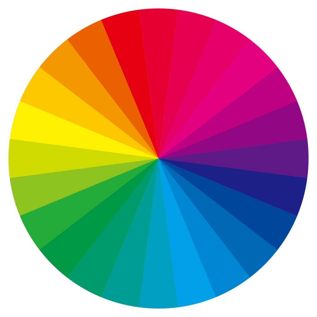
Process colors Using four or more common inks, process color is a technique that can produce thousands of different colors. The most popular technique for producing color in printing is known as CMYK, four-color process, 4/c process, or simply process. Using the letters Cyan (C), Magenta (M), Yellow (Y), and Black, a file is divided into four independent colors to reproduce a color image (K).
Each of the four colors is given a screen tint during separation, which consists of tiny dots placed at various angles. One color is overprinted on top of the next as the screened separations are then put onto four individual printing plates, one for each color, and driven through a printing machine. With the appearance of continuous tone, the composite image deceives the unaided sight.
The proportions of cyan, magenta, yellow, and black are used to represent process colors. Numerous color options are available in varying percentages. Decorative features like borders and graphics can be made out of process colors when images are reproduced using four-color process printing. By doing so, it is possible to save money by printing in all the spot colors without using an additional plate.
Last Thoughts
The choice between digital printing and offset printing may have a significant impact on whether a project is produced using Pantone Matching System (PMS) colors or CMYK (four-color process). All digital printing design work is printed in CMYK, with the addition of a fifth or sixth color on some digital presses nowadays. Digital printing frequently does not allow for the use of certain inks, such as metallic colors. Offset work can be done in a variety of ways, including using solely PMS colors, only CMYK, or a combination of the two.
There is a logistical aspect to this as well, similar to paper. Depending on the intended purpose, specific ink kinds, such as wax-free, fluorescent, heat-resistant, etc., may need to be specified. To avoid color surprises when the project is printed, the digital art files must be created in the precise color format that the item will be printed in. While the main requirements for getting a project printed have been covered, there are still certain requirements that need your attention, such as the trim sizes for printed parts.
Due to its impact on the additional manufacturing components that can be added to the mix, a project’s deadline or due date also becomes a crucial specification to take into account. Try to become well-versed in each area of specification so that you may concentrate on it early in the design process. With this information, a designer can bring a design to life, serving as a valuable resource for a client and a knowledgeable customer for a printer.