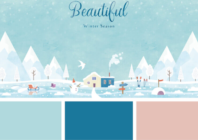
Winter color palettes are charming and fresh. From snowy whites, iron reds, icy blues to cozy creams, you can assimilate arctic tundra with an array of chilly shades or create a pleasant winter with shades to cover your home in comfort.
It is that time of year again! The leaves are changing color, the weather is cooling, pumpkin spice, and everything is back in season. For digital product designers, this means it is time to start thinking about winter color palettes.
There are different methods of extracting colors from our environment and applying the same to designs.
One of such ways is to extract colors and shades in a photograph using Photoshop or Photoshop Elements. You can use colors to display emotions. That is why a good designer must choose a color scheme or color combinations to use in a design project.
Also, designers are inspired by nature because it provides colors that draw people’s attention.
In winter, nature is about somber colors. The earth enveloped with snow lessens the visible cluster to give you a monotone canvass. Snow is like white dust covering busy backgrounds with a veil.
In winter, the blue color appears chilly, especially the blue tones with shades of purple. If you use these colors in a scene, people may feel a shiver as they respond to it due to their emotional response to such colors.
A winter color palette should have diverse colors instead of always being monotonous. For instance, a dull color palette designed with a touch of brilliance would be more attractive and pleasing to the eye.
How to use your Winter Color Palettes
Winter color palettes are trends in digital products, branding, and fashion. They are as well sources of inspiration for a retro-party decoration.
You can use the HEX code color swatches to translate your designs easily to online applications and the web. Also, you can use design software to convert your winter color palettes to printable CMYK swatches.
Each palette is a combination of colors that adds seasonal style to packaging, illustration, graphic/web designs, and branding.
Read on to realize a new world of winter color palettes that are not limited to green and red.
Winter Color Palettes: 26 recommended color schemes
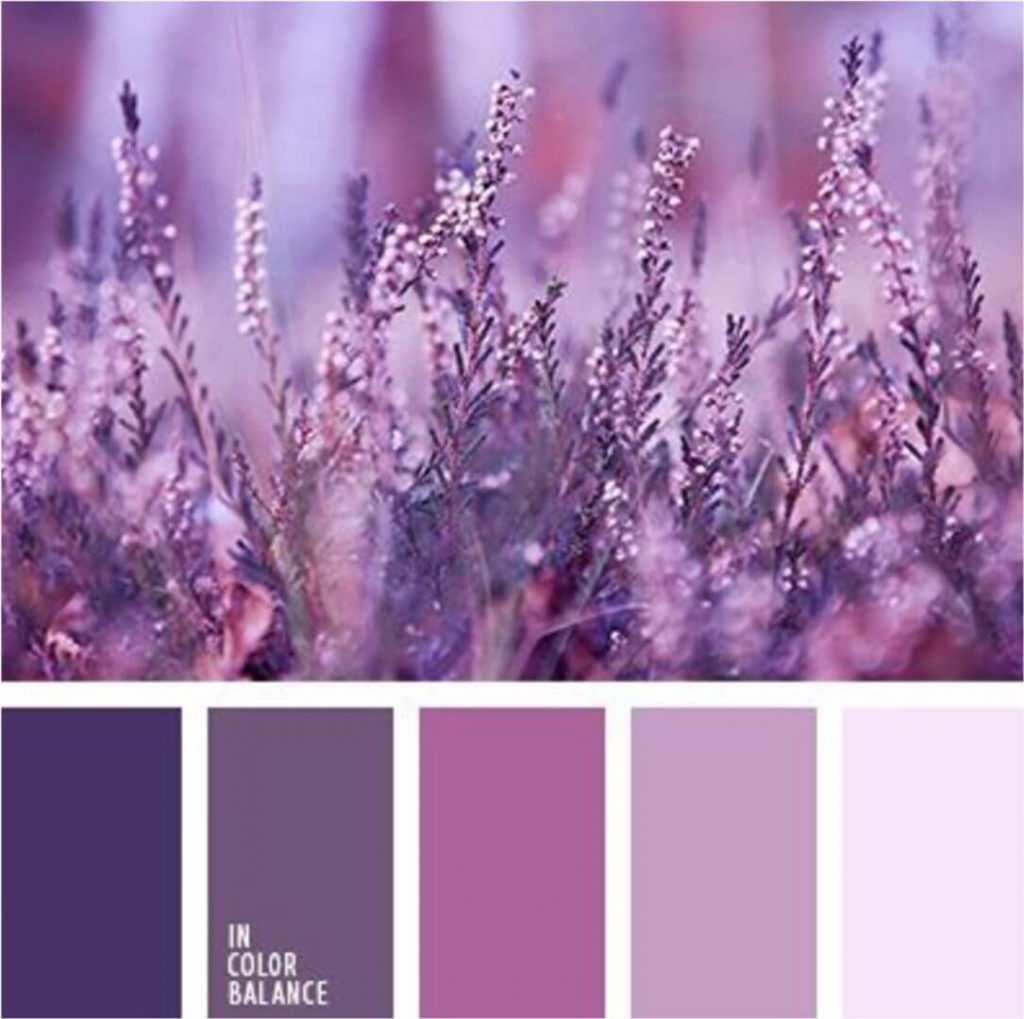
Purple Beets
This winter color palette comes from the rich colors of winter. It is perfect for days when it is just too chilly outside. The earthy tones are warmth while purple hues give off that cool vibes you crave.
Use them instead of your traditional color scheme or mix some into other seasonal designs – they will make any day feel new again with their contemporary flair.
Source: Pinterest
Pink Party
Are you looking for something trendy to decorate your home this winter? This winter color palette is perfect. The colors contrast conservatively between dark blue from the cold season, snow-white minimal tones (for an elegant look), but there is also some fun with neon pink that will add life to any party or event.
You can use it anywhere, including the workplace during those dull Mondays or on top of each other when friends come over unexpectedly. It does go well everywhere because Gray with warming Pink rounding it out makes every space discoverable.
Bordeaux Velvet
This winter color palette is perfect for people that want to create a modern classic look. It features green and red hues, used together or separately for different effects, so you are sure of not running out of inspiration.
Christmas red swaps for richer-mulled wine hues. It makes your design more luxurious and adds that festive feeling. These darker shades are perfect without being too overwhelming or gaudy when combined with other colors like deep sherbet pink and rejuvenating forest green.
Orange Frosting
In winter, we all crave something warm to brighten our days. This winter color palette fresh combo will do just that.
The red-orange with deep purple-blue creates an energetic yet elegant design, perfect when used in your logo or illustration work because it makes the text stand out against images while still being easily readable at any distance over screen resolutions, including computer screens.
Source: Pinterest
Mustard Seed
Mustard Seed is the perfect color to set your design apart from others. It has a subtle folky feel that will make you feel cozy and warm, just by looking at it. Use this mustardy-yellow theme in adverts or social media posts for an immediate sense of hygge inspiration.
This variation on the popular urban themes from 2021 – illuminating and ultimate gray, gives this pairing an old-world feel.
Days Of Rust
It is a winter color palette, perfect for winter weddings or seasonal interior design. It features earth tones with nature-inspired colors that balance nicely to create an attractive scheme without being too overpowering in any particular color.
Burnt orange and chestnut combine smoothly into lighter pastel blues, while charcoal black anchors everything from deep berry shades down through purest whites at the base level. Looking closely, you will realize that these blocks are more than just geometric shapes.
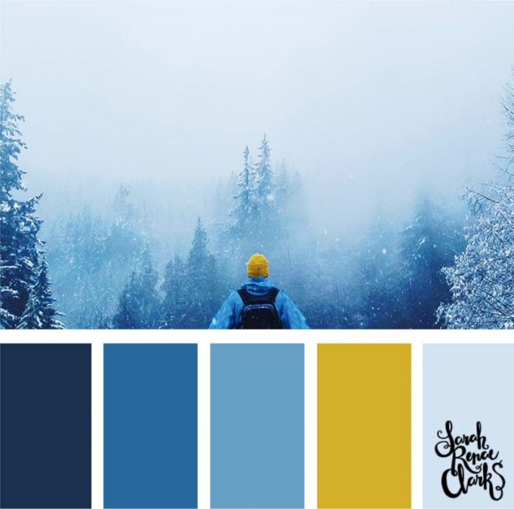
Winter Blues
This winter color palette balances the cooler tones of denim and navy blue with antique gold to create the festive 1970-infused palette.
The warm colors make for a cocooning feel while still being sophisticated, making it perfect in the colder months when you need more than just bright walls but some warmth on your heart.
December Dopamine
The color of spring is finally here to bring some life back into our grey winter days. Rainbow brights have been trending on fashion runways for a while, and if you want an autumnal scheme that will make your house feel like Christmas all year, then this is it.
This color palette has a bright but friendly design and features bold patterns in shades ranging from orange, yellow, green, blue, purple, white, and black. There aren’t any bad choices when selecting what type or color pattern suits how you would prefer things around the home.
Cabin In The Woods
Winter is the time for winter clothing, Christmas trees, and presents. But what about color? What should you paint your nails or hair when it snowballs in December?
The gothic palette nods towards Scandi noir by presenting blood reds and ink-black to make pure white look alluring on its own without any other hues added to it to mix up the seasonal scenery even more.
If horror movies are not enough, an emotional girl would love these colors too since they are dark enough, just like the heart-wrenching loneliness she tries so hard to hide from everyone around. There are ways you can use these colors in different projects.
Crimson is perfect when you desire the ultimate anti-festive feel while also serving as the background color on book covers, poster prints, etc., especially if they have some charged ornamental features like lace patterns.
Onyx Forest
The dark side of your wardrobe is here. This winter color palette will take you back to those moonless winter nights and give any design a moody, mysterious beauty this season.
If it is not about celebrating the holidays with bright colors but feeling like one in black and white, these shades are perfect for a website or app. You can use it without adding color, which may be distracting when working on designs full time.
Winter Color Palettes – illustAC
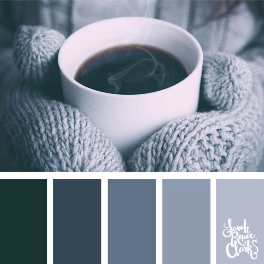
Shades Of Gray
The different shades of gray will make the picture unique, as they give off a serene beauty. This winter color palette would be perfect for minimalistic designs that need extra-paregoric touch. Just imagine how wonderful your office or home will look when you use these colors as accents in their layout design.
Muted tones can create anything from cozy cardigans at night or cold winter days spent bundled up indoors reading books by candlelight.
Frosty Berry
The colors here would look fantastic on any food-themed design. They are perfect as background decoration or even tableware. I would love some cake plates made out of them.
Creamy Ivory and Warm Taupe
This traditional scheme integrates much creamy ivory and warm taupes. Always ensure that your white color palette does not reflect a single note but different shades of white to make it appealing.
The blue color has never failed in this scheme, but to get the best of it, use some cool shades of blue.
Winter Evening Hues
As it gets darker, pinker hues appear in abundance until finally turning into soft browns or tans at night, when all that’s left is darkness.
This beautiful color palette is perfect for projects that require muted tones because the pastels will give just enough flair without being too flashy. They are best on furniture pieces or dress designs.
Source: Pinterest
Other ideas for winter color palettes
Bright Whites and Saturated Pops
Creating contrasts reflects the essence of winter. A tree in snow depicts a black segment on a white scene, but then the same tree in spring settles within a green land, a patch of floral hue, and the blue sky.
You can capture the spirit of winter by contrasting it in different ways. For example, a dark wall tone with jewels or shiny white fittings. White partitions with white furniture, highlighted with some saturated materials.
Dusk At Winter
Pinks, purples, and dark silhouettes are a calming color combination, perfect for women-related design projects. The sky during winter turns to shades of blue and grey while it is still light out, but soon after sunset, it gives deep purple tones before fading into darkness.
Summer sunsets do not have this effect because they contain orange hues that make them look more vibrant than their cold counterparts.
Flowers In The Snow
The images of cherry blossoms covered in snow are stunning. The colors extracted from the photos provide a similar vibrancy to the previous one, with an eye-catching purity that makes you want to take up your camera once more.
Glitters In The Snow
This winter color palette is a gold Christmas ball buried in snow, glittering and shining like a beacon to create a beautiful sparkling sight.
Snowy Road
The Snowy Road is a perfect winter scene for your next web design project. The road is lined with trees and covered in snow. The cool blues make it very pleasing to look at, which will help you get that creative juices flowing.
Source: Pinterest
Blue, Gray, and White
As winter gives way, the colors in our environment change with the season, and the freezing part of the year comes with a blue-gray sky, turbulent winds, lots of snow and ice, and low temperatures.
Interior designs depict fresh and frosty colors that bring the winter spirit to mind. Some cool shades that usher in the winter mood indoors include Frozen, Chill, and Snow Day.
Thistles Teasles
If you use a monochromatic winter color palette, your designs will look simple and more minimalist. It is the perfect choice for those looking to make their designs sleek or urban-looking. I love designing business cards in these tones because it is easy to create cohesive looks across all platforms.
Tire Tracks In Snow
This winter color palette is the image of a pathway with tire tracks, which is perfect for the branding of any business. The blue sky and trees lined at the horizon produce contrast against the white snow, which creates visuals for marketing materials such as websites or social media posts.
Deep Navy
This winter color palette is the ideal paint color for creating a space that feels like it is offering you a hug in winter. The dark color makes your room look like a warm haven where you may want to curl next to a fireplace.
It looks fabulous in a library, decorated with plaid patterns, wool, and leather fabrics.
Winter Colors from Seasonal Brands
One way to approach winter color palettes is by thinking about how brands traditionally use them for their winter campaigns. If you are looking for inspiration outside winter colors, try looking to the sky.
Colors from the Sky
One of the best things about winter is that we get to see all sorts of different shades of blue in the sky. It can be a great source of inspiration for winter color palettes. Not only does it help convey the winter feeling, but it also creates a sense of unity.
Toasted Walnut, Silver, and Cream
This winter color palette is elegant and calm, suitable for personal studies and vacation homes. I prefer using it at intimate corners – an appreciable treat in small portions.
With the neutral color scheme, you may adorn it with glass, crystals, and a detailed design to finalize your private winter wonderland.
If you are looking for more winter color palettes inspiration, do not forget to check out winter color schemes for digital products on Pinterest.