
Are you a graphic designer, or are you interested in this venture centered on textures? If the answer to this is yes, you need to invest in creating living designs with help of textures. A visit to illustAC will help you understand textures and create your designs with ease.
Textures on your designs are the feel of the quality of your end product. In physical art, the texture is pegged on the materials you use—additionally, the paint, wood, stone, or skin, among other materials, matter.
The texture is mainly visual in the graphic design field but creates a physical illusion on your objects. The assumption that texture is physical is not true. You first see, then make a mental texture that prompts you to feel. You will make a texture judgment even if you do not have a physical touch. Before diving deeper into the tips for using textures, it is wise to understand what it is in detail and its importance in your works.
What are textures in Graphic Design?
Texture in Graphic Design is usually visual. Artistic tools are used to create an admirable 3D illusion. The main role of texture is to add depth to your designs and make them interesting. A good texture will help other features like content, colors, and patterns are more pronounced in your products.
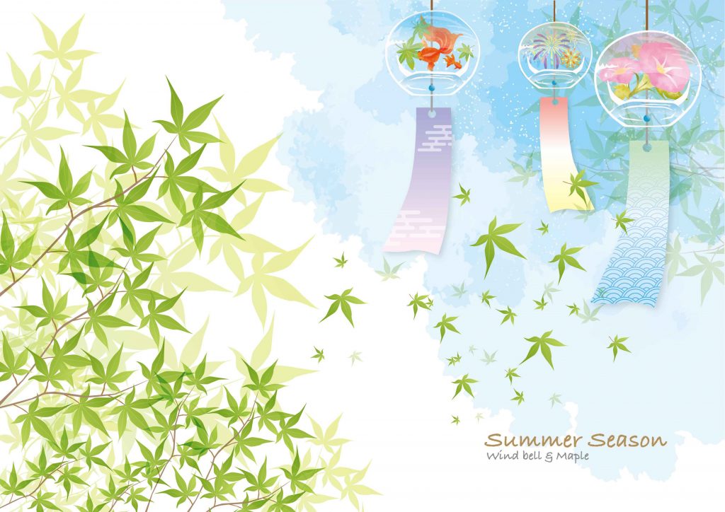
Some notable textures are the 3D texture, typography texture, and paper and artificial texture. You are free to pick any template from illustAC depending on what you are designing.
Why should you use textures in Graphic Design?
Textures in your graphic design assignment make your dull designs lively. Here are some of the main reasons why you should use textures.
- Tickle your target audience’s emotions
Graphic design is usually made for a particular audience. If you want to evoke the emotions of your target audience, a good texture is needed as a form of engagement.
- Create visual interest
Besides emotions, another critical texture application is creating visual interest. The mental and physical attention of those who interact with your design is affected by texture. The texture you use transmits a certain message to your clients.
- Create a personal identity
Having an identity in the art world is a milestone worth celebrating. Your identity is also pegged on the brand you are promoting. The people who see your works should link them to you or a certain brand. Graphic design textures are needed to make your end product realistic.
How to use textures in Graphic Design?
You now understand what graphic design textures are and why you should use them. You now need to learn the tricks you should apply to bring it to life in your designs.
- Photography application
One of the best ways to achieve a striking textured background is using quality photos. Create fascinating designs using quality photos combined with textured messages.
A picture can also be the focal background texture. You can take advantage of the beauty of nature captured in your photos and combine it with easy-to-read messages in the foreground. You are encouraged to play around with color variations and transparency levels to achieve your desired design.
Accent Photography is another alternative for your designs. You can contrast the image with other graphic elements to direct a viewer’s attention to a particular message point on your design. The illustAC platform has some of the best photo templates and eliminates the necessity of having a quality camera.
- Textured graphics
To come up with immersive designs, use textured graphics. The end product of this trick is a detailed and deep piece of art. When you have visual texture immersed into a textual message, you create striking art.
- Tactile texture technique
Tactile textures are not entirely visual. This texture has physical quality. It is one of the most widely used techniques in printed art. Print art uses matte surfaces and glossy ink layers on paper that attract the customer’s attention to your work then this interest is turned into a physical attraction.
Besides the fact that tactile textures focus on the physical surfaces of art pieces, they can be applied in graphic design to create the desired feel. Magazines and stationery designs use this type of texture to bond with users. The main aim is to have the final product’s combined physical and visual qualities.
- Artificial textures
You are free to develop experimental designs using artificial graphic design textures. This texture sets itself from natural textures by having numerous imagery applications with human-fabricated objects and surrealistic patterns. There is also a large variety of elements produced from manufacturing, photography, and three-dimensional design.
Other artists use crumpled paper, artificial geodes, washed-out textile, and wall surfaces as focal points in artificial textures. The availability of modern 3D visualization technology enables you to develop endless artificial textures. Your imagination will only limit you.
- Natural textures
As you master the beauty of artificial texture application, you should also invest in mastering the beauty of natural textures. This texture is helpful when you want to include organic life in your creations. You can get inspiration to create this kind of feel from almost anything natural around you. You can use the crispy grass look or even a feather touch.
This trick is what you need if you want a clear design full of life, warmth, and beauty. As an artist, you will have your potential client glued to your artwork. Adding typography and geometry to your designs will enhance the attractiveness of your design.
- Textured fonts
Besides textured typography, textures fonts have various features applicable in the design space. Artists apply this feature in contemporary and conservative art.
There are many existing textured fonts that you can use as an artist. Their availability will help you avoid the struggle of mixing filters and general setting up of texture opacity. The resulting artwork is amazingly visually appealing.
Textured fonts work miracles on a clean background. You need to avoid decorative fonts and work with sans serif. These considerations will make your text readable.
- Paper textures
Applying paper texture meets the crispy design’s desire. The beauty accompanying this kind of texture has made it a great choice for all contemporary artists.
With this graphic design trick, you will be able to bring to life minimalist designs that are visually appealing without shifting your focus to the background image.
If you desire to explain how man is attached to his nature vividly, a paper texture is a wise choice, among other ideas. You will have an easy time making the intention of the design known to those who interact with it.
- Textured typography
Art has to bring out bold statements. If this is your main target, mix texture with appropriate typography while working on your artwork. You will add accent and diversity to the peace you are working on. This typography texture eliminates the need for complex design features.
It would be best if you were keen on the final piece’s size, texture, color, and shape. These factors affect the quality and the type of typography to choose. This texture is vital when you want to emphasize a specific part of your art or direct visual attention to a specific part of your graphic design.
- Textured three-dimensional layers
A static textured background might be great, but a multi-layered three-dimensional texture is awesome. You are free to convert a 3D textures image into graphic pieces that are two-dimensional. This twist is called Skeuomorphism and can be used by adjusting transparency and opacity.
The trompe l’oeil effects are responsible for Skeuomorphism. This process simulates a three-dimensional object and turns it into a two-dimensional image. Apple’s icons and iOS operating system used this technique before it was overtaken by taste and technology. However, the end product is an awesome work that glorifies the visual magic embedded in graphic design. This touch is all you need to increase interest by adding variety.
- Visually appealing textured background
Do you desire a visually appealing textured background? A provoking design will have a larger influence if you incorporate textured background. You can use bright colors and various shapes to have a background that will be captivating to the eye.
- The textured shapes trick
Everything you see has a shape. Some shapes are clearly defined, while others are hard to explain. However, all shapes have a meaning, and you need to understand them to be a great visual artist. Shape psychology affects visual impressions.
If you have a textured shape to which your audience can relate, you are likely to pass your message with ease. Learn about all shapes, including organic, inorganic, simple, complex, abstract, and non-abstract.
- Contrast, balance, and alignment application in textures
It is wise to note that everything you include in your art affects contrast, balance, and alignment. Good contrast in your texture is what you need to create borders between various parts of your artwork. The background and other elements need to be differentiated.
It would be best to have a texture that balances your graphic design work. If you fail to consider this fact, your target audience and clients will feel like being pushed away from the piece you have produced. Whether you apply asymmetrical or symmetric design, mind your customers as you sharpen your design skills.
- The facial trick
The only thing that will give a special visual texture besides landscapes is a human face. You can test all photographic subjects, and you are likely to conclude that a human face is a good mine in graphic design.
Those who design magazine covers have invested heavily in this trick. You are free to try several variations to develop the best art.
- Metal and wood textures
Sometimes it is recommended that you apply the things that have been in use for ages to evoke visual textures. For instance, metals are associated with hard things. You can use a metallic texture to communicate hard feelings or industrial emotions. There are metallic color tones that can help you achieve this. Alternatively, a chain-link photo brushed copper and stainless steel can be applied in this art.
A wood texture is an awesome pick for a rustic or generally natural look. You can use a texture to mimic a tree bark, tree rings, or wood grains.
- Vintage and marble textures
We have some artworks that need to be associated with age. These textures can help you trace your memory lane to a particular location or time. Pixelation and linen textures are good examples of vintage textures.
On the other hand, a marble texture can help you achieve both soft and hard visual feels. The marble should appear to have pastel colors for a soft feel. They bring out a natural or standard marble look for a harder texture.
How do you get started after mastering textures?
After learning all the mentioned tips for using textures to develop great graphic designs, you need to practice. If you desire to avoid the complexity that accompanies quality graphic designs, you should master the application of textures in your art. This powerful tool will help you create visual textures that set your work apart from what other designers produce.
To start, you need clear photography pieces or isolated images that will help you have lively artwork. The second vital necessity is a creative idea. Note that you can apply textures as an emphasizing element or the main focus. This texture necessity is now a requirement in all contemporary art.
Above all, you should be a premium AcWorks member to fully benefit from their design solutions.
The necessary tools besides textures
After understanding what makes a great graphic design piece, you need to have the tools to make it. Besides the great help from illustAC, it would help if you started by having a quality notebook where you will be noting down your ideas. Always carry this book because you never know where inspiration will find you. Secondly, reliable, creative software is needed. Even if you are a pro at making sketches, a little refining with the help of software should be encouraged.
A quality monitor, a monitor calibrator, and an external hard drive are required. The quality of your monitor is usually reflected in the final product. Also, note that the calibrator helps deal with the color warping menace while external storage increases storage and eases portability.
The other basis is a quality camera and furniture. The photos you take have to be good enough to make admirable art. Last, due long hours you will spend piecing together your idea about textures, you need quality and comfortable furniture.