Unity is one of the design principles you should know, and this guide is dedicated to helping beginners to navigate their paths through the design principle unity. Before anything else, one of the main things to recognize is that unity, as the name suggests, does not come with so many defined guidelines or strict rules, but it only seeks to unify all other design principles with the aim of creating cohesion.
But why should we be concerned about design principle unity? If you are considering designing your business communications, you will need to fully understand the design principle unity. With this, you’ll be able to easily take documents and convert them into a very impressive piece.
The amazing thing is that you won’t need the help of a graphic designer for you to fully understand the concept. Continue reading to find out more, together with all the examples that you’ll need to fully understand the concept.
What is design principle unity?
As suggested earlier, unity focus on creating harmony in designs. Basically, it involves using textures, shapes, and colors. It also describes the use of negative space, in addition to playing with proximity, alignment, and repetition.
Basically, all these principles, when put together, will help you arrive at a very beautiful and visually stunning picture. Another thing that you should note is that unity doesn’t completely imply that the design is completely balanced. Basically, it’s possible for a random or asymmetrical design to appear harmonious, and the only thing for this to be possible is for other design elements to complement each other.
At this point, it’s normal to be confused, but this article aims to make everything a lot easier for you and improve your understanding of the unity of design principles. Basically, in most examples where you can the design principle unity applied, you’ll find that they mostly contain design elements like texts, motifs, icons, colors, images, patterned background, and a header. Also, these elements must all be in harmony.
All elements are expected to perfectly convey the message and theme for this to be possible.
Visual unity vs. conceptual unity
In plain terms, visual unity has to do with the design elements themselves, while conceptual unity relates to the content elements. When it comes to user experience, conceptual unity gains more application. This is because it mostly involves figuring out the ways to deliver content to users in a streamlined and logical way, and you can equally apply this to a visual design.
For example, if you’re designing an infographic or something similar, you’ll need to be able to present it in a cohesive and logical fashion to make it easier. It’s safe to say that you’re creating the infographic such that using a conceptually unified approach.
From a drag-and-drop to a user-friendly interface, you have a range of templates that are designed professionally on the website, and this will help you in creating different unified designs.
Why is Design Principle Unity Effective in Design?
Now that we have given you a detailed background of what design principle unity is all about, the next thing is to show you why it is effective in design.
Here are some reasons why design principle unity is effective:
Pleasing to the eye
The most obvious reason why design principle unity is effective in design is that it’s pleasing to the eye and can easily catch and retain the attention of your viewers. Ensuring that the design can effectively work and create a harmonized look will always be engaging and delightful to your audience.
Enhance Comprehension
One of the easiest ways to achieve unity in your design is to ensure that the design follows other design principles. Examples of these design principles include proximity, visual hierarchy, and repetition. These are key principles that aid comprehension. Basically, repetition will allow your audience to easily identify different elements. Proximity will aid the relationship between these elements, while hierarchy will highlight the most important elements to viewers. Combing all these principles will help to enhance the design and aid comprehension.
Highlights key messages
It’s easier for contrasting elements to stand out in cohesive designs, thereby making it easier for emphasis to be placed on certain elements of the design. With that, viewers won’t be easily distracted by elements that are discordant. They will also not get confused by the contrasts in the design. This will also allow you to draw attention to certain design elements
Enhances Balance
Another amazing thing about the design principle unity is that it helps to create balance in your design. The even distribution of elements enhances the flow of the design and creates a balance between the different sections of the design. This also makes it easier for users to comprehend and easily understand the message in the design.
Promotes Creativity
Following the basic design principles is an easy way to achieve unity in any design. With this, there’s no limit to what you can do. This is also a great way for you to use different creative texts, textures, and colors in a fascinating way. The ultimate result you get is a more eye-catching design that will enhance information retention.
From the benefits above, you’ll see that they all share a lot in common, especially when it comes to ensuring effective communication. The bottom line is that creating unified designs will help your viewers to understand your message easily.
Apply the Design Principle Unity in Design
There are many ways to apply the design principle unity, but here are a few applications that you know:
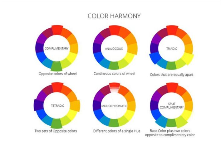
Choosing Harmonious Colors
One of the straightforward approaches to use in achieving unity is to select harmonious colors. Ensuring that the colors in a design work together is a great way of building a sense of cohesion in the design. This will also let you enhance the aesthetic appeal of the design. To ensure that you choose harmonious colors, you might want to consider using color palettes that suit your design.
Use Similar Shapes
Like ensuring that the colors are in harmony, you’ll also need to ensure that the shapes you use in your design create unity. This is also an approach where you can easily apply the design principle of repetition with ease.
Adding Complementary Textures
Textures in graphics are used to describe the feel of the finishing of a surface. With patterns or images, you can easily evoke different feelings to your design. For instance, the images on an oil painting will have its texture in a two-dimensional design.
Basically, you also need to ensure that the textures you use in your design all work in harmony, and this further enhances the design principle unity.
Placing Elements with Care
When it comes to the placement in your design, there are different design principles that can be applied, and thy include alignment, repetition, and proximity. Each of these principles uniquely enhances the design principle unity. For further emphasis, here are a few things that you should note.
Proximity emphasizes on how close the different elements in your design are, while repetition describes how you reuse each of the elements and the strategy that you use in achieving this. On the other hand, alignment describes the relationship between each element in your design.
Another factor that plays a role in determining how you place the different elements is the negative and positive spaces that you use in the design. Negative space is also known as white space, and it’s the space that surrounds each element, while positive space describes the visuals in your design.
Basically, you need to maintain a balance between the positive and the negative space in your design. This is to further ensure the composition in your design are not too busy and too sparse.
Tips to Apply the Design Principle Unity
Now it’s time to get with the application of the design principle unity, and for this, you’ll need some handy tips. Here are five tips that you should always have in mind.
1. Start with a clear purpose and vision
The first step towards achieving unity in your design is to have a clear purpose for your design. Before you get busy on your paper or screen, you’ll need to ensure that the message you want to convey is already determined. Without this, you’ll only end up mixing your messages and making it hard for your audience to relate to your messages.
To avoid this, it’s advisable to first create an outline for your design and work with the outline. An outline will help in demystifying all the points to ensure that you are focused while designing. Also, creating an outline will help with conceptual unity, and ultimately design principle unity.
2. Proximity makes it easy to build connections between elements
As highlighted earlier, proximity implies the distance between the elements in your design and is key to building a relationship between these elements. Grouping visuals with the elements in your design will help you create a relationship between each element. Also, using proximity is a great way to keep your readers glued to your design.
3. Align sections and elements
Alignment is also a great way to build relationships with the different elements in your design. This is also a great way to ensure that the design comes out tidy and neat. Alternatively, you can decide not to maintain the alignment of the elements in your design. The bottom line is to ensure that your decision stays consistent throughout your design.
4. Utilize repetition
Repetition is also a design principle that you can apply to enhance unity in your design. It refers to strategically and repeatedly using elements in your design. You can use this principle for multi-page or large-scale designs. With repetitive elements, you can easily tie different sections together.
In addition, repetition also allows your audience to recognize that each section or page is part of a whole, further justifying unity.
5. Experiment with different techniques
There are multiple options to apply when it comes to applying design principle unity. Examples include balance, movement, and unity. It’s worth mentioning that movement and rhythm work together, and the aim at creating a visual energy that suggests action. For example, you might want to consider using dotted lines to direct users to a segment of your design.
On the other hand, balance can utilize symmetry in a more formal manner. Balance can also be established in an unsymmetrical manner, and it all depends on visual interests. The most important thing is to ensure that all the elements in your design are perfect for your main message.
Conclusion
Unity will help to ensure that your design does not feel off. It will also keep your business communications clear, so you can avoid unnecessary confusion. With that said, it’s important to ensure that you are familiar with the design principle unity and how you can apply it to any design project.
Also, regardless of the project, you’re working on, the key thing to note is that you don’t need to start from scratch. With illustAC, you can find professionally designed templates to use. This will allow you to create visuals in a unified fashion and with ease.