Adding spaces to design might seem unnecessary, but this is one of the most vital aspects of design. It caters to different areas, including empty areas and small areas on web pages. A good designer is tasked with the responsibility of learning how to effectively use spaces in their design. This is to ensure that they can create successful, harmonious, and attractive designs.
White space is a type of space that is widely applied in many ways today, and this is because of how it helps in creating a balance between the layout and elements of your design. In this article, we’ll go through everything you should know, including how to apply white space in your design. We’ll also cover the importance of white spice and provide key examples to aid your exploration.
White Space: Definition and Its Role in a Design
White space is also called negative space, and it’s used to describe the empty space that surrounds elements on a page. It is also one of the 13 basic principles of designs and comprises the space between buttons, images, objects, and texts that users see on pages.
There are mostly classified based on their use and size in different designs. When they are applied intentionally to certain elements, they are mostly referred to as active white spaces. An example of this is when they are applied to posters or other similar illustrations or graphics.
In a case where the white space is created naturally, they are referred to as passive white space. Another type that you should know is the macro and micro white space. As the name suggests, micro-white spaces refer to smaller spaces, while macro describes larger spaces.
A key thing to note about white spaces is that they have elements, and these elements include letter spacing and line spacing for text and paddings and margins around functional elements like buttons.
Role of White Space in Design
The importance of white space in design cannot be overemphasized, especially when they are used correctly. Here are some of the benefits of using them correctly:
It organizes and structures content
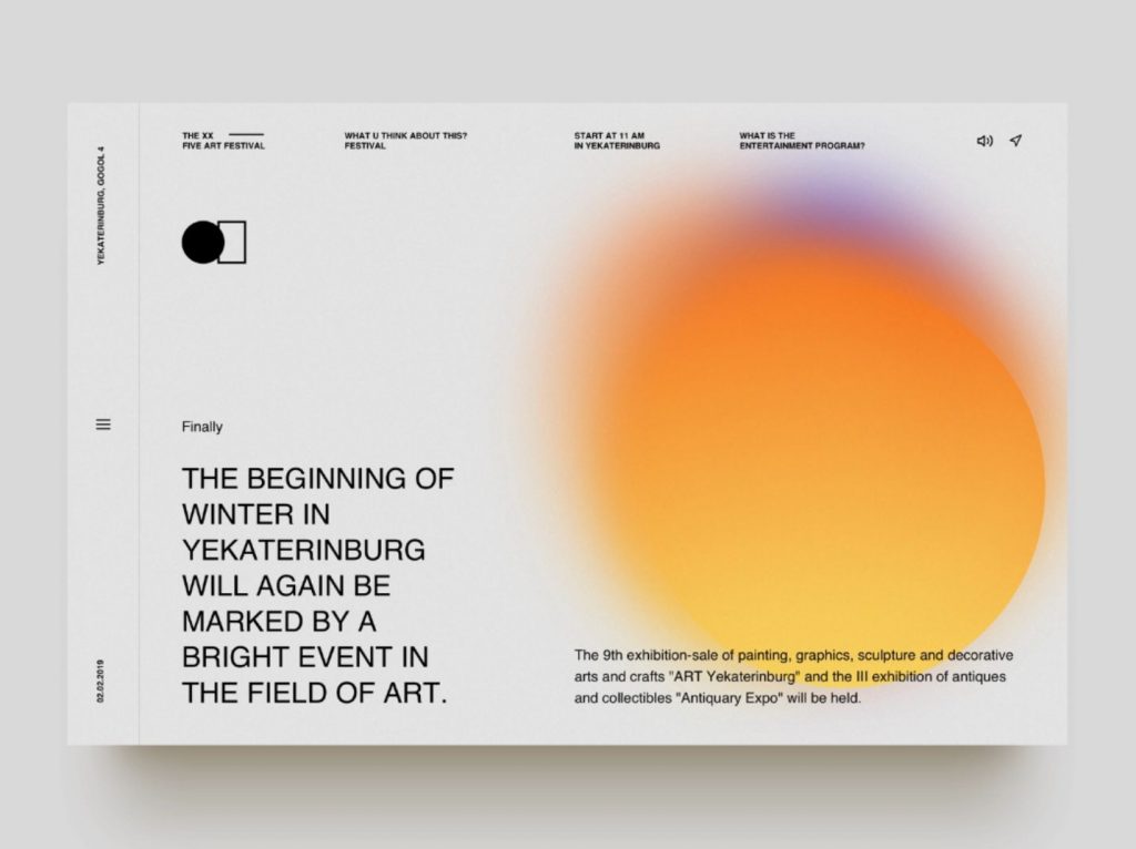
One of the roles of white space in design is to group and separate design elements. The aim is to show how the elements are related and to allow users to get the proper information from the design. A key thing to note is that the proximity design principle highlights that objects that are placed close to each other are mostly seen as a group rather than being seen individually or as unrelated parts.
Decreasing or increasing the space in your design is a great way to group and divide the design elements. This will also make it easier for viewers to process all the information that is contained in your design. In addition, they will also be able to process this information in a more logical manner.
Source: From Valery Cheplygin via Dribbble
It improves legibility and readability
Another role of white spaces in design is to separate texts and improve the readability and legibility of the content. This helps in improving comprehension of the content you design. Adding white space to text also helps in keeping the eyes of readers overwhelmed by the information in the design.
It increases user interaction
This is a strategy that helps in promoting the visual hierarchy of content within a design. It also makes it easier for users to find information within the design. By including enough white space in your design, especially around headlines, navigation menus, buttons, and headers, you can easily prompt your viewers to take action.
Another impressive thing is that this strategy can prevent distractions and keep viewers attention on the content.
Source: From DesignAC
It draws focus on important elements
In most cases, to attract more attention to an element or to make it stand out more, the strategy is to apply to make it a lot bigger and also to add more space around the item. Using bigger spaces around elements also helps in creating more emphasis on these elements. This strategy is widely applied when highlight CTAs, and other key areas that require focus.
It promotes balance and visual order
Applying white space in design helps in promoting the even distribution of empty spaces and other elements in the design. By creating a visual hierarchy and balance, you can enhance the visual appeal of your design and also improve user experience. This also enhances the unity of the design.
Another thing worth noting is that this helps in creating a minimalist and clean design, which is handy from sophistication and luxury to enhance branding.
Source: From DesignAC
How to Apply White Space in Your Design
Now that you know the benefits of white spaces in the design, the next thing is to understand how to apply them in your design. Continue reading to find the best practices and tips to help you apply these design principles.
Consider Visual Hierarchy When Positioning Elements
Using the principle to separate the design elements in your content is not the only way you can apply them. You can also use them when positioning and arranging elements. When you use them in the right places, you can easily guide your viewer’s eyes to the key elements they should focus on within your design.
Source: From Venngage
Implement Proper Text Formatting
Using correct margins, line spacing, and paragraphs in your texts helps to improve the presentation of the text. In addition to using paragraphs and line spacing, you can also use headlines and titles, and for this, you only need to increase the space between letters.
The key thing to note is that the ideal spacing between lines should be set between 130 to 150% of the actual size of the font that you use.
Source: From DesignAC
Group Content and Objects Logically
You might be wondering what it means to logically group content. This is basically what you do when you group information into logical categories. The application of negative space is handy for a situation like this one, and this is because it will help you to organize content and elements in a strategic and more sensible way.
Source: Behance
Maintain a Clean and Minimal Design
Cluttered designs should be avoided because it only brings about cognitive overload, and this mostly occurs when there’s so much information that it becomes too much for our memory to hold. To avoid this, you’ll need to keep your design elements clean and minimal so that you can avoid clutters in your design, you can also consider promoting cohesiveness and clarity in your design.
In addition, you should also ensure that you have sufficient negative space around the texts in your design. Basically, this will help you create a balance in your content.
Negative Space Does Not Imply Using Color
A lot of people are quick to believe that using negative space is the same as using only white colors alone or without the use of other colors. However, that’s not entirely the case, and it’d interest you to note that you can use other colors in your negative space. This can actually also be any texture, pattern, or background image. The key thing is for the space to be relevant to your design.
Another vital thing to note is that when you use negative space, you can easily create the contrast you need to make all the design elements pop.
Source: DesignAC
5 White Space Examples for your Inspiration
Now that we have covered the basic things you should know, let us look at some practical examples to guide you further:
1. Make Text More Readable
Most of the information that you’ll find on the internet today, particularly in mobile apps and on the web, are in written form. With that, it’s vital to ensure that the design is easier for viewers to understand. The best way to enhance the readability of written content is by applying negative space. This will also ensure that the elements are easy to identify.
One of the basic things to always have in mind when using negative space is that you’ll need to adjust line height. With too tight line height, you’ll only make it harder for the users to read your text. Also, too many negative spaces also alter the flow of readability.
You might be wondering the ideal line spacing. The best thing is to choose a line height that matches your font size, and the ideal height is between 120% and 145% of the font size you use.
2. Create Connections Between Individual Elements
There are many impacts that negative space gives design, and one of the most important things is that it makes designs to be more comprehensible. The law of proximity which we highlighted earlier, is a practical case to have in mind. Basically, negative space acts as a visual cue that allows us to process images even better.
3. Drive User’s Attention to Particular Objects
Another key thing to note about with good designs, you can enhance interaction on your page, and this is the part where negative space will come in handy for you. Using white space will help you to enhance the attention of your viewers. By adding more negative space, you can also increase user retention because they will be more focused on your design.
Basically, with negative space, you can also enhance attention on your landing pages. This is because you’ll be able to enhance the visuality of functional or content elements.
4. Create Visual Hierarchy on a Page
We have already highlighted the importance of visual hierarchy on a page, and this is for emphasis. The aim is to create a good organization of the content on your page. The importance of using a visual hierarchy is that it enhances the scannability of your website.
With negative space, designers can create a nice flow in their content, and this enhances visual appeal and makes it possible for viewers to scan the content with ease. Another thing you might want to consider is to use symmetrical layouts, which are also easier on the eyes.
5. Convey a Feeling of Elegance
Negative space plays a key role in branding, especially when it is paired with powerful photography and crisp typography. Following this strategy delivers a luxurious feeling to design. Basically, it helps in placing products in the spotlight and gives a clear signal for the product to stand out appropriately.
If you own a brand that requires a unique appearance in design, you should consider using negative space in your designs to increase elegance and also promote the appearance of your design.
The bottom line is that with negative space, you can comfortably improve your design for the benefit of your brand, as well as that of your users. It’s a user-focused and more effective design principle.
Conclusion
We have covered all the basic things you should know about negative spaces, and what’s certain is that it’s a very impressive design tool that every designer should have in their toolbox. When this design strategy is properly applied, you can rest assured that it will enhance your design and increase the flow of your content.
In addition to everything above, you can also get more design inspiration to properly understand the use of white space in the design. Basically, for this, you only need to check designs from professionals that have applied these principles in their design. The best place to check for these inspirations is on illustAC. Here you’ll find different from leading designers from across the world, and it can serve as a great option for design inspiration to fully understand the use of white spaces.