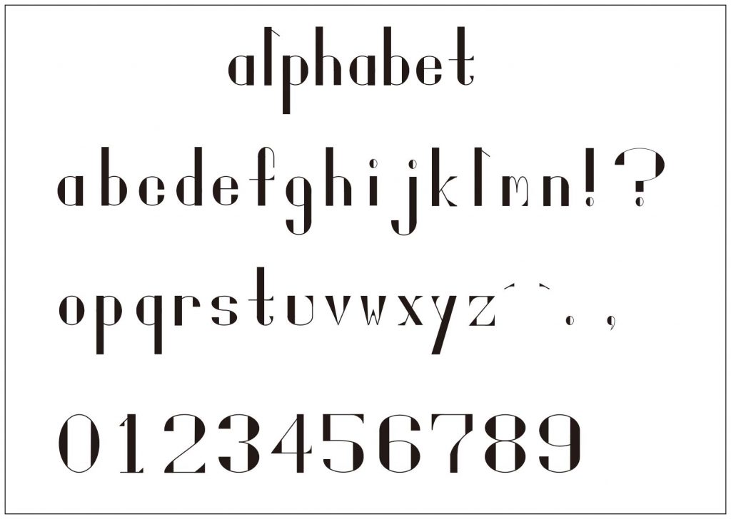
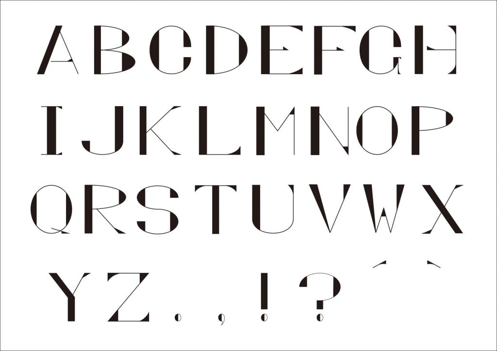
A common trend in recent times is the fact that you’ll find typography design everywhere. From that line spacing that is added to a list of ingredients on a package to the nice shape of figures on price tags or even the unique weight of letters on street signs. These are some of the common ways we see typography design every day.
The truth of the matter is that letters surround us and can be found at every turn. What’s more is that these different sources provide us with different insights and perspectives, in addition to showing us more ways to use typography design.
In this article, we’ll take a deeper look into typography design, but before that, let us go through what is typography and where it came from. Continue reading to find out more.


What is Typography Design?
Typography design involves arranging messages in an aesthetically pleasing and readable composition. This is one of the key design elements, and it mostly requires designers to use typefaces rather than draw letterforms.
The processes also need attention to detail, as a designer will need to go through different options while making a decision. This includes choosing the point size, selecting an ideal typeface, line spacing, adjusting kerning, and creating a perfect layout.
You might want to think this is a rather arduous task, but it is something you can do easily and quickly on your computer, laptop or phone. Another thing to note is that the rules used in typography design are dynamic and constantly changing, thanks to technology. It hasn’t always been about technology. Right from the 15th Century, movable type was already being used.
This is from the works of Johannes Gutenberg, who revolutionized typography, making it possible for printed materials to be produced in mass. Interestingly, before the existence of printing machines, people were still inspired to create type-based posters and books. The only thing is that they could only do this by hand, which requires a great level of dedication and patience.
Humans have always found ways to create a message, and we were never stopped by a lack of writing tools. In ancient civilizations, the commonly used options included carving glyphs into wood or stones. Taking a deeper look into typography and how it has evolved over time, you’ll find that there’s a subtle battle between the geometric and the organic, between the machine-made and the handcrafted.
Today, harmoniously merging both worlds and equally separating them produces new and unusual results, which fuels an unending cycle of typography for exploration.
Key Typography Design Concepts You Should Know
Like every other design aspect, typography design has its unique terminology. It’s important to know these terminologies as the words can be easily misused, mistakenly switched or confused. To get started, we’ll go through some major distinctions that you should know, and they include the following:
1. Typeface vs Font
For most committed typographers, one of the worst words that you can throw at them is “font.” It’s worth mentioning that fonts actually come from noble incarnations, the “typeface.”
Before you wrongly use this terminology with a typographer, here’s what you should know:
- Fonts are simple digital files with information regarding the style, sizing, and weights of the type. Therefore, whenever you view a type style on any software, you are simply viewing the font file. This further implies that the font is the main thing that you use.
- Typeface on the other hand has a deeper meaning. The term is actually used in describing the metallic blocks with the same of similar features. Typographers are required to sort these blocks before they can use them for printing purposes. However, with the innovation of desktop publishing, it’s not so easy to differentiate between typeface and font. The main thing you should know is that a clear description of the baseline of the type of style is actually the typeface.
Caslon is a typeface, but when it’s set to 12 pt. size in italic, it becomes the font version that designers use.
Another impressive thing you should note is the fact that typography design is of non-digital origins, and everyone today respects this fact.
2. Letterform vs Paragraph
Typography has so many interesting layers you should know, and letterforms form the basis for the creation of paragraphs and larger words. It simply describes the actual shape of a character or a single letter.
When you type a letter in Word and allow it to appear as big as possible, you’ll be able to see the detail of the letter. Among the things you’ll notice include lines going down (descenders), lines going up (ascenders), enclosed areas (counters or eyes), or sticky-out bits (serifs). All these are the details that make up the design of a letterform.
As a typographer, you should be able to understand how you can identify or create letterforms, as well as how you can work with these letterforms to create a cohesive composition, which is part of a paragraph.
Typographic skills are also required when formatting paragraphs. This involves optimizing the paragraph, as well as other task switches, and it’s done by adjusting line-spacing, aligning, remedying, tracking, and straggling words.
The main thing to know is that paragraphs and letterforms require different levels of care and also observation. However, they remain important elements in typography design.
3. Kerning vs Tracking
Letter-spacing is more than just its literal meaning. What you should know is that letter-spacing can be done across each phrase or word, and this is known as tracking or done between letters, which is called kerning. Basically, tracking makes it possible for text to be evened out or made more legible. However, you’ll notice that it’s kerning that typographers actually like to go for.
As mentioned earlier, kerning involves adjusting the spaces between characters and letters. You’ll be surprised at the things that really earnt the attention of typographers, and among these things is kerning. One of the things that will help you know that you’re becoming a full-fledged typographer is when you start to have a passion for kerning.
Remember that most of the fonts you’ll find today don’t actually have a perfect space between them, which is where there are so many combination options for characters and letters. However, with kerning, it becomes so easy for typographers to improve the appearance of phrases and words. By simply making changes to the spaces, they can make the appearance more streamlined and symmetrical.
4. Typesetter vs Typographer
This is the last distinction we’ll take you through, and it’d interest you to note that a typographer and a typesetter are separate individuals. Here’s how they differ:
- A typographer is a designer that specializes in using and creating type. This implies that their work is type-based focus rather than image-based. Most typographers like to design their own typefaces, which they eventually sell in the form of downloadable fonts. In some cases, they establish their foundries, and this is simply a selection of quality fonts.
- On the other hand, typesetters are completely different, and they are not as trendy as they are typographers. They specialize primarily in typesetting, which involves laying out a type. They mostly work for printing businesses or publishing firms, which mostly involve typesetting in magazines and books.
Other Key Things to Know
In addition to the distinctions above, let us go through some basic definitions you should know about typography design.
Style
When you look at different printed materials today, one of the first things you’ll notice is the fact that letters come in different styles and shapes. In many cases, it can be rather challenging to start to categorize them in typography design, and this is because there are so many factors that should be considered. From their appearance to the inspiration behind them, their use, and when they first appeared. All these need to be considered.
To make this simple and to remove the complications behind their classification, there are three main style categories in typography design to know, and it is from each of these styles that we have smaller ones.

Serif
Serif typefaces are inspired by traditional calligraphy, which is also known as Old Style or Humanist. This style comprises rounded and smooth forms, and it also has a slight weight variation. During the mid-18th Century, newer forms of this type became popular, and this is what is now referred to as the Transitional typeface.
The transitional typeface is actually a transition between the humanist and modern styles as we have today. It’s mostly a combination of both styles. During the late 18th and early 19th Century, another serif style became popular, and this is the mode radical serif style, also known as the Modern serif. It’s easy to recognize the style as it has sharp weight contrast and straight and thin serifs.
Another serif style that was introduced later in the 19th Century is the Slab or Egyptian Serifs, which has a rather bold appearance. This is the style that’s mostly used in commercial materials today.

Sans Serif
The 20th Century ushered in the Sans serif typefaces as this was when it became popular. This style also has calligraphic influence, and we can call them Humanist like serifs. Sans serifs generally deliver a warm vibe with their slight weight variation.
During the mid-1900s, a transitional sans serif was created in typography design, which is Helvetica. It comprised more right but uniform letters and had no handcrafted elements in it. Another form to know is the geometric sans serif, which is what we now refer to as the modern serifs. This style is mostly created on geometric forms, and you can identify them by looking at some letters which have strong and sharp peaks.
Cursive
The last category that you should know is the cursive category. Most script letters today imitate calligraphic and handwritten styles. These styles can either be formal, sleek, effortless or messy, and we can refer them to the script typeface.
Another cursive style is the brush typeface, which is a lot similar to the scripts, but their inspiration is mostly from brush lettering, which makes them less elegant but bolder.
The last one is the Blackletter or Gothic style, which gives the traditional calligraphic feel. This style was first created by the Carolingian minuscule, and during the mid-12th Century, newer forms of the style were created for typography design. However, this time around, it was with angular, straight, and sharp lines.
Anatomy
In addition to styles, the anatomy of letters is also a key thing that one should know in typography design. Typography design is a broad field, and every detail requires equal attention, including the anatomy of letters. However, anatomy itself can be rather complex because elements and details have their respective terms.
Some of the terms include cap height, baseline, ascender line, descender line, ascender, spine, bowl, aperture, stem, crossbar, terminal, shoulder, descender, arm, eye, counter, and log. These are the main features and elements that make up a letter.
Conclusion
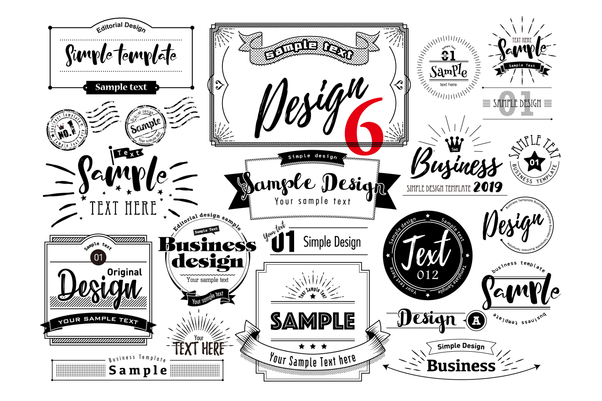
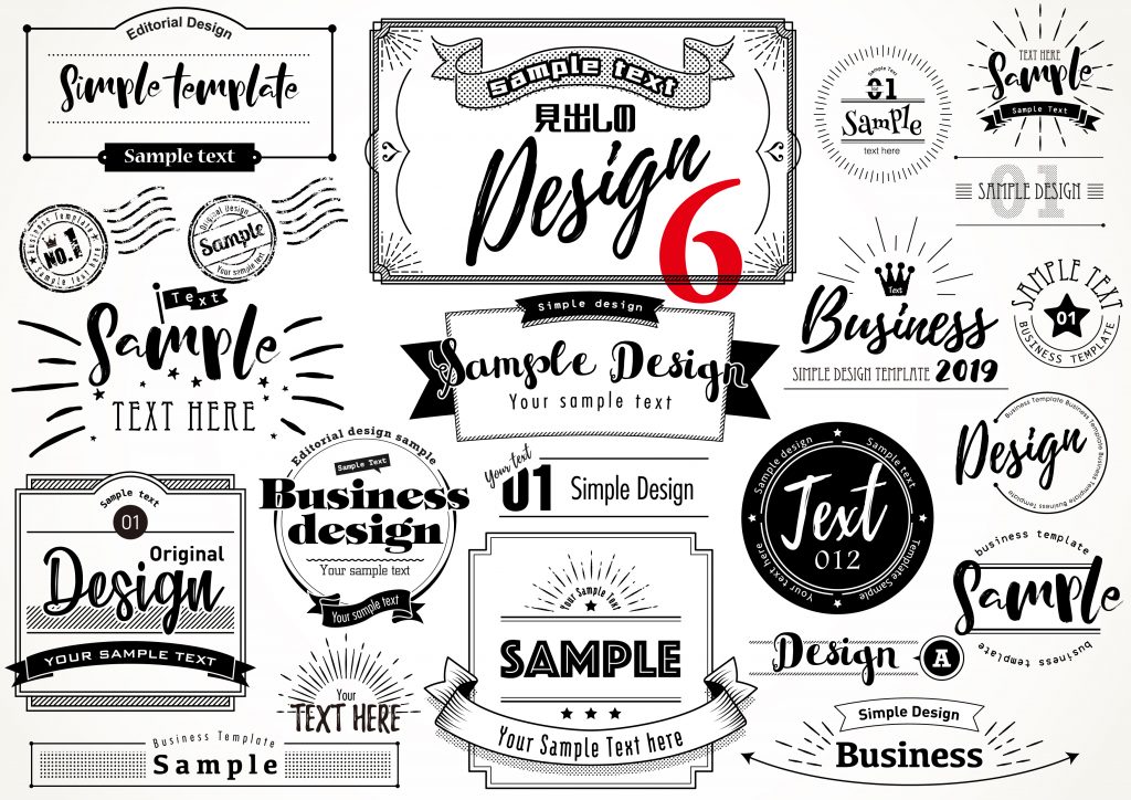
We have covered everything that you should know about typography design. From the most important distinctions that you should know to the key categories of styles that are used today, you can find all these details above. In addition to the information about typographic design, we recommend checking illustAC today. Here you’ll find different illustrations of the different styles, fonts, and typefaces that we have mentioned above. Whether you’re a typographer, or a designer, having a tool from which you can get illustrations form is very important, and for that, we recommend checking illustAC.