The design principles are the standards that a designer must follow to create an effective and appealing composition. The emphasis, balance and alignment, the contrast in design, repetition, proportion, movement, and white Space are the basic design principles. Continue reading to learn more about the seven basic design concepts. In any case, understanding these ideas and how to use them will help your next project stand out.
The first of the seven design principles is the focus, which refers to a design’s focal point and the order of importance of each element inside a design. Assume you’re designing a concert poster. You should ask yourself, “What is the first thing my audience needs to know?” Is it the group? Or how about the concert venue? What about the cost of attendance and the day?
Alignment and Balance
Never forget that each element on a page has a weight. Color, size, and texture can all contribute to weight. You wouldn’t put all of your furniture in one corner of a room, and you shouldn’t put all of your heavy pieces in one region of your composition. Your audience will feel as if their eye is sliding off the page if there is no balance.
Repetition
If you limit yourself to two strong typefaces or three strong colors, you’ll quickly discover that you’ll need to repeat some elements. That’s fine! It is frequently stated that repetition unites and strengthens a design. If your band poster only has one thing in blue italic sans-serif, it may appear to be an error. You’ve created a motif and are back in charge of your design if three things are in blue italic sans-serif.
Proportion
The apparent size and weight of parts in a composition, as well as how they relate to one another, are referred to as proportion. It is generally beneficial to approach your design in portions rather than as a whole. Proportion can only be achieved if all aspects of your design are appropriately proportioned and arranged. The proportion should occur organically once you’ve mastered alignment, balance, and contrast.
Movement
Controlling the elements in a composition so that the eye is led from one to the next and the information is appropriately transmitted to your audience is what movement is all about. If you look at your design and notice that your eye becomes “stuck” somewhere on it—an element is too huge, too bold, slightly off-center, or not a complementary color—go back and adjust until everything is in harmony.
There are many ways you can add movement to a design, including using simple arrows, people, or animals in movements.
All of the other design principles are concerned with what you add to your design. The only one that expressly deals with what you don’t contribute is white space (or negative space). White space is the empty page surrounding the items in your composition. It might be a dangerous zone for inexperienced designers. Giving a piece more breathing room can often elevate it from mediocre to successful.
Contrast
When people say a design “pops,” they’re referring to contrast in design. Contrast creates separation and space between items in your design. To work smoothly and readable, your backdrop should be significantly different from the color of your elements. Understanding contrast in design is critical if you plan to work with type since it indicates that the weight and size of your type are balanced. If everything is in bold, how will your readers determine what is most important?
When looking for examples of extremely powerful, effective design, you’ll notice that most only use one or two typefaces. This is because the contrast in design can be efficiently accomplished by using two strong fonts (or even one strong typeface in different weights). Adding fonts dilutes and confuses the aim of your design.
2. The Importance of Contrast in Design
In reality, contrast in design is a key design idea that should be incorporated into every project. Why? Contrast aids in the organization of your design and the establishment of a hierarchy, which simply indicates which components of your design are the most important (and signals viewers to focus on those). However, contrast provides visual interest to your design in addition to underlining the focus point. A layout with everything the same size, shape, or color will be boring—but contrast adds interest.
The contrast in design should be used, like with other design principles, in a balanced manner. Too much contrast, on the other hand, can be just as terrible as none at all and can lead to a confusing or visually jarring design. Nothing will stand out if all of your design components clash. What then is the key to using contrast in your design in a way that will benefit your project?
There isn’t a magic trick, which is unfortunate. As your design abilities improve, the process frequently starts to happen instinctively. Don’t quit up just yet if you believe this sounds like some secret talent that designers are hiding. Continue reading to learn more about contrast in design, a design tool that anyone can use to organize and add visual appeal to their design efforts.
2. 7 Tips to Create Contrast in Design
Contrast with Dark and Light Colors
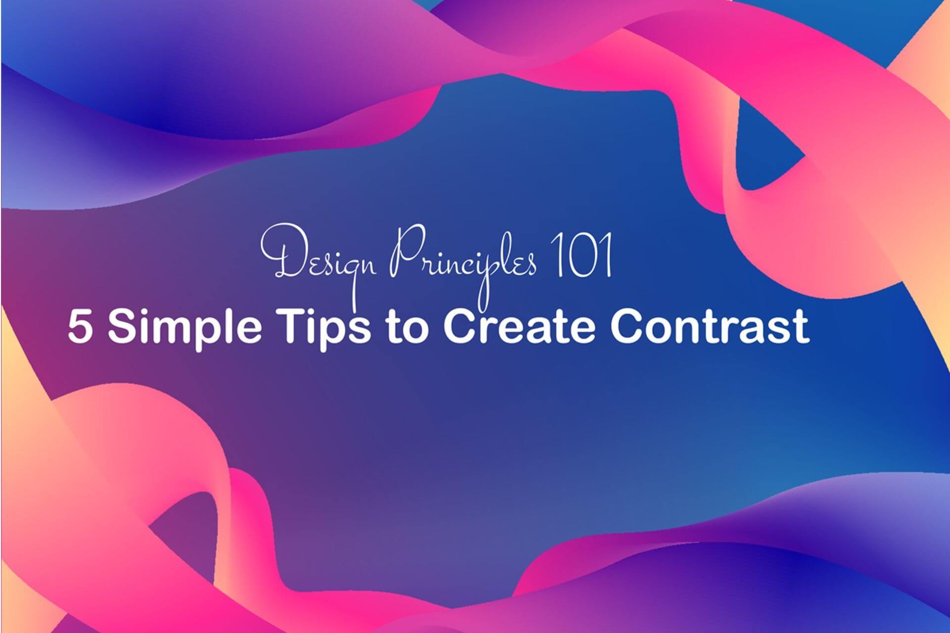
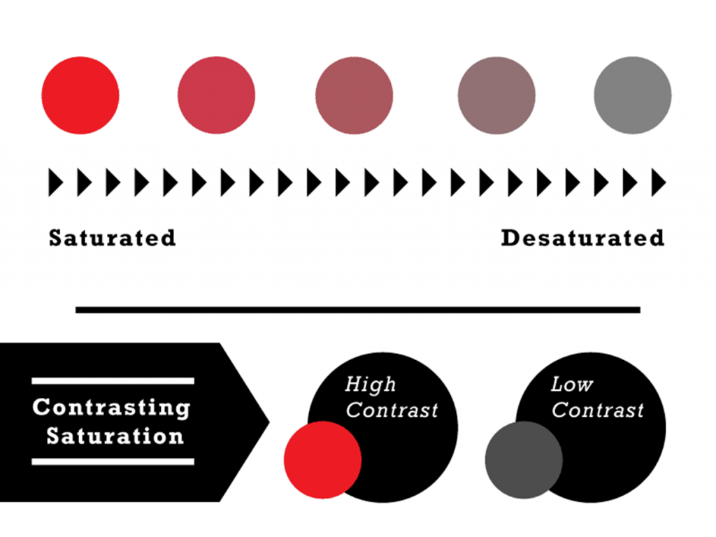
Value simply refers to a color’s lightness or darkness, with pure black and pure white being the most extreme examples of contrast. To produce a high-contrast design, though, you are by no means required to keep to a black-and-white color scheme. One of the simplest methods to add contrast and increase the visibility of particular elements of your design is to play lighter and darker colors off of one another.
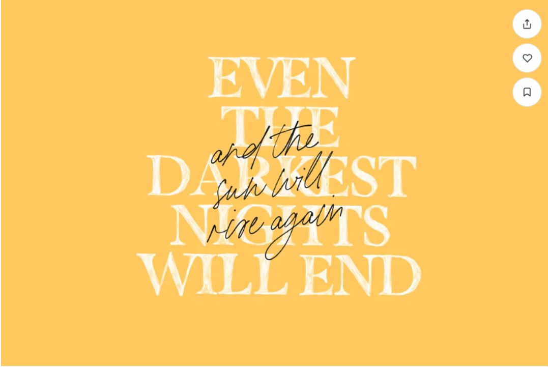
Consider a straightforward example of dark text on a bright backdrop, or vice versa, as in this design. The contrast in values here (bright white lettering over dark tones of purple and blue) helps it work even though reading the small print on a picture may otherwise be challenging.
Source: From via Dribbble
Contrast with Color Hue
A specific color, typically one of the 12 on the color wheel, is referred to as a hue in art. But graphic and online designers can also benefit from understanding color theory. To produce high-contrast compositions, painters have used a variety of traditional color schemes for millennia. These can be found on the color wheel. Several possibilities are:
Complementary colors are those with great contrast in design and intensity, such as red and green or blue and orange on the color wheel.
This emblem makes use of a straightforward, complementary color scheme that is both eye-catching and useful in that it divides and categorizes different components of the design into sections.
Split-Complimentary color schemes still have a strong visual contrast but are less striking than complementary color schemes. Split-Complementary color schemes include every color on the color wheel plus the two opposites of its complement.
Any three evenly spaced hues on the color wheel are considered triadic.
Remember that you don’t have to employ these colors in their most vibrant, pure versions (like those seen in the color wheel chart above, which can sometimes clash). Although it may be more practical for real-life design situations to make your colors lighter, darker, or muted, this can still add some wonderful contrast to your design.
Contrast with Color Temperature
Warm, cold, or neutral temperature categories can be used to categorize all colors. Blues and greens are regarded as cool, while reds, oranges, and yellows are considered warm. Neutral colors include black, white, and grey; depending on how they are utilized, beige and brown may also be included in this category. Warm and cool color temperature combinations, in particular, can produce a striking contrast in a design.
For instance, the blue and yellow hues on this web page’s layout contrast with one another. This makes the main image and the call-to-action button stand out especially nicely. Additionally, although having a very high contrast, the combination looks coherent because both colors have a colder hue (with a hint of green).
Source: From Stella Stoyanova via Dribbble
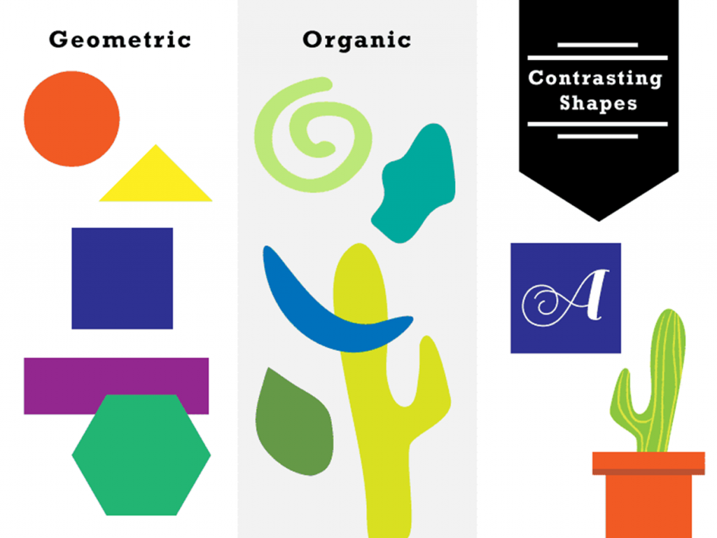
Contrast with Shape: Organic vs. Geometric
The majority of shapes fall into one of two categories: geometric (circles, triangles, rectangles, etc.) or organic (fluid, nature-inspired). The typically bending, asymmetrical characteristics of organic shapes can contrast beautifully with the consistent angularity of geometric structures.
Source: Vecteezy
Contrast with Scale & Size
The contrast in design not only adds visual interest but also helps organize and prioritize various design elements by establishing links between them. There won’t be much hierarchy if every object in your design is around the same size. How are viewers supposed to know what to look at first or what is most crucial? In addition to being crucial from a practical aspect, employing scale effectively is one of the simplest ways to make a dynamic, captivating layout and add drama to a design.
The large photo on this magazine cover design highlights the issue’s theme without dominating the other design aspects. The typography’s size, form, and color serve to emphasize the main subject of the shot.
Contrast with Visual Weight
Similar to size, visual weight is another approach to indicate to the viewer that a particular component of your design is crucial. Visual weight is simply the degree to which a piece stands out from the rest of the design, or how high-contrast it is. It’s not necessary for the element in your design that has the most visual weight (usually the focal point) to be the largest object on the page. Color, texture, shape, or any other distinguishing feature that draws the eye can also make something “heavier” or more noticeable.
Take a look at this collection of postcards to showcase Cincinnati’s cultural attractions as an illustration. Each card has a large number of architectural illustrations, however, the “Enjoy More” tagline stands out because it is the darkest part of the page.
Contrast with Font Combinations
The majority of designs must use typography because it offers special chances to add contrast in design. There are several unique factors to be aware of when selecting and using typefaces or developing custom typography for your designs, even though practically all the methods of increasing contrast we’ve already covered here may be applied to typography.
One serif typeface and one sans serif font should be used as a general guideline. This is frequently a combination that has excellent contrast in addition to being complementing. Check out our 10 font mixing recommendations for a more detailed look at this procedure. The typographic logo below uses a sans serif, a slab serif, and a script font combination to create a flawlessly balanced design that relies on type contrast.
Source: From creativemarket
3. Best Examples for Contrast in Design
Contrast of Size
You may see a very basic illustration of size contrast in the image below. The huge text grabs your attention. Something enormous next to something little will naturally imply that the big item is much more important. A contrast in design and in size enhances their position’s visual attractiveness and can help you identify the important components of your layout so you can be certain the visitor is concentrating on the right location.
Contrast of Typography
As a graphic designer, you’ll use fonts in many of your projects. Typefaces can be customized in terms of color, size, and shape. It is advisable to keep one or two typefaces in a layout and employ stylistic variants for unification. To generate contrasting effects, for instance, try the light, regular, and bold styles. Another method for highlighting text portions is by picking hues that go well with your overall color scheme.
Contrast of Color
In graphic design, the use of color is crucial for establishing contrast. The viewers are most accustomed to this idea. This can be demonstrated by using a plain white background and all-black text. There is a clear contrast in design between the two color values. Your color palette will be much more varied. The eye can become agitated or perplexed when contrasting colors are used. The contrast in design is created by using complementary colors, which are also more aesthetically pleasing.
Contrast of Shape
The effective design uses a shape that stands out from the rest of the elements in the layout as the focal point of the design. If, for instance, the majority of your design is composed of square-shaped regions, adding a circle will compel the viewer’s eye to immediately draw attention to it. The human eye finds comfort in similarity but finds interest in discernible variation. For the best results, you should put your main message there.
Conclusion
One of the most significant abilities in graphic design is the ability to create a visual center of interest through contrast. The combination of multiple contrast techniques produces the best results. Using contrast in design in a balanced way will not appear as a punch in the eye to the viewer, but will naturally inspire them to glance at the essential points in your layout. Now that you’ve got some tried-and-true methods for adding contrast to your designs, it’s time to put them to the test. Feel free to share your results or add other contrast-boosting approaches in the comments area below. As usual, happy designing!